


black pearl press *
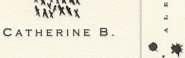
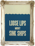
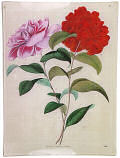
d*s reader elisabeth founded her own letterpress studio in 2004 called "black pearl press". working out of her boston studio, elisabeth launched her debut collection, pearlpapers.com. she describes her work as being born out of, "a great desire to celebrate craftsmanship in some small way through clean, simple design on paper" and i think she's done just that. the designs are beautiful, modern, sophisticated and executed flawlessly (her use of color is spot on as well). you can click here to view and purchase elisabeth's goods (don't miss the inky collection!). best of luck to you, elisabeth, your collection is stunning! [thanks to elisabeth for giving d*s the first look at her new collection!]

Labels: paper
posted by design*sponge @ 9.3.06
![]()


7 Comments:
After WEEKS spent with graphic designers and a typographer for choosing paper, colors, fonts, etc. for my business stationery trying to fit what I wanted into my budget, I can definitely look at this and say without a doubt that it's as good as it gets and it's what I dreamed of having. Now I have another item to add to the "If I won the lottery , I'd get..." list.
Congrats on your work Elisabeth.
I'm a little confused. Maybe someone who knows more about letterpress than I do can explain-- These pieces seem to come up rather than be pressed down... is that the nature of their specific press?
I've done some letterpress myself and always found that it indented in.
It is exceptionally beautiful stuff. Very impressive. (no pun intended)
Thank you so much for such nice comments!
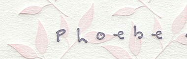
Laura, I can see what you may be referring to in the "V" monogram, but I assure you the ink is pressed into the paper! Because of the swash of color surrounding the letter, the paper appears raised, and it is in a way, because the plate presses down around it. The faint shadow around Phoebe's leaves is perhaps deceptive, and makes the pale pink appear raised?
It's quite difficult to get good results with a scanner, at least with the one I have on hand...
Thanks again!
Elisabeth
very gorgeous stuff. i love what a professional printhouse with a platen press can do with lovely designs like these!!!
very beautiful examples. i tried to send elizabeth an e-mail, but her site seems to be not working properly. i wonder if she will do custom business cards. thanks grace for another beautiful design idea!
Wow. What absolutely beautiful work. I would love, love to be able to afford some of those inky cards. And I have to tell you that the baby announcements are so adorable that I am tempted to have a baby just to send them out....
absolutely in love with this papaer. the quality of her work, and the lightness of her design. that is design at its finest. minimalistic and pure.
thanks so much for sharing this link. her website is bookmarked... and if only to simply drool for now!
angela.
Post a Comment
<< Home