


the d*s apt project: episode 6 [the bedroom]

ok, last post on the apt today and the last word from me as i'm due at a lunch meeting for work in an hour. ac is going to post a few thoughts on the apt and the redecorating process later, so you can enjoy his comments on what an experience it is to live with someone as nutty about decorating as i am. i'm sure it will be funny to say the least. anyway, thanks for trudging through all this- i promise to take better pictures next time. i hope this can be a learning experience for everyone and we can all get something out the process. i've shown everything in its very, very rough, "fixer upper" reality in hopes that, when it's all said and done, we can track how far it's come and how fun (or frustrating) creating a home in real life (and on a budget) can be. see you tomorrow, xo, d*s
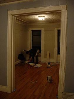
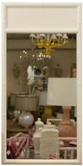
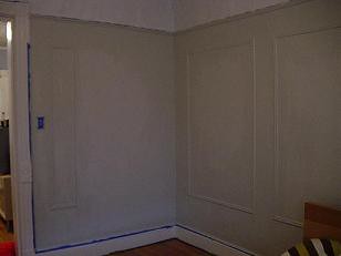
i had a vision that our bedroom [click here for full slideshow] would be a deep, grey blue with bright white accents and a gorgeous crystal chandelier. somehow the blue i chose (again, site unseen- dumb, dumb, grace!) turned into primary blue and it looked like we lived in a little boy's room. i immediately repainted with benjamin moore's "silvery moon" paint to cover the mistake and now we're both not quite sure about the color. it's nice, but we don't really have a cohesive vision for the room so everything's in that oh-so-fun limbo stage. all we know is that we plan on keeping our bed (malm in oak) and putting a knotted wool rug under it to counter balance the sharp edges and lines of the bed. i was thinking a grey and red theme, but i'm not quite sure anymore. we don't have linens picked out and we don't have new dressers yet (ours don't match) so it's all a crapshoot right now. any random suggestions? thoughts on colors? fun themes? we're open to most things right now....
Labels: interior design
posted by design*sponge @ 11.1.06
![]()


21 Comments:
As someone who has been living in an old house for a year before making any color decisions (and has a partner with strong design feelings of his own) can I make a few suggestions? But take them with a grain of salt since all we've decided is the ceiling and 1 bedroom color! We still have the hallways, other bedrooms, living room, kitchen and dining rooms to go (don’t hate us, it’s not NYC).
There is no way I can afford Farrow & Ball paints, but I've found the information packet that they sent me to be invaluable, especially if you spend time reading what they write about each of the colors, which includes colors they think you should look at by themselves, next to white, in a large space, in the bedroom, in the kitchen, next to wood, etc. etc. I found it very educational.
Another thing is to check out the Historic Colors of America. I'm not saying use them, but check out the color card. First, it narrows down the choices so you can get an idea of a color that might look good in your old apt, secondly, there is a reason some of the colors have been popular for hundreds and hundreds of years, they work! I totally love some of the 40's colors right now.
Lastly, this might not be New York appropriate, but make friends with the guys at your paint store. I have learned so much from them, and the ones here in Portland really love to talk about paint colors that look good in our climate (grey all winter), primers, sealing plaster cracks, etc. etc. The best thing I've learned from them? They have kept the "old" color palate of the company (Rodda) because it has less optical brighteners and cold undertones and they found that all these people fixing up their older houses liked the palate better. So you can't have color chips to take home, but they will mix up sample pots of colors you choose from the old palate, and then mix up real paint for you using the old color recipes.
And last, I guess you know this now, but always, always test out your color in the room you intend to use it in, with the lights on, and lights off (artificial vs. natural light). You'll be glad you did. A big piece of cardboard painted with a primer and then your paint gives you a pretty good way to test it if you don't want it on the walls.
I'm looking forward to reading about your adventures since we're still amicably bickering about the colors for the rest of the rooms! (I like color, he likes white, grey and black).
regards,
trillium
When we moved into our house (an 1850 farmhouse in Virginia)we had to paint the whole thing at once to get rid of the "Williamsburg Collection" feel. One thing that was helpful was to make sure all the paint chips looked good together because when you move from room to room, you experience the apt/house as a whole. Also, Benjamin Moore is now selling sample pots for $4 each that cover a 2'x 2' square, giving you a pretty good idea of what it's going to look like or at least what color family you are going for. I have a good blue we used for our bathroom that brightened it up alot with out making me look blue in the mirror. I forgot the name, but will look when I go home tonight. Good luck!
this whole process is hilarious. ac's post is the best! i completely sympathize with the both of you and know exactly what you're going through. my boyfriend and i moved into a 700 sq. foot apartment here in seattle that is a great deal! but the rooms are weird (bedroom) and storage options are few and far between. i went from a walk-in closet to a small bedroom closet big enough to fit my clothes, but where in the world is the other stuff going to go? we haven't painted for fear of having to go through re-painting a very large apartment, but my advice would be to keep it simple and elegant. understatement with the wall color will allow you to indulge your trendy tastes :)
Wow, what potential!!....I love all the architectural detailing, especially on the walls, its so unusual! The floors look beautiful too. I'm looking forward to watching it evolve. :)
i have the same exact bed (and i live in florence, italy)! ah, globalization. the chaos that is a trip to ikea is universal.
The bedroom is tough. It's a sanctuary right?
But you've got great bones. That architectural detail is HOTT (To echo above). You could paint frescoes there. trompe l'oiel? Nahh.. to rococco. Maybe nice, modern organic silhouettey stuff?
Which way do the windows face? What kind of light do you get in there? Drapes? Shades? GAHH!
I empathize. My wife and I finally picked a bedroom set last week (it came today) 6 months after moving in.
It's modern. I'm surprised she liked it! (And happy!)
I picked a blue-green in it (BennyMoore of course) and placed it on the near walls (our bedroom is rectangular) and a nice creamy off-white on the far walls. We have carpeting unfortunately, but will rug it up soon. We went with a darker reddish brown for furniture to make it pop.
We want a seating area near the window with nice low bookshelves (like AC, I apparently collect books. When I moved my small collection via mail, our mailman asked if I "was sending myself marble slabs.") :)
I'm also not allowed to buy any more books.
And where oh where can you put your hockey sticks? Blast!
dbd
love the framing on the walls. it always looks fabulous in magazines, but i never think to add things like that. did it come originally with the apt or did you guys add it?
this is great. what a great space to work on. love ac's perspective too...nice to see the other side..
(by the way, the comment link to the "ac" post doesn't seem to br working...)
design (like many other things) is about knowing yourself. i love your posts- reminds me of when i was just around twenty too. by thirty you'll stop worshipping trends and all this domino, domino, domino nonsense. you'll know your colors (even if your colors is a couple). just about being comfortable in your own skin
Wow, you are brave to share all of this with us. It was fun to read! I have a hard enough time making decisions as one person, so I cannot imagine two. Ten years ago I was fortunate enough to get a rent stabilized lease on a one bedroom in the East Village, back when I still had to step over the occasional heroin addict and 13th between A and B was all squats. I too crave those architectural details like you. I don't have as many, but mine also came with dirt and sloping floors!! I did get an amazing top floor southern exposure, but I did not get the beautiful pressed tin ceilings and living room shelves you have.
B/c nobody in their right mind gives up a rent stabilized EV apartment, I am still here. The apartment has had a lot of changes as life has changed, so don't worry too much about it. As you already know, you can repaint. Sometimes I have found a painting at the flea market or a great piece of Danish Modern and then have made some changes around those pieces. And as for the previous comment... didn't I recall you already saying your resolution was to honor yourself over trends and honor the space in your decoration, a mature statement I thought, so while you may post on trends and Domino, I didn't get the feeling you were planning on living it. You can change colors, even after thirty, in my opinion or maybe I just know myself as someone who likes to change things around every so often.
So, I wish you the best and look forward to seeing your progress. The only two ideas I can share with you are:
1) My walls were so imperfect that I knew I'd never get a perfectly painted surface. I decided to embrace the imperfections and do a colorwash. I took two similar colors, one in matte and one in semi-gloss, mixed about 1/2 paint to 1/2 water and brushed them on the walls at the same time (quite a workout). I also made a mistake in the kitchen and it seemed to haunt me, glowing a toxic green, so I took an army green and washed it over and then rubbed it off (another workout). I was happy for years until plaster just started falling off the walls, not to mention I stared at a large water stain on the ceiling for almost a year. Anyway, I just posted about my repairs and if you want to see the color wash colors. They are probably too Med or Caribbean for you, but you get the wash idea. My small bathroom is entirely white... hoping it just seems bigger this way.
2) The next is a matter of personal style I suppose, but I think if you can add something unique from a flea market or antique shop or a family heirloom it makes the space a little more interesting, BTW, is that a George Nelson clock you show?? Nice!
Good luck and have fun!!
Oh and I have a 4 x 5 foot antique mirror in my smallest and darkest room. This seems to reflect light and open the space up...
(sorry for the long comment!!)
My favorite paint color is called "Iced Cube Silver", and have used it three times in different circumstances so far. It's an amazing, light and subtle ultra-pale lavender/blue/grey that you might like. Benjamin Moore makes it. I've always used flat, no sheen.
so... I gotta say... it's really encouraging to see people with great style and taste still sometimes pick paint colours that just don't work in a particular room.
makes me feel better about some of my choices.
I'm sending you a link to a woman who "styles" rental properties for landlords and does an incredible job with paint. She even supplies the brands and color names. And unlike in magazines, she has photographed the rooms in natural light. http://www.pbase.com/house_vixen
I've recently done a post as well. Must be the alignment of the planets or something. Colour is so personal so it's difficult to give direct advise but you might like to have a look at what I wrote - perhaps something will ring true or to your taste. There is no right or wrong as far as I'm concerned and as you can see from the post I'm going as far as to suggest gloss, stone finishes and glazes.
Hope you enjoy the read and thank you for being brave enough to share your redecorating with us.
I want first to congratulate designsponge for the bravery to show the whole process on-line. It will probably be really helpful to many people. And I join the anonymous comment that said that ac's post is the best - it just shows the other half of population's way of thinking;)which always interesting to learn about.
But all this proves again how useful a professional help would have been. There are a lot of programs that allow to 'see' the almost real colours of your interior before beginning of painting itself.
Even a short conversation with some good professional interior designer with enough experience would have saved part of the mistakes. On the other hand - you will have missed some fun, too. So - everything has its bright sides. Good luck in your new living space!
Love, love, love the look of your new/old apartment. You made a great choice!!
I understand your use of the term character when used to describe it. We found our dream 1920's home 8 years ago here in Jersey (we could never afford this same house now the way real estate has gone up around here).
We still have a ways to go in redoing it completely. With me, I find the room has to "talk" to me...I know, it sounds crazy, but you start to get feelings after you've been in a room for awhile, then the ideas hit me.
I really think you're brave to paint before moving in. It would have made things a lot easier on us=) I probably would have switched colors more times then I'd care to think about.
I hope you have as much fun fixing up your place as we have ours.
Welcome to the neighborhood! My boyfriend and I just moved in a few blocks from you and are having all the fun you are. From painting the living room a bright deep red (lovely.. but too dark? I don't know, it's too painful to think of repainting.) to having beautiful period details that are almost a pain (we have a claw-footed cast-iron tub in the bathroom... which doesn't leave room for a sink in said bathroom. joy.) But at least you have the rest of the slope to spend time in if it gets too crazy inside! Good luck!
We had the same baby blue issue with our guest room. Try BM's "Kentucky Haze" It worked for us. A bit darker than planned, but feels oh-so-cozy. Lovely contrast with whites and creams.
we recently painted our bedroom 2 colors - a super light beige (which turned out to be too close to white), and an accent wall of what was suppose to be chocolate. like you, i saw the color in a magazine, loved it, and went to search for it. we ended up picking and testing BEHR in "moccha accent" and it looked beautiful. then the paint guys told us benjamin moore is a better brand -- so we had the color match done. we didn't do the patch test the second time thinking the color match would come out the same. it didn't. now it's kind of a khaki/deep olive brownish. overall the combination doesn't look bad, but they were certainly not what we set out wanting. our bedroom furnitures are mostly wenge color with clean lines. i got a shaggy rug in ocean/teal color to balance out . we're pretty happy with this combo.
when we started choosing the paint colors for our apartment, we settled on the kinds of mood we wanted on each room, and whether or not, all the different colors would go well as one entity. We didn't want our place to be like colored blocks of rooms. *we're not really adventurous ppl :)* We used different tones of a color and complementary colors as well.
We started from choosing a color for one room, then moved to the next room, justifying from the light and mood to choose whether it should be lighter or darker than the room next to it, but still from the same family of colors. We used complementary colors only in living room and kitchen.
Overall, we did okay, except the khaki color for the master bedroom didn't turn out to as dark as we wanted it to be.
good luck d*s! (this from a woman who painted her kitchen 3 times in 2 years) our most successful color was this deep green/grey called "Landmark" from Kelly Moore i think? we did the dining room in it and the color would change from one shade to another all day long. there is a very bad picture here - http://www.flickr.com/photos/reebob/1772651/ - it really worked in a small room, though.
your place is a prime candidate for cool mirrors, i think...
Post a Comment
<< Home