


the d*s apt project: episode one [entry and dining room]
all of these posts should really be entitled, "how NOT to choose paint colors", but i'll go room by room for now. when you first walk in our apt, you walk into our dining room with a hallway on either side leading to the kitchen/bathroom on your right or the rest of the apt on your left [click here for slideshow of dining room pics pre painting, and please not that i'm clearly not a photographer]. when we moved in the room (aside from being pretty slanted, which we can say about most of the apt) was a dirty putty grey color with not much else going on. i envisioned a deep chocolate brown room accented by pops of bright white and rich, patterned fabric. so, i picked a color i saw in a magazine (benjamin moore- rockies brown) and had our painter paint it. (he's the guy in the pictures).
lesson number 1: never pick paint colors without living in a space for at least a day first.
the dark brown, while not a bad color in itself, is way too dark for our space. granted, the overhead lighting will need to be changed out (for a chandelier hopefully, when we have the funds), but the room is in the middle of the floor-through which means it doesn't get much light (that window doesn't serve much purpose). so, we're now weighing the options of a grey-blue/robin's egg color, which would certainly lighten things up a bit and look great with the black table/chairs we're ordering.

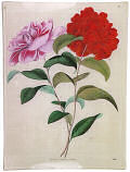
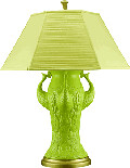
the sideboard will be stained a dark glossy black to match the table and chairs and will hopefully be accessorized with a new lamp, buffet mirror and some small artwork (like the print below) on the table. we'll be using the sideboard to store dishes and other odds and ends because we need the storage space badly. after that i hope to ge a sisal rug for the room (with a black border). we plan to utilize the niche on the dining room wall by either buying a bench or building one into the wall (with padding) to be used as seating for one side of the table. we'll see how this works out..it's our plan for now. any suggestions on great colors of paint? i'm looking for a fabulous robin's egg grey/blue and would love to know if anyone's found one they love...
Labels: interior design
posted by design*sponge @ 11.1.06
![]()


13 Comments:
Not exactly greyed - but I love the Robin's Egg Blue that I painted in my living room. Kamaka Island by Ralph Lauren. It went on like a dream as well.
Bleu Passe by Pratt and Lambert is absolutely delicious, and i covered dark grey walls in one coat (but used two just for kicks) it looks much more blue in my room then on the sample, which is a pretty easy rule of thumb when looking at paint samples. pick something that is a little less colorful than what you think you want.
I just did this in my previous apartment! I loved Martha Stewart's Everyday Blue. It's more blue than green, right amount of gray so that it's not totally desaturated and dull. It went on pretty evenly with just one coat too.
My furniture is also black/espresso and it does indeed look so delicious. The focal point in my old studio was the Expedit bookcase in black-brown from Ikea. Such a great price and everyone who came to visit commented on it and couldn't believe it was Ikea.
I can't wait to see your results! This series of postings are teriffic.
covington & palladian blues by benjamin moore are witching in both hue and appellation.
my daughter's room is done in a color called "blueberry hint." It's one of the colors in our local paint store's line called "shades of white." it was supposed to be white with just a hint of blue(berry). It is much bluer than we expected but it turned out really well.
so, Grace is right on with picking something less colorful.
I painted my living/dining room "Birdbath" by Martha Stewart (Sherwin Williams). It's a great soft blue that has lots of gray in it. I highly recommend Sherwin Williams line of Harmony paint. It has zero VOCs and almost no odor.
I hate to even post a suggestion, because I'm the OPPOSITE of a good designer (and exactly why I read your wonderful blog) but I live in SF and moved into a 70's style house that was previously owned by two gay men (sorry for the stereotyping but they were fantastic decorators) who had a very clean, modern esthetic. Well, they painted every single room of the house -- and hallways -- a putty green color (it's light, kind of a sandy, natural color) and shockingly it matches EVERYTHING. Our son's room has splashes of blue (it matches), our kitchen is white and orange (it matches), our bed linens are red and brown (it matches). And we just put up large pieces of artwork and use pillows and lamps to add color to a room instead of painting. Just an idea... at least until you get settled... and then you can paint to your heart's content.
Beacon Gray (2128-60) by Benjamin Moore is beautiful, a perfect mix of blue and gray.
decor8.blogspot.com
Two ideas: You can tape it off and try painting a harlequin design, overscale, using robin's egg blue against the chocolate background. LUSH. Or, purchase large wall decals. Check my blog for the company I featured, SPROUT. In their accessories section, they sell large wall decals - peel and stick, baby! Would look wonderful in a small space. :)
we just painted our bedroom from a rich chocolate brown (which was nice but just too dark) to a robin's egg blue. we needed to use 2 coats of primer, but it looks so airy and fresh now. andyandangelique.com
One thing you might consider before you totally throw out your beautiful brown paint choice, what about more CHEAP lighting? I know Ikea was hell for you last time you went, but you know they have tons of nice and not going to break the bank simple modern, recede into the walls fixtures that might end up creating the space you were envisioning and dreaming of. You know Candice Olson, that Divine Design lady who's kind of quirky/crazy? She uses a lot of really rich paints, and she's really good at making it not feel like a cave by using lighting well. Look at her stuff online at her web site for inspiration and you might reconsider. It looks like you've already painted some other areas blue and chocolate is a nice contrast to that. Don't give up so easily.
Margo
How about a slightly darker shade than the oatmeal? Perhaps something like a light toast color or that tan/yellow colored dot in your website design. I think something richer like that with the black and white will give a luxe sophisticated feel.
Whenever I realize I've gone too dark with a color, but I still love it, I like to just put it on one wall. I second the vanilla creamer color in the dot on this page's background - maybe for the other walls, with crisp white or bright cream oversized floorboards (those are the things that go against the floor all the way around the room, right?)
One deep rich wall will make it seem so far away from the other walls in the room, and I think it can sometimes have more of a lightening effect in poorly lit rooms than all-light colors, which can come across as sort of dingy when they're alone in that kind of room.
Post a Comment
<< Home