


reader advice...
d*s reader houri has a question for everyone out there...in her own words:
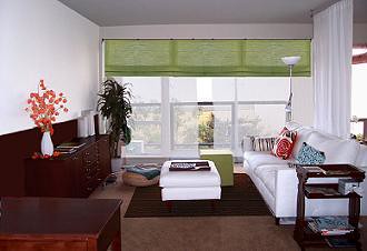
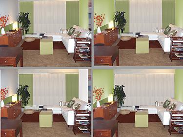
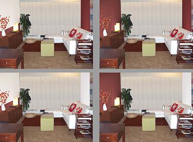
"My fiance and I are in the process of furnishing our first place together-- a one bedroom apartment in San Francisco with a fantastic view of the city. I'm getting pretty obsessive about choosing the color scheme so I took a photo of our living room and photoshopped the colors of the walls, rugs, curtain panels and throw pillows to see what I like best. I have 8 different combinations of either white+brown with maroon or chartreuse. I'd love to see what advice/opinions your readers could give?"
ask and you shall receive, houri. so, feel free to let houri know what your favorite look is (green, white or red? i like the white...) and any design advice you have for her in the comments section. good luck houri! let us know how it turns out :) have a wonderful weekend everyone!
Labels: interior design
posted by design*sponge @ 20.1.06
![]()


40 Comments:
I like the green walls with the white window coverings. The brownish walls seem to lose the furniture a little bit. However, skeezix makes a good point, window coverings are much easier to change. On the whole i have to say that all of the options look ok and the apartment is beautiful. Congratulations!
i too like the before pic. but of course that is my taste. keeping it simple bright and fresh is best when dealing with a small space and one that is such a main focus in ones home. maybe you can place a rotating canvas on the wall opposite the sofa. i have a rotating small art gallery above my kitchen sink. right now i have 12 postcard size works by yoshitomo nara up. good luck!
I like the first picture the best. Is that the "before" picture? It's really clean but with a nice dash of green to make the room wider.
i love the dark wall paint. what is the color?
I love the first picture. The "before" pic :)
It looks happy, fresh, simple. It also looks like something that would be easy to change into another look.
Green, it is cool and soothing and very modern. I really like the first picture. The red would work, but only if you got rid of the green cushion things in front of the sofa (and I don't like the white and red together, but that is do-able).
Love the first pic shown, white walls w/ darker brown behind credenza. Green shades add the perfect amount of color.
I also like the large original picture. It's a clean look to have the walls white, and the window covering green, with the window covering the complete width of the walls. But yes, paint the half-wall behind the console either white or the same shade of green as the window coverings.
I like the first one the best as well, I like to have a fairly neutral cube that I can change with flowers, or lighting, or pillows, etc. I also used to have roman shades that color facing west and the filtered green light was amazing to wake up to- like a jungle or a garden.
This comment has been removed by a blog administrator.
all white, for sure! just like the main photo. crisp + it gives you room to change your accessories as your moods or seasons change. the white really captures the big picture window beutifully. good luck!
for sure the top pic! (is that the before? ) i love it-its clean, looks finished but not too cluttered.
:)
I really like the dark/light green combo.I think it lends a sort of exotic flava,and i'm sure would accent the view perfectly.
But honestly,it all looks spooky hot! ;)
I love the before picture too - and my second favorite is the one that only changes the room a little, the second one on the left with the green curtains and the white wall with the white curtain behind the couch. Though I love the maroon I think it closes in the room. It would be good as an accent color, especially in cold weather.
I like the before pic as well, it looks light and fresh, but I also love the dark red paint, it looks cozy. I'd go with horndog's advice and sit on in for a few days and choose what you keep going back to. Good luck!
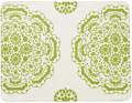
I like the light green/dark green combo (top right). love those colors together
I do not like the new color combinations. They actually distract the eye from the view that you are so proud of. Perhaps adding a pattern to the cloth divider behind the sofa would add some interest and art placed on the opposite wall. I also like you original window treatments because you can really what is beyond the walls.
The 1st photoshopped one. With one green accent wall.
I like the 'before' also, but I think to live in the room, I would like the light green walls with either the white or the darker green window coverings. I think that combination would be best for all times of day and lighting.
To be honest, I like the before picture. It's so clean and the furniture adds the color depth to it. Not a huge fan of the maroonish color at all. If I were to go with color I like one of the suggestions with one wall colored and then perhaps changing the green of the window treatment so something else, like a pattern to add texture.
I vote for the before picture as well. I think alot of people are drawn to that one because the green window covering is a strong focal point against the largely white background. In the photoshopped versions, everything seems to blend to together. Your eye isn't drawn in by one element, it's just wandering all over the place.
-m
You are brilliant! That is such a good idea. Saves on fabric, I'll say! Coincidentally I have been photoshopping all day...I really like the chartreuse ones, the way they set off your plant and red accent pillows. I do like the shade in the before pic. That is quite crisp. My favorites of the photoshopped ones are #2, #4. The dark plumish walls make the place look a bit small.
I really like the white. It's got lovely clean lines and really opens up the room so that your focus instantly goes to the beautiful view.
love the first image best! great balance of white and color, dark and light....
This comment has been removed by a blog administrator.
Voting for the first pic with a twist...keep the white around the window and the green at the top, but the wall to your left needs some color. Have you thought of a metallic, like a silver or a glaze over a chartreuse on the wall to give it a sheen?
And, though it is great to have lush carpet, I would choose a wood floor with a rich tapestry rug with some of your colors in the pattern.
You have impeccable taste though, so whatever you do it will turn out fantastic.
Think you have started something. Thanks for sharing.
Brings out the amateur decorator in all of us.
Definiltey like the first, original photo!
I'm a big fan of white, but the trend this year is so not white! With a white base you can do exactly what you propose in the first picture-- accent (affordably and as often as you like) with color through pillows, area rugs, window treatments, etc. Another neat idea is "outside wallpaper" by UK artist Susan Bradley to introduce something textured and colorful... I think her website is www.susanbradley.co.uk but I'm not sure.
Just back from imm cologne, and the lime green is definitely in this season (like the outdoor wallpaper type stuff), as is the higher pile rug...
http://www.threelayercake.com/content/view/122/27/
or download the trendbook from
www.imm-cologne.com
Best of luck with your exciting new place!
Kristina
First pick with a twist...
Where was my head at? After sleeping on it overnight am posting again to tell you I was wrong to insert my taste with the orinental rug...obviously not a part of the look you are going for...just my favorite rug.
I do think that the wall to the left needs some subtle treatment though instead of being left flat white...it makes everything put in front of it look too stark. Still think that you need some drama on that wall (the glaze option) to head the viewers eye to nature outside, but not a mural or anything that holds you to the wall...is light blue or a soft aqua a possiblilty? Love how those colors set up browns and chartreuse.
Just some thoughts over morning coffee.
Best Wishes for your upcoming wedding.
I like image six - the brown walls, but with solid color curtains; I like brown on brown. The room will look expansive and engaging, especially with all the natural light. Use a satin finish paint rather than flat for just a little more interest and play with light. (Consider a low VOC paint too, which won't overwhelm your plans with paint fumes!)
Then I would replace the curtain room divider with Algues, mentioned here on design*sponge:
http://designsponge.blogspot.com/2004/10/for-love-of-ronan-and-erwan.html
Algues are terrific because of their see-through nature. As for color, I think you could go with white Algues; green would be my second choice.
Whatever you decide, we want to see what you come up with!
I have to say the best one to me is the very bottom right with the red behind the credenza only. great look.
I would go with the before. The white looks so crisp and clean in contrast to the dark wood pieces in the room and the clean lines of the green shade.
your bright white couch, ottoman and curtain don't sit with the rest of the room. you have two competing looks going on. a clean, bright vibe (couch, sheer panel and hits of green) and then a richer, more masculine vibe from the carpet, rug, credenza and side table. choose one look or the other, but they're not working together.
Since comments seem to have gone from helping you select paint to redesigning the entire space (ha ha), I have a few things to add...
LIGHTING
I HIGHLY suggest investing in an amazing arc light. I recently purchased this for a client who had a space like yours and it MADE the room. The light is called the OVERACHIEVER ARC LAMP and is available at storehouse.com for $449.00. I'd put it in the same corner as your current floor lamp and extend it out of your white ottoman.
FURNITURE
If you're not fond of the buffet in the rich dark wood, either sand and refinish, paint, or replace with something from IKEA in birch. Birch would look splendid. Same with the end table. Maybe you can paint it a high gloss chartreuse?
Resources:
www.storehouse.com
www.ikea.com
HAVE FUN!
~holly
www.decor8.blogspot.com
this is the castiglione designed arco by flos? it's a pain in the butt. it may look neat, but it gets in the way ALL the time. for some reason, designers like to put it in other people's homes...but only keep it in theirs when it is a gift, and then it's always knocked out of the way! (ok nobody kill me for that comment)
even if i can't tell the true color of the credenza and rugs (in the first picture they look much darker than the successive pictures) i wouldn't sand that credenza and i definitely wouldn't put anything from ikea in its place, i'd lighten up the floors instead. if there's a way to get the original flooring in a lighter color or get the floor more neutral, maybe with a custom-sized natural fiber floor covering (coconut, or jute, or hemp or whatever).
At the end of the day, it's also rewarding to put things together one piece at a time til you get exactly what you want, so maybe you save up for a really neat sideboard and get that, then tackle the floors, etc.
Thanks again everybody for the comments!
You can see what I posted earlier in response to everyone. My blog name is "ange", above (it's the long one).
I thought i'd mention again that the top pic is not the before pic. It's just our current favorite photoshopped color scheme (only white and brown as dominant schemes). The credenza is right now an orangish wood color, but it's a piece of crap from ikea and we wouldn't mind if it didn't stick out. That's why we're thinking of painting it dark brown like the wall to make it recede. In answer to three layer cake's comment about sanding: it's made of cardboard, anyway! :) Good tips about the flooring from everyone. We much prefer hardwood and the rest of the apt is hardwood, but the carpet was just put in so we're going to leave it.
What's castiglione, 3Lcake?
Achille Castiglione (1918-2002) was one of the most important industrial designers of the 20th century who created the Arco lamp in 1962. It has been in continuous production since then. I have an arco lamp and love it. This is not an arco lamp in the photo and I'm surprised three layer cake would disparage the Arco lamp without even knowing what one looks like.
There was a question mark at the end of my question to which you referred 'Anonymous' and it was a question directed at decor8's comments: "I HIGHLY suggest investing in an amazing arc light. I recently purchased this for a client who had a space like yours and it MADE the room."
Of course, if I could read, I would have seen that Decor8 said OVERACHIEVER ARC LIGHT in the very next sentence, but that's beside the point.
I know exactly what the Flos Arco is, hence my stated opinion about the Flos Arco, not any other lamp.
I'm glad you like your Arco.
Love the first picture. Where did you get the green window shades?
It's the 'before' pic that does it for me too. There is a great balance between the white/green and the wood. I like the injections of colour on the cushions, and in the vase. The only change that I would make would be to liven up the blank wall on the left with some sort of artwork...
Post a Comment
<< Home