


d*s reader recs! [rdd needs our help]

d*s reader "rdd" needs some help and i know you guys will have great suggestions for this piece.
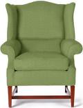
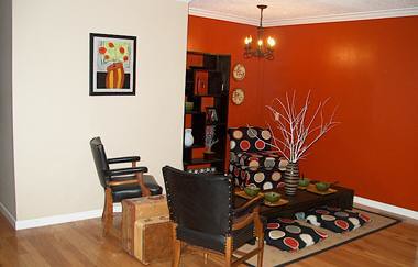
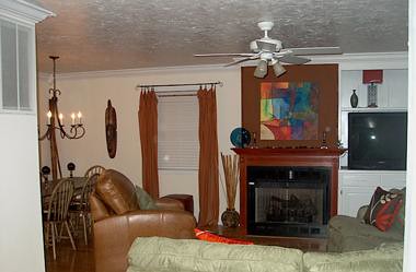
"First- In the picture I have labeled living room, I am looking for a drum pendant, very short, preferably with a cover over the bottom, to replace the white ceiling fan. Second, my home has a very open floor plan. From the entry way to the kitchen nook to the living room, it is all open. In addition, there is a second living room that is open to these three rooms as well. I am on the verge of purging all of the furniture in that room and completely revamping. My dilemma, I want to lose the red in this room. As you can see, my living room, kitchen, and entry all scream of red. I enjoy it, but I want some variety. I am trying to come up with a color scheme for this second room that is complimentary of the others, but is void of red, except for maybe a vase or accessory or two to link them up. I have considered painting the walls gray and going with a white/cream sofa collection, but I have kids and a dog and figure this is not very wise. I then consider going grey with furniture, adding color through pillows, but have no idea what color the walls should be. To sum it up, I am wanting badly to use grays, black, the ocean blue from west elms latest catologue and the stem green, white and cream, with just a pop of red here or there and maybe some yellow or orange, but very minimalistic as far as color goes. Is this doable? I really want the rooms to flow, since they are essentially one. Any advice will be appreciated."so, any advice for rdd? pass it along right below this post- and don't forget you can send in questions to d*s readers about your own home- we'll have two a week on mondays and fridays. thanks! [click here to see rdd's entryway]
posted by design*sponge @ 10.3.06
![]()


10 Comments:
For the drum pendant I would suggest Alluminare - not only do they have a myriad of existing materials, but they even do custom fabrics now. I'm not sure if they do bottom covers, but I know they do diffusers, so I imagine that would take care of any glare worries.
If your room weren't neighboring a very large red surface, I'd recommend using lots of the ocean blue, but with the existing scheme I'd limit it to a few accents.
If you're looking to avoid having too much color in the room, perhaps a stripe or a few asymmetrical stripes of the stem green along the white walls would work?
www.alluminaire.com for wonderful pendants in many textured papers, including wood!
Go to www.dulux.co.uk and you will see a My Projects section on the home page. You can try different colour combinations on an actual room. If you go to my blog designersblock.blogspot.com you may find some inspiration also. Good Luck
Ange, I agree with you, which is why my decision making has been so difficult.
Anonymous, thanks for the Alluminaire tip.
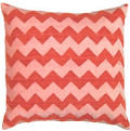
Mel, the color in the polka dot is gray. After having read all of your comments I think I am going to base my color pallette on the water color striped pillow "espresso" from west elm, paint my walls cream, do chocolate or black floor to ceiling curtains, and go with gray furniture and possibly one butter yellow chair, having yellow be the only bright color accent in the room. We'll see. I'm still mulling it over.
Thanks to you all for your suggestions.
Sincerely,
RDD
my advice - don't decide on colors first, decide on things. a swatch or pantone strip may have a great color, but good luck finding just about anythign in your "favorite colors." Find a purchasable item you love as inspiration - that west elm pillow is a good one. Rugs are also great. I'm minimal too and limit patterns, so maybe start with your patterned item (pillow or rug, etc) and grab a color from it for the walls, another color for the sofa. pick a style of casegoods... things will come together. don't "pre-stress" -- just make a few purchases (read: committments) and you'll start cruising.
Drum pendants - why design/customize your own. It's easy - Moon Shine Shades on the web has some awesome retro chic designs you can customize, and you can get diffusers for the bottom. I had them make some shades for me and I highly recommend them. Only downside is it can take 6 weeks, but in my case I thought it was worth the wait.
Di, thanks for the wonderful advice. I checked out your blog. Love it.
11:18 - very wise advice. You verbalized exactly what I have been thinking over the last couple of days. I think I am going to buy that pillow and work from there.
12:06 - I will check out Moon Shite Shades. I'm in no hurry, I've lived with the white fan for two years, so the wait is not a problem.
Thank you all so much for your comments. My husband is silent on these issues and it is always good to hear other ideas...broaden one's horizons.
Thanks again.
Sincerely,
RDD
The one suggestion I have is to either add another painting directly below the one you have above the black chair or move the painting lower. Generally, paintings should be hung at eye-level for someone who is 5'6". However, in this case, teh picture is too discounnected from everything else in the room, so I'd have it directly above where teh chair is...or perhaps a little to the front of it...
It's a welcoming space!
Laurie
Thanks for the tip Laurie. I previously had a much larger picture in this space, of which I painted over and placed in my entry. I replaced it with this smaller canvas. I needed to move the nail, but two problems. It was stuck in the wall stud, and I have no paint to match to cover up the spot when I move it. So I'm waiting for either paint or a new picture.
Ya know, I was just looking at the picture again (sorry for all my bad spelling/typing above). And I think it would actually work best to paint the wall with the painting the same color at the darker walls. Reason? I think the dark walls really define the space and say, "This is the living room." However, with the one lighter wall, it makes it appear that the chairs are in another room. Perhaps that would also make the picture look like it is more a part of the scheme. ;)
Laurie - http://ranchredo.blogsome.com
Post a Comment
<< Home