


d*s reader recs [houri needs our help]
d*s reader houri needs our help again. she is trying to decide what color to paint her dining room and i'm sure you guys will have some thoughts on this one. here are the details from houri:
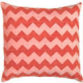
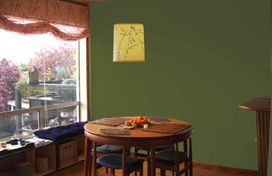
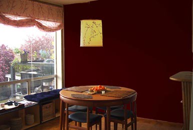
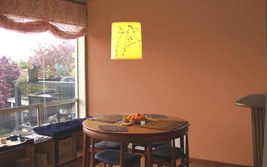
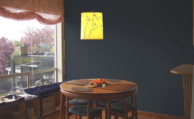
"Okay, so we need some help painting our dining room. That, and some art and wall sconces or track lighting for the art is all that is left and the dining room will be finished! Can you help us choose between the following 4 colors? The rest of the apartment is very clean and modern, so I really want this space to feel warm, peaceful and a little bit romantic. Please keep in mind though that the room is already pretty feminine with light pink cherry blossom shades. I don't want to drown out the design of the vintage dutch dining table, either. What should we do?"so, what do you guys think of the colors above and below? which is your favorite (fyi, the top is not a before picture, but a color option from which to choose). leave your two cents below, and remember to leave helpful tips if you have them, but no mean stuff. thanks. [psst: i'd love to see a rich, warm gray in here]
Labels: interior design
posted by design*sponge @ 3.4.06
![]()


19 Comments:
Houri,
Choices too dark! Go for a periwinkle blue in a darker shade. It would be VERY restful and an unexpected jolt. Bright but dark enough to suit your tastes.
Of all of those, I like the green the best, but I'm not crazy about any of them. I have to second d*s; I'd like to see how a gray would look. You need something to tie together the black seats and the pink window treatments.
i agree...i think the options are a bit too dark..(of them thought, the navy is my pick for the best) you can go warm without going that dark. i agree with grace on the warm gray option. that would allow you to being in color in other places too without worrying if it;s going to clash with the wall color.
those all look too dark to me...i'd go with something like copper--something almost reflective that would give some texture to the wall.
is that a table where the chairs fit into/under it? i've never seen anything like it! please describe more/more pictures of your table?
What color are the seat covers of the dining chairs and that window seat? They look navy to me. If so, then going with blue on the walls seems ok, but might 'match' too much. I agree that these colors all seem too dark. It is daylight in the photo you've chosen, but at nightime, both the dark brown and dark blue would be tooo dark! I have that problem with the apartment I moved into, and I want to repaint the dark blue kitchen a light grass green.
I vote for the green, although I'd pick a lighter shade if I were you. I think it goes well with the wood and the cherry blossom curtains and lamp.
Take a look at the Sico greens:
http://www.sico.ca/En/Tendances/Vert_Collection.asp
I think 'lemon thyme' would be a nice green that is lighter than what you've got, or the 'grilled artichoke' which is closer to the brown you picked.
hi houri, out of the choices you have i like the green one the best. the green color opens up the room a little more and at the same time makes the room more inviting. it would be nice to see the wall in a bluish color of your choice. it's really up to you in the end. my advice is to go with how the color makes you feel when you're in the room. i hope it helps.
houri
just to clarify. my own personal idea of warm gray is like a benjamin moore "winterwood" color. i just painted my dining room that color and am loving it. it's grey and neutral, but still warm.
xo
d*s
bok choy / riesling /spring melon or some other room-brightening green. stay away from tones that look too much like toothpaste, though.
i vote for a mossy green (much like the top photo). i've painted every bedroom i've had for the last few years green--i find it really calming but bright enough to cheer you up and it manages to go with just about anything you choose to put in a room. it goes well the the nature-y feel you get from the cherry blossoms on the curtains (without being all LOG CABIN!) the last option gives me a weird sort of country-ish feel. not a fan.
I think the green is the best choice, it makes the things in the room stand out by contrast. Another consideration is that it makes your view out the window POP! I think something around a Pantone 575 would be fantastic.
I had my dining room painted the top color of green. I like the color but it only felt good on sunny days. If you're going to go dark, I suggest something happy like Ben.Moore's orange "Fruity Cocktail" (#147), or "Mango Punch" (#154).
I loved the last option (the light blue) - but really, I'm posting to ask, how did you do those photos? Are you just a photoshop guru or do you have some fancy software? I'm dying to know and try it out! I can never picture a color in my rooms, and often need the visual to help me.
I think if you want the gray, I'd suggest changing the window treatments and lamp to something white. I just painted a room sheffield grey (pittsburg paints) and it is quite similar to the option you have listed at the bottom. It didn't look quite right until we put up white gauzy curtains and more white accents. Now everyone always comments on how it's their favorite color.
GREEEN!! I think the green is far and away the best choice. I thing it brings out both the modern and earthy feeling of the place
I like the blue best. The green is my least favorite. I think you could go lighter on the blue, but not too much lighter.
Invest in a huge, modern art painting (no frames)and leave the wall white. I crave white walls because I live in the Midwest where most walls are painted in the greens and blues.
Hey everyone, so I got lots of questions, and I'm going to try to answer them. My usual blogger name is Ange, and I've posted a comment above with a link to a grey wall pic.
Okay, so about the table:
yes, the chairs tuck into the table itself like a puzzle. When they're all in, you can run your hand around it smoothly. We love it! We bought it as an original vintage piece from a restored vintage furniture store in San Francisco. All we know about the design is that it's Danish and from the 1950's. And the best part? There is a hidden leaf inside the table itself that makes the table 50% larger for a party of 6!
For those who inquired about the table, check back. I'm going to do a little more research and try to get more information.
As for how i did the images, Yes, I used Photoshop. I admit, I am pretty good with the photoshop but what I did was pretty easy. For those who have the program, here are the steps:
1. take a photo. try to leave as much wall as clear as possible. remove any vases or other accents in the way of the wall that will be difficult to trace and "select" out.
2. select out the wall from the photo. This can be done using a variety of tools:
the magic wand tool you can just click on the wall and if you're lucky it will select the entire wall for you. It picks out areas that are all the same color. You may have to repeat this step if the magic wand tool only gets part of the wall.
the magnetic lasso tool will help you trace around the area you want. it's easier than freehand lasso tool (in the same tool box though-- you have to switch which kind of lasso you're using) because the magnet tool likes to stick to areas where the color changes drastically.
3. once you have the wall selected you hit ctrl C to copy this piece only of the picture.
4. Then hit Crtl V. This pastes a NEW layer of the wall on top of the entire picture.
5. go to the window option on top and select "layers". This will open a small tool window box which shows you each of the layers in the image. You should have 2 showing: 1. the background. 2. the top layer of the wall (you can test this because when u are working in the top layer you can move around or do other things to just that piece. switch from working in one layer to the other in the layer window.)
6. While in the top layer, hit Ctrl U. This brings up the hue/saturation box. Hit "colorize" and play with the saturation and hue and you can change the color of the wall to whatever you like right before your eyes!
7. When you've got the color you want. Hit Ctrl E to merge the layers together and save it as a jpg. If you have more than 1 layer it CANNOT save as a jpg. Also, if you used magic wand tool to select the wall and you had to do it in pieces, just look in the layer window and merge the layers that contain the pieces of the wall. Ctrl E merges a layer down onto the one under it.
Hopefully that helps. Thanks for all your opinions, guys. We were rooting for the terracotta peach color, and now we're seriously considering green. Sorry for the fans of grey/blue, but we decided that San Francisco is too foggy and overcast some days to continue any overcast sky color into our home.
thanks again! we REALLY appreciate it!
Post a Comment
<< Home