


color help!

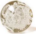
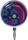
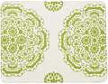
ok guys, believe it or not i still haven't chosen paint colors for our home. it's been so tough. i'm finally growing out of my obsession with cool colors and grey everything and am trying to get a nice clean, mid-century simple look in the house. warm woods, warm colors. but i'm drawing a blank for color ideas. i'm trying to do something california clean but with a nice warm, mid century edge. any suggestions? i'm working with benjamin moore colors (bc they're downstairs in my paint store) so if you have any suggestions for colors that fit in that scheme, i'm all ears. i keep trying to look for the perfect green-yellow but can't find it. eep, help! xo, d*s! [i'm loving the color combos in this photo by ny times photographer thor swift. that green is so gorgeous]
Labels: miscellaneous
posted by design*sponge @ 5.5.06
![]()


24 Comments:
if you can get a decent printout of the photo, take it to the paint shop andhave them put it on their magical color matching computer.
I read something the other day about using warm colors in rooms with North-facing windows and cooler colors in rooms with South-facing windows.
What caused you to lose interest in cool colors and grey? Just curious.
What types of wood will you be using? I love, love, love Mahogany wood with yellow-greens and other citrusy hues.
Okay, I'm going to my Benny Moore chips now and I'll be back!
go with food colors. Italian sauce red, seared scallops white, black cherry ice cream purple would go great for a bathroom.
I think you're missing a nice dove gray.
This month's Saveur magazine has an article on Deborah Madison's kitchen, which features green and yellow boldly and beautifully.
try B. Moore Historical or Classic colors -
HC-11 Marblehead Gold, HC-12 Concord Ivory
(both on the gold side & very rich)
another great color is B.M. (classic) 515 Baby Turtle.
-a cool green but is very cali/mid-century with a lot of
depth to it . . .
I should know . . . It's the color of my L.A. Living Rm.
Good Luck!
we painted our family room bm's beacon hill damask. it's a bit lighter than the plate in the picture, but to me a perfect green-yellow color. we have a mid-century look going, too. dark brown barcelona furniture and redish oak wood and it all looks great together. good luck! patricia
Hi there,
I would suggest looking at back issues of Atomic Ranch Magazine http://www.atomic-ranch.com/. They always have inspiring real life (ie lived in not glossified) photo stories.
Also, I recently found this "Suburban Modern" Sherwin Williams color palette on their website. May not be what you like, but could provide some ideas? http://www3.sherwin.com/do_it_yourself/paint_colors/paint_color_palette/color_themes/suburban/pdfs/Suburban_int.pdf
I painted my living room Benjamin Moore's Dill Pickle color. It's fantastic. It's a good yellow green that's very bold but really not overwhelming. It's a lot warmer than I expected and has drawn a lot of compliments. I even had a neighbor ask me about it as he saw it through the window, which was creepy but nonetheless...
hey grace,
the closest colors to the mustard-y color in the photo from Benjamin Moore are:
sulfer yellow (2151-40), golden tan (2152-40), spring dust (2150-40), and timothy straw (2149-40) depending on how green/yellow you want. I love that color too..but sometimes when there's more green in it and it's flat and not textured like that plate, it tends to have that muddy, puce look...what about going more towards the deep yellows/golds (flat not metallic) like...
dorset gold (HC-8), stuart gold (HC-10), marblehead gold (HC-11)..also semolina (2155-40) is more orange-y but warm and light. An avocado green is also very mid-century modern like, pale avocado (2146-40).
Good Luck!
-Joy
Green- Yellow?
Am I the only one that thinks, ick?
What if you painted one of the walls a warm kind of honey brown color, using the pastries or whatever they are for inspiration, but maybe a little lighter, and use a warm white for the rest? I think the two would compliment each other and add that mid century feel without making it feel dated. If you use too much color, it won't feel clean. That honey color reminds me of a honey colored maple, which is a key color in mid-century modern design it seems.
Yes, Thalia. Green Yellow is delish!
Cristi
I'm with you, Thalia. The fascination with these muddy colors is beyone me.
I think colors like the green in the picture, although somewhat muddy could be really great for an accent wall. Then maybe a lighter version for the rest of the walls. Also, with dark woods in the furniture I think a lighter color on the wall could be great for contrast. There's my two cents.
looks like the photo is from a japanese restaurant? i know they often use that sawgrass color with natural woods in traditional japanese homes. maybe it's worth exploring that world for more research. in any case, i love this color combo!
hi grace,
one trick i've learned since moving into our old 1930s home and having painted *every single room* in the house (yes! and enjoying it!) is that when you are choosing your color from those little swatches they will try to trick you!
even from my artists eye i thought i was always picking up the right hue, but the magic is in going a few shades lighter than the one you *think* is exact, especially from a photo that has different shades (like in the shadows from that plate)
that green is beautiful! and picking the right one is tough, but sometimes you just need to live in a place for a little while to get the feel. good luck!
pop that photo into Photoshop... convert to INDEXED color, then export the COLOR TABLE. it will give you can have it give you the 8, 16, 256, (etc) number of prevailing colors in the photo.
Check out Amy Ruppel's blog (May 4th). Her living room was just re-painted by a friend in a "While You Were Out" sort of event and the color seems to be very similar to the plate in the photo you posted. You could at least find out what that color is/brand/etc. and paint stores will usually match other brand's colors without too much fuss.
Good luck!
While I would like to make suggestions for BM colors I will stop myself so as not to abondon myself to anyone who asks for help and insted offer this. Paint is one of the easiest things to change if you don't like the color you choose/chose and people often get anxious about color exclaiming they are affraid of choosing the wrong ones. Color has an emotional impact like all things and that is why you see so much beige in interior design because it is neutral/safe. Color is meant to be fun and if using it at this particular time is not then wait, because every little thing's gonna be all white,
Nicholas.
We just got some lovely danish modern furniture from Baxter & Liebchen in Brooklyn http://www.baxterliebchen.com
and it means that my mister is finally ready to use a little color. We've been looking for something that would go with our new rosewood dining table, chairs, and wall unit, but also harmonize with our kitchen cabinets that are visible from the room, in that typical "honey oak" color, and the flooring, also more of a golden color. We were looking at the following Ben Moore:
Classic: Corn Husk #307
Color Preview: Oriole 2169-30, Ocean Spray 2047-60, Shore House 2047-50
Another thing we've done is get a veneer sample book (I work at an architectural firm, but I'm sure you could find a source) and take the chips that match our woods so that we have more flexibility in looking at it all - for example, if you want to look at your wood in a friends apartment, where they've painted, and check out what you think of the color...
Another thing about paint (and how relatively easy it is to change) is to talk to your paint store in advance and see if they can do a tinted glaze for you. If you end up with a color that's just almost there, but needs just a hair more yellow/blue/tone down with gray, you just apply the clear tint over it. I did that a lot when painting sets, and not only is it very adjustable, it gives an added depth to the color without being an "artistic" finish.
I used BM Pear Green on some living room walls of my upstate cabin and it looks great next to the wood paneling on the other walls.
Our apartment doesn't get tons of light so I had to go for much lighter shades of paints. I bought small cans of the colors I liked and did test swatches on the wall before I invested more $$$. I ended up using the following Benjamin Moore colors:
Ceiling and Trim: Decorator's White
Bedroom: Titanium - a soothing grey
Kitchen: Fernwood Green - looks great with our teak dining set and Nelson lamp.
Bathroom: Whispering Spring - a very light aqua color which looks good with our white subway tiles.
Living room: Grand Teton White - light off-white which provides warmth and contrast from the stark white trim without being too blah beige.
Good Luck!
watch far from heaven for some fantastic color schemes or flip through Anna Starmer's Colour Scheme Bible for the right colors to offset your yellow-green.
Post a Comment
<< Home