


d*s apt project
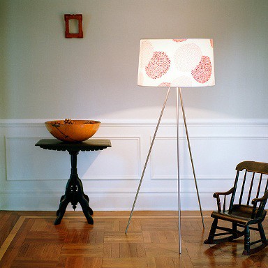
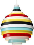
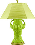
i'm going out on a limb today and i'm going to try to reproduce this look in my living room. our living room doesn't get much light is pretty narrow, so i need something that's going to let the room breathe and feel open and light. i saw this photo for the weegee light and thought, i like the idea of an oatmeal colored wall accented by lots of red, orange and maybe even some greens and pinks. oatmeal is such a great background for bold colors. and i'm thinking our artwork and accessories will be the color in the room. i may even get this light. i love the shade. so i'll have update photos soon...i'm off to the paint store. xo, d*s
Labels: interior design
posted by design*sponge @ 5.7.06
![]()


21 Comments:
looks totally fab to me. i like this lamp so much better than the other tripod ones i have seen lately. great shade.
Good luck on your project!
After trying many (I'm not kidding when I say SIX!) bold paint colors in the living room, I finally came to the conclusion that I like a more neutral paint color (at least in my living room). My furnishings are mostly neutral too, but then I bring in color through framed color photography, a canvas triptych, plants and some colored art glass. I think it's a relaxing combination.
great lamp. my living room has white walls, generic rental white, and i have lots of orange, greens and blues in the room, so i'm trying for a similar effect. i know yours will look fabulous. can't wait to see the results.
Although I love the lamp and the overall colour scheme, since the room is narrow maybe a tripod lamp will use up a lot of space. I think th colour scheme is a great idea for the type of room, but maybe try to find a more space efficient lamp. Sorry to be a downer!
What is the name of the paint color you will be using? Do you think this would work with blue accents as well?
no paint color yet, going to check them out now. i think a great china blue would look awesome with a nice creamy linen color.
d*s
i love the red-orange against the creamy wall color. make sure not to add in a rocking chair (not cat friendly!) let us know what shade you choose. a couple of my favorites are Elmira White and Litchfield Gray both from the Benjamin Moore Historical Colors.
Oatmeal/cream walls with red and orange accents sounds wonderful. My apartment (rented) has white walls, and I have a large red painting over the sofa. I've always wondered whether white is too stark, and cream might look softer and more appealing.
I agree about the lamp-it might take up a lot of space. It's such a lovely lamp so I hope it fits in your home!
Looking through your Flickr group for the apartment, I realized you have never updated us on what you've done to the other rooms (like the bedroom wall color you asked advice on). Please show some in-progress pictures even if you are not finally satisfied with them. Thanks.
lsaspacey
well, when i have em, i'll share em. i doubt you'd want to share your house half done either ;)
d*s
anyone have a headsup on a similar lamp in black instead of chrome/nickel?
hmm...here are some choices. a little pricey though:
http://ylighting.com/glb-blx-jackief.html
http://ylighting.com/amc-sc-tripod.html
d*s
i picked up the meridian mum table top lamp last year when target carried it in their red hot shop. the lampshade is very pretty and it also looked very nice against our previous apartment's neutral beige walls (now we have rental white . . . sigh).
good luck with your living room project!
What kind of red? Cranberry, tomato? Brick?
cranberry and magenta, i think...
d*s
d*s, I totally understand you wanting to wait on showing your pictures. I look forward to it.
Funny you said that last part, because I am showing my apartment before it is done (clutter and all), on my blog.
love the light, do you know if the shade is available for a pendant light? would look great...
Hi from beautiful Vancouver, Canada - I also love the combo of red with neutrals. Here's my suggestion for the wall colour - Benjamin Moore Natural Linen.
We have it in our home; it's a wonderful colour - not too pink, not too beige, and it looks great with our art. The rooms change with the light and the seasons -a very liveable colour that I love even after almost 2 years.
I enjoy your blog.
CanadianCP
thanks! and yes the light is available as a pendant, right here:
http://www.2modern.com/index.asp?PageAction=VIEWPROD&ProdID=1124
d*s :)
dear grace,
i have that exact lampshade. and i dream of one day owning a grace chair, and our names are both grace. it kind of creeps me out sometimes.
lol. well, i'll try not to creep you out too much ;)
d*s
Post a Comment
<< Home