5.5 designers
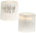
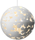
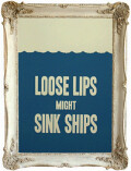
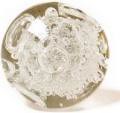
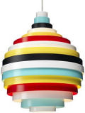
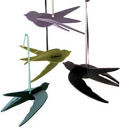
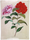
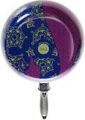
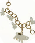
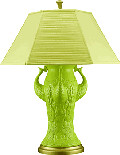
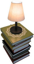
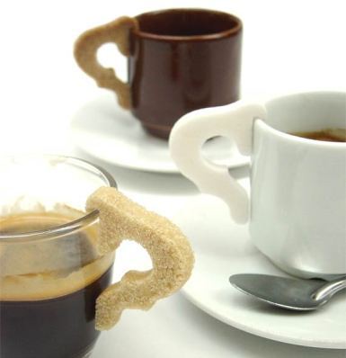
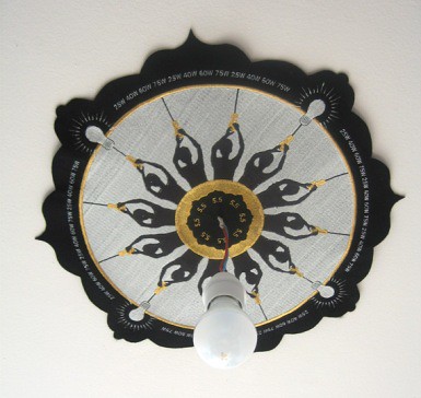
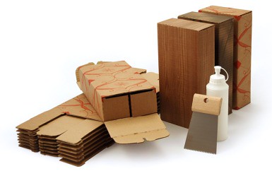
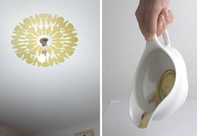
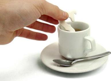
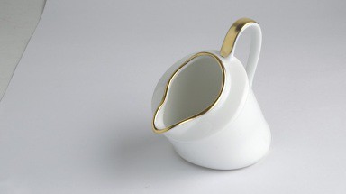
parisian d*s reader ana (who always sends the most amazing links) sent me a tip about 5.5 designers. based in paris, 5.5 designers is a large group of designers and makers who have created some amazingly beautiful products. you'll need to contact 5.5 directly to ask about purchase, but these were too pretty not to post. just consider them some wednesday morning eye candy. click here to view their full collection. the sugar cups are phenomenal (you dip the extra handle) as well as the ceiling stickers, rug creators and build-a-block modules). [thanks, ana!]
[i'm buried in outside work today so i'm going to log off until tomorrow. i'll be back tomorrow with a fresh podcast, fresh design and an update on the biz lady meet ups]
Labels: accessories



























10 Comments:
those sugar cube handles are amazing!
What an amazing site! Thanks Grace!
Some interesting products....although I accidentally ended up on the french version of the website, so had a bit of trouble navigating around. Then when I got to the english version, I realized that was just the design of the site.
By the way, furniture designer Rick Lee did a fabulous goldfish vase a few years ago that was in the Launchpad show in SF 2001
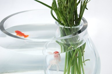
I love the fishbowl.
It's all so luscious! Can' figure out if I love the sugar handle or the fish bowl more.
Thank you for always showing such beautiful products, designs + great guest bloggers!
sorry to be a design curmudgeon, but a lot of 5.5's offerings are simply making a statement about design, especially in the sugar handle that everyone seems to love - that was made to change the image of the tea cup, which, in its prefect functionality, we take for granted. in the sugar handle's delightful non-functionality, it casts the tea cup in a new light.
i know d*s is a great resource for pretty-looking products, but sometimes i wish it would educate its readers a bit more on the concepts behind these objects and actually make statements about design, not just provide "eye candy" and things that look "really really amazing," which simply leads people to wanting more stuff they really don't need.
alice
d*s was never designed to be a forum for serious design analyzation. readers are welcome to start a discussion of this sort in the comment section but i choose to leave statements and deeper discussion to them. by putting something on the site i hope to merely bring people's attention to an object or designer and let them make their own decisions. however, if you're looking for some great analytical sites i would check out something like designboom.com, mocoloco.com and perhaps reluct.com.
d*s
Someone sounds a little highfalutin, Alice. I think we are all smart enough to make observations like this. I like that D*S doesn't make grand declarations about the meaning or purpose of something. Sometimes a sugar handle is just a sugar handle. And if it's not, well, I'm sure we can all figure out that people want to reimagine objects...we're not all a bunch of slack-jawed gawkers here. Why do people always try to make design so serious? I think most of us are enjoying the fact that we can check out new things for inspiration or just for fun. Count me as one of the people (and I don't think I'm the only one) who's never bought a single thing from this site but comes to look and be inspired. I personally read other sites for deeper discussion and I second the DesignBoom link- they're great for bigger picture ideas. I don't think every site has to be everything to everyone.
Chris
i know i was being a party pooper; i guess my eyes just glazed over at 3 in the morning. i read a myriad of design sites from many different viewpoints and appreciate them all. i didn't mean to undermine the purpose of your site, grace - i think your postings are very fun. for this particular one i just had to say something. i have studied 5.5's work previously and was just put-off that everyone seemed like they wanted a pack of those sugar handles in their christmas stockings when the intention was deeper. so, i disagree with chris - in the design world, sometimes a sugar handle isn't just a sugar handle, but this particular posting on d*s made it seem that way.
that's what i was responding to. i'm not looking for "grand declarations" about design here, just some responsibility and truth to the original intention of the design concept that goes beyond beautiful product photography. as a designer myself, i come to this site for inspiration. but if a design i am familiar with was featured in an inaccurate light, i'll speak up. i think it's valid to bring up these questions even on a non-serious site, even if it's about those silly sugar handles.
anyhow, i appreciate the room for discussion, so thank you.
alice
alice
your thoughts and discussion are always welcome here :)
i do disagree that i showed the handles in an inaccurate light. i think there are many different interpretations for an object and i don't think highlighting the "fun" behind the idea is somehow inaccurate.
d*s
Post a Comment
<< Home