


in the magazines....
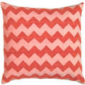
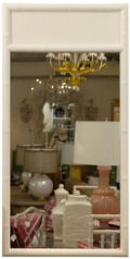
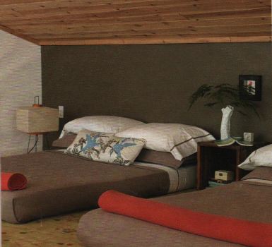 for a while i wasn't really reading design magazines like i used to. when i was in high school and college i devoured design magazines like food, but somewhere between then and now i lost my appetite. but a few weeks ago i started hoarding them again, tearing out pages and storing them in my little folders for inspiration. i find elle decoration and living etc. to be my favorites these days- their real life room shots always give me new color combinations to think about and inspire me to be bolder with my paint choices. i'm trying to recreate the color combo above in our tiny dining room (a mossy grey/brown with reddish orange cushions) and i'm trying to figure out how to get my hands on some knubby chartreuse fabric to do something similar to the shot below. [photos above and below from the jan issue of elle decoration and feb issue of living, etc.]
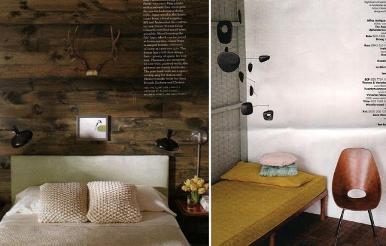

Labels: interior design
posted by design*sponge @ 15.1.07
![]()


12 Comments:
those two are my favorites too..they really have the best rooms and color inspiration!
For a mossy grey-brown color, take a look at Martha Stewart's "Cashmere." Really rich color. If that's too dark for your space, we found Behr's "Potter's Clay" to be too olive in our den, but BM's "Valley Forge Tan" with reddish-orange accents was spot on. That's a little more greige-y though.
i wish i had a martha stewart paint store closer to me. it has to be in walking distance for me to carry it all back so i'm always stuck with the benjamin moore shop downstairs. but i went with "waynesboro taupe" which i love. it's a lot richer and warmer than it looks online. i'll post pics as soon as the table is put together and the room is a bit better...
d*s
I too hoard design mags...especially elle decoration and living, etc. I have them laying all around my studio for color combonation inspiration. I am loving the wood and yellow right now!!
I used waynesboro taupe in my bathroom, and it gave the bathroom an intimate cozy feeling. It's a rich color without being too bold. Love it - considering using it as an accent wall color in my living room.
Those two are my favorites as well. I love the styling and the photography. Lots of inspiration!
If you like these two magazines I suggest Marie Clair Maison. Obviously only in French but my favorite of them all. Available in certain bookstores but you can also get a subscription through Amazon.com. Worth it.
Living Etc and Elle Decoration are my fave mags as well- another brilliant read with amazing photos, rooms and style is Vogue Living from Australia.
Living Etc. is the only magazine I'll buy sight unseen. Used to be that way with Domino, but they've changed and are a little too foofy for me lately.
Would you please post a pic of your dining room when you're done? I like that color combo too, and would love to see what you do with it.
i love these two magazines for their well balance between over-the-top furniture and affortable products. nothing is un-reachable or unpractical. there is a great connection between the feature projects/products/decor and their readers.
which magazine are the two bottom spreads from?
the english elle decoration or american? i must say that i love the english one but even after a year's subscription just can't get into the american elle decor.
i'll check out living, etc. though - always on the hunt for cool home design mags!
Post a Comment
<< Home