sneak peek...our house
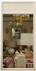
 yesterday was spent on some new projects and all sorts of work around the house. i thought i'd share some shots of our living room as we start to get things going. there's a gap in the artwork above our couch as i wait for some new pieces to arrive and we're still looking for a rug (and some fabric for the window). so i thought i'd open it up to you guys. we have a grey chair and a green and white couch (with touches of yellow and pink on the wall). what sort of fabric should i get for the window? we have one window that i'd like to make a roman shade for but i'm torn on the fabric. i wanted a neutral linen or neutral almost burlap-type fabric but i'm open to ideas. anyway, that's the dining room in the back but it's just barely coming together (need to get chairs, mirror for the main wall) but i thought i'd share for the heck of it...
[my internet is out today so i'll be back as soon as it starts cooperating]


Labels: interior design, sneak peek












































55 Comments:
pls remind me where you got the cool bird prints. I recall you mentioned them awhile back... they look great. Thanks
grace your place is gorgeous! can't wait to see more of it. i like the idea of a neutral linen/burlap like roman shade. go for it!
This comment has been removed by the author.
Your cats look SO happy!
Could you share what your art pieces are? I recognize the deer painting as Jen Garrido but would love to know what the poster is (Sunshine cinema), the yellow/pink print over the couch and the cute black/white, red/white bird prints.
Thanks for sharing your home!
the bird prints are by wayne payte (http://goodshapedesign.com/) you can email him for the bird print, i don't see it online yet. i think it was like $30?
the sunshine poster is a limited edition that ran during their re-opening and was designed by adrian tomine. it's ac's and i had it framed. i love the dark orange.
the top poster is by nick butcher (http://www.programmablepress.com/) and the tiny green print is by amanda kavanagh. (http://shop.amandakavanagh.com/)
it's def. a work in progress and i'll update as we have more. oh, the and black and white print in the dining room is a nama rococo wallpaper panel.
grace :)
i love how you have mixed so many colors. it looks like a really cheery and comfortable place to live.
-arin
And I thought the gap above the couch was just an interesting way to arrange artwork! :)
what white did you use? I love it. I keep painting what I think is white and ending up with yellow!
thanks guys- the white is benjamin moore's "seapearl".
the color is a little much for me right now so i need a rug and curtains to ground it all so it's not so pop-py and techno-y. i think ac might go blind from all the yellow and pink. a nice neutral will bring it all together....hopefully.
;)
d*s
Grace,
The pics aren't showing up on my computer and I'm dying to see them. Is there something I might need to update?
What a surprise to see that poster. My husband's office designed sunshine theater and I would have loved to have gotten one of those posters for our house. It looks fantastic in yours though!!
anon
if it doesn't work after a refresh just let me know. they're showing for me so maybe it's a cache thing?
d*s
show us the windows? it might spark some ideas.
Ooo, I love the art!
Here's a question...is that lamp attached to the wall or does it have a floor stand?
We have a couch that sits flat on the floor and is in a very dark corner. We have no idea how to get a hanging light to hang over it without a floor stand...but your lamp would work perfectly!
vanessa
the light is a nelson pear wall sconce. it attaches to the wall and has a cord that hangs down. it's perfect for awkward corners or dead space behind a couch. we love ours so far.
http://www.modernica.net/browseProducts.asp?CatId=1012
d*s
oh, it's beautiful, grace. i wish i could see it in person!
Thanks so much! It almost looks like a different lamp in your room. So pretty!
Your place looks like it's coming along beautifully...For the window cover, I'd go sheer and billowy white or a sheer soft leaf pattern (with inner pull down shade for privacy). I love the splashes of yellow color and the artwork. Beautiful cat too...
beautiful! i can't tell from the photo, but did you do the craftivity project on your dining room light? it certainly doesn't look like naked bulbs. i'd love to see a close up!
I would almost go with a very plain sheer white curtain, or think about a white curtain with accents of a color you already have. (the green of the couch perhaps?) Even if you use a neutral color, you're still introducing a new color.
your place is lovely! can't wait to see more. =)
whoops, i meant daniel clowes, not adrian tomine.
d*s
i think a cute little white and red print would go well on the window to tie in the reds in your art and the chair in the background...but nothing overpowering. it looks great!
You have done a nice job-great mix of mod and classic!
cheers
CM
grace, looks so lovely! can't wait to see more..
your place looks so great! i love it all... especially your framed artwork.
i prefer wood shades to fabric ones (surprisingly since i love fabric). i like wood blinds or bamboo rolling shades. the fabric roman shades that we have never look good, they're either wrinkled or hanging uneven...
i like browsing smith + noble for shade options.
It's everything I imagined it to be! Absolutely beautiful. The sofa still makes me swoon.
Those bird prints are amazing!
You have a gorgeous home! No wonder your cats look so happy... Have you tried reprodepot.com for fabric for curtains? They have some very nice neutrals.
Where did you get the frames for the bird prints? Thanks!
beautiful and cheery grace. love it! ;)
Fab-u-lous!!
What a fine abode you have...
your space radiates a welcoming sense of warmth and joy.
Thanks for all the resources... impeccable taste!
great job! your place looks great. I love the orange birds print. I would love to have one in green.
I agree with your choice of neutral roman shades. I think this will fit with the room's style.
I love your chair (charcoal colored?) The cat seems to really like it too :-)
thanks guys. our internet JUST came back so i'm finally back online.
the frames were all done at sky frame and art on west 28th street in nyc between 6th and 7th. it's a fantastic resource for affordable framing. i had everything done in plain white wooden frames.
people emailed me about the rest of the room so here are some more answers:
pillow: "procession" by judy ross
couch: hable construction in "bead", colorway "green bean"
chair: "grace" by room and board
couch: "andrew" by room and board
chair: eames eiffel base (found in the house when we moved in) with new dark orange top from sparkability.net
chandelier: gift from pottery barn, painted a matte white (crystals and all)
painting: jen garrido (custom)
light: nelson bubble sconce (pear style)
d*s :)
Hey grace...
You have a beautiful place! Love it!
Your house is definitely more retro cool than mine. That red chair is awesome! Notice I only show very small parts of my home..cause as a whole it needs some work. I'm inspired to get some art on my walls stat..love your taste.
raya
paper pony
Totally Fab- I love your color sensibility.
Trish :)
mah-velous, darling ;)
kate
I love the bead pattern fabric(color& texture) How expensive is it?
Thanks
http://www.purlsoho.com/purl/products/fabricdetail/2566
check this out =)
Love it, can't wait to see more...
Tara
your cats are so cute. a cat always knows the more comfortable place to sit. your blog is a great find. good luck with your new site.
best
Robin
hey-
nice furniture pieces. i love the sunshine poster. i would go with a white shag rug. there is one that i got at ikea for about $150. instead of a fabric shade, i would go with a natural fiber shade, the rolling type from china town. good luck with your space! it looks really great so far. j
beautiful home! oh, and i will be dreaming about your couch.
Love the chandelier! Your place is lovely!!
what a cozy home you have, Grace. I love how you put all the artworks in place. a perfect match.
Love your place. The couch turned out great! (Did you decide not to do the orla kiely wallpaper since you redid your couch? I've been dying to see it.)
That's the Andre couch at R&B, btw. Somehow a W snuck in there. (Everything looks wonderful!)
what a great mix grace! LOVE the chair and the poster it all goes so well with everything! i'm thinking wood blinds of some sort - a darker wood perhaps? if it's not too dark for you, hard to tell from this standpoint. but i love what you have going on so much!
okay, in my humble opinion...most important question: how do you get kitties to stop scratching on your gorgeously upholstered furniture? i'm dying for a new armchair, but shudder when i think about shelling out 100s of dollars only to suffer claw marks within weeks...
I ve been looking for the green bean (hable construction) fabric everywhere- can someone help me please?
thanks
Hi, I love your apartment. I just painted my LR seapearl (also BM), and it washes out in sunlight and casts a greenish tone in artificial light. Does your seapearl do the same? Does it contrast enough with the white trim, and go with your bright colors? (am trying to figure out whether to repaint!).
Thanks.
Hi, I love your home -- it's beautiful.
I just painted my LR the BM seapearl as well, and am trying to figure out if the color works. It washes out in bright sunlight; and casts a greenish pall in articial light at night. Does your seapearl do the same thing? Is there enough contrast with the white trim, and does it go well with your bright colors/
Thanks!
anon
i've been pretty happy with seapearl. it doesn't look greenish at night for us, but it could be because we use pretty yellow bulbs. i wish i'd picked something a bit darker but it's been pretty good to us...
d*s
Post a Comment
<< Home