


nama rococo
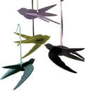
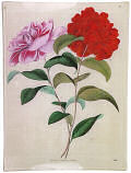
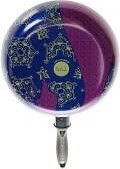
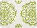
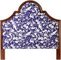
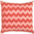
 my photos of karen's new work at nama rococo really didn't do the new pieces justice. however, these photos are perfect and totally spot on color-wise. just wanted to share photos that looked a bit more accurate. darn my camera and it's stupid color issues.
Labels: windows and walls
posted by design*sponge @ 22.5.07
![]()


6 Comments:
Oh. My. God. I love the hot pink panel so much that it actually, physically hurts. Thanks for blowing my budget, Grace. :)
I love this! I tore a page out of a magazine recently that featured great designs in red. One of them was a Nama Rococo wallpaper, and it inspired one of my paintings: http://wexfordgirl.typepad.com/wexford_girl/2007/05/painting_2.html
That Red DCW has the back rest attached upside down! Love the prints!
regards,
Joel Pirela
i saw these in person and i totally agree: they are GORGEOUS. they're like vivienne westwood dresses for your walls! one of these days, i won't be in a rental...
lourdes
The new designs from kstudio brought a big smile to my face :)
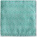
I LOVE the bottom picture, just my style!
Post a Comment
<< Home