stationery show 2007: part one
 this year's stationery show was a blast. despite the fact that each year it feels like the good booths are hidden behind rows of people selling self-help books, halloween masks and crazy hats (those booths drive me nuts), this year's show did not dissapoint. after about 20 rows of the aforementioned tchotchkes, i stumbled upon a few fantastic companies i hadn't seen before. today's highlights will include my favorite "new" companies (you're going to love joy's beautiful debut line below) and plenty of great new work from the companies we already know and love. my computer is chock-full of stationery show photos so there will be a part two on thursday with many, many more photos. until then, here's my first day roundup of stationery show highlights. if you'd like to skip the text and go straight to the full sized photo slide show just click here.


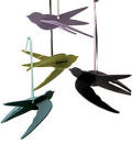
one of the booths that stood out the most to me belonged to molly meng of 8mm. i don't know where i've been living (under a rock perhaps) that i haven't seen her work before but i'm so glad i've seen it now. i loved her beautiful birdhead series and the "carbon" series that looks like lined paper. such beautiful work...


small square design of san francisco was new to the show this year. artists basak notz and rae dunn created the sweetest, most adorable cards for adults and children. the lovely baby cards and recipe journals were my favorite- they had such a nice sense of softness to them. due in no small part to her wonderful way with line and color. be sure to check out her work right here.


this year's show marked the debut of fellow blogger joy's beautiful nantaka joy line. i knew it would be great but i didn't have any idea how great it would be until i saw them in person. these photos can't do the collection justice- joy's line is stunning. the way she worked with metallics was just gorgeous- i would have bought those top journals right on the spot- and i think many, many people will once they're in stores. i can't wait to see what joy does next- she's got such a great eye and i'm sure this is just the tip of the iceberg. and it's a very pretty iceberg already...


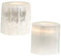
sweet bella had a beautiful booth full of accessories like tiles and the sweet white letters above. they also debuted a new line from lisa stickley, shown above.


for some reason my notes are a little scrambled for this row but i'm pretty sure these beautiful cards belong to studio olivine (please feel free to correct me if i'm wrong!). i loved the colors they were using- the soft melon color and the rich ochre yellow were such nice choices.


amy of amh design debuted a great new series of notebooks that have holes in them for embroidery! i love the idea that you could personalize your notebook with a needle and thread rather than labels or something flat. she also showed cute little stitched ipod covers- colorful and perfect for summer.

letterpressed "love" card from deluce design.


it was a pleasure to meet katie muth in person and check out her lovely new calendars- can't wait for these to hit stores.

colorful coasters and aprons from rock scissor paper.


i love trace- they're one of my favorite stationery companies around and whenever their website is up and running they'll surely be regulars on the site. until then, you can browse some of their new products above. i loved the printed linen albums and "hi y'all" cards. they've always got something fun, different and colorful to share.

i was nuts about little tree press' calendars. so simple but so beautiful.


new cards and a handsome new print from binth in chicago.


egg press is always one of my favorites- their work was fantastic as always.

retro-style cards from elum.


brady and lindsay at hammerpress debuted some gorgeous long cards and a great new cowboy print that i'm already trying to find a place for in my home. they're consistently great so it was tough to pick which pieces to photograph. you can check out their site for more work and to shop online.


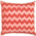
i was thrilled to meet blogger/author/designer meg mateo ilasco in person at the show. her pillows and stationery were even lovelier in person than online. i was particularly into her ikat-style notebooks and the bold colors she worked with. i loved the combination of deep yellows, reds, blues and pinks. such great work. and of course, her little ex libris bookplates were painfully cute.


last but most certainly not least is night owl paper goods. i've been a fan of theirs for a while now but was so psyched to hear the buzz on their booth. they seemed to be a show favorite so when i pulled into their booth at closing time last night i was glad i could catch their work in person. aside from having a seriously kick-ass vintage embroidery in their booth (first photo above), they had a wonderful series of new stationery and announcements to show. i loved the button series and thought their children and baby designers were so, so sweet. they also showed a great line of moving announcements and cards printed on thin wood veneer. very, very cool. more to come from them this week.
Labels: design shows





















26 Comments:
Wow, thanks for all the great coverage! I'm crazy about the button cards from Night Owl!
Yowza! High fabulousity! Thanks for the wonderful reporting. -- Joyce
fabulous reporting as always! it's so nice to have eyes & ears on the design scene, for those of us who can't be there in person.
just promise us that you'll never stop reporting!!
Great post! I also loved Joy's line. There's some real talent from Philly this year at the NSS and the ICFF.
Caroline
Wow!!!! Joy's work is amazing! I'm blown away by those notebooks. Those metallics, gorgeous gorgeous gorgeous!!!!!!
i like that owl with a belt on
fun, fun. lots of great stand-outs g.
wow, what the lovely links! I'm in love with the simplicity of small square design. thanks for the heads up on many great designers!
great work, but, is it just me, or does kate muth's calendars look too close to nikki mcclure's work?
Thank You. Thank You. Thank You. For all the pics. We were suppose to go this year and then at the last minute couldn't make it. It was such a bummer to miss it, but seeing posts like this helps (though makes us jealous too!) Keep the pics coming. Thanks again!
gorgeous pics grace. thanks for all this. there are some really beautiful designs. what a treat.
one of my favorite booths at the show was the night owl booth, and i'm glad you posted about them. one of the reasons they were probably so popular was because of the cute tote bags they were giving away. it was really smart of them to tack their booth number onto them so that anyone attracted to the bag could go check out their booth.
i think i may have seen you at the show but i couldn't muster up the courage to say hello, especially if it wasn't you! great show overall, though. you covered almost everyone i went to see. it was an absolute joy to meet the people at paper + cup and everyone from san fran, and noteably, lisa from good on paper. (i work at gilah press + design, and we had a booth at the show. we're also listed in your letterpress guide under baltimore!)
super! thanks for so much for this coverage -so many presses to check out!
I didn't get a chance to wall the Stationary show, but quickly walked ICFF.
I saw those ceramic letters at ABC already. They really are fantastic! Ceramic letters are popping up everywhere. They seem to be popping up here and there in Europe and Japan.
Amazing coverage! I couldn't stop reading, wishing there is more! Thanks so much for sharing!
In almost feel like I was there! (I wish.) How frustrating that I was in NYC this weekend but couldn't make it! But i love reading your reviews!!!
I am so constantly amazed at the talent and creativity the blogging world has made me privy to. And thank you Grace for giving us a glimpse into this fantastic show. I can't wait until I can go myself down the road. And Joy's work is just breathtaking. Can't wait to blog about it on kstyle.k
oh man, great coverage grace! thanks!
WOW!! awesome coverage, Grace!! Lots of exciting products and designers! and gosh, joy is just amazing!
these are amazing! thanks for sharing!
The wallpaper with the ladies is so cool, it would be great as a feature wall in a single guys apartment.
Thanks for sharing
Jordan
Thanks for all of the lovely photos, it is as close as we can all be, if we weren't able to attend!
great coverage! please tell us who designed the clocks that appear in your flickr photos.
it looks like there were some beautiful things out there ... i wish i could have gone! thank you so much for posting!
random question -- do you have any more information on the first embroidery image you have here -- the tree with birds, leaves & flowers?
i found this very same embroidery in a thrift shop and love it -- i was surprised to see it here! is it a vintage pattern of some sort?
thanks!
kate@corleyz.com
this post is great! i was at the ICFF and saw that there was this stationary show going on at the same but i only had a badge for ICFF. thanks for posting great photos, now i don't feel as bad missing it.
Post a Comment
<< Home