design review: thoughts?
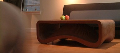
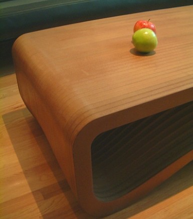
i met designer caleb dawson when i spoke at the idsa chicago conference. he would very much like to get the d*s audience's opinion of his latest piece, a coffee table designed with his wife in mind. caleb mostly designs consumer goods for transportation/medical/electronics markets, but this is his first stab at a completed furniture piece. [the table is mostly CNC routed 3/4" MDF pieces. They are held in alignment with 1/2" dowels and fastened to each other with drywall screws and wood glue. The dimensions are 47" X 28" X 17". If he has another chance to build another one, he's going to try wheatboard (a sustainable material) instead of MDF]. there's a complete photo set right here, so take a look and if you have time, please let caleb know what you think. and remember- constructive criticism and conversation is always welcome, but rudeness and comments like "this sucks" are not. [thanks for asking our opinion caleb!]
Labels: furniture


































18 Comments:
caleb
i love that you're considering a sustainable option. i'd love to see what that ends up looking like in prototype form.
my only criticism would be that to me, the market seems to currently have a lot of similar pieces in it. not that you were necessary designing with that in mind, but i think a few people may feel like this is a look that they've seen a lot before.
that said, i think it's a great jump into the furniture world. please keep me up to date on your future work.
d*s
I agree that there are similar designs out there, but I think interesting finish options could set this apart. It looks kinda masonite-like right now.
I like the complimentary forms on the bottom. One moving along the "grain" and one against it. I think it's very tasteful.
I've used wheatboard in the past and would recommend it for anything like this. It takes a rubbed oil finish extremely well.
Congrats on your work.
Its not a bad design at all - quite sculptural and organic. It is also very well executed. The overall design shows that you have a good knowledge of the processes involved and how to work with the strengths of a CNC router, even if it will look a bit 'simplistic' to many people because they have little or no knowledge of what work had to be done to arrive at the final item. And yes, at first glance it looks quite similar to other pieces out there - but looking through your flickr gallery shows that it has a lot more refinement/complexity of shape than what items it will be compared to.
The best part is that you created a functional piece of furniture yourself, using technology that is readily available, for what is probably less money than you could have purchased something similar for.
Nice job!
you might consider some options that would be less wasteful, for instance devising a way that the interior pieces are actually made up of the waste from the exterior pieces. it seems to me that the way it is now, you're discarding a lot of material in creating those negative spaces.
that being said, the interior space is the most sculptural and ultimately, the most interesting. the angles at which you've chosen to photograph the piece will rarely be the angle at which the casual viewer sees the table. from the top you have, more or a less, a rectangular box. you might want to take another look at making the top view more interesting, and for your subsequent pieces, try to imagine this thing sitting on the ground. models are misleading as you are able to rotate them in your hands and see them from all possible angles.
Knowing that it was designed with your wife in mind my first reaction was to the feminine curves yet sturdiness of it; I appreciate the poetic contrast. Very sweet and a nice piece.
The design is very appealing and the inside cavity is almost seductive. I like being able to see the segmented parts of the table from the inside. The design feels quite ‘trendy’ for the moment, and I wonder if there’s not a way to make it perhaps more personalized to you? I know that on D*S you said it was your first piece of finished furniture, so maybe there’s a lot of room to further explore this. Its elegant, but I feel like its predictable, so it could easily be overlooked.
The construction looks really solid, and has wonderful potential to be made from recycled materials. I wonder if there’s a way to get more out of one ‘sheet’ of the material however, to cut down on material cost/waste? A seam down the middle would break your pieces in half, possibly being able to nest together on one flat sheet- but the line may detract the fluid gesture of the entire piece.
Have you considered using those negative spaces you cut out, as a complimenting, smaller side table? The contrast could be interesting.
I think the table has a nice organic feel to it. However, I don't think the way it is oriented shows off its character enough. I would actually love the table if it were flipped upside down and the flat side was just cut off. So then the sides were actually the legs and the top surface was the concave side.
In my opinion I don't see the point of making this table out of sustainable materials. As someone else mentioned below, there would be a lot of waste material. It would be nice to see those negative spaces be used as something else. But I know that may be difficult.
Over all, I think you have a nice start to a good looking table.
great table. I would photograph it with a non wood floor.
perhaps a low pile wool rug. maybe oatmeal or maybe
pale gray/green. I think you have a winner. best
A.mG
I was going to say the exact same thing about the wood floor in the picture. Needs something to break it up and draw the eye to the table. I really love the table...
Wow, you've inspired me design something of my own. The process is similar to those Eames cardboard chairs. I think the form is just great. I would create the piece out of real wood, so that the variation of the wood grain creates a kind of subtle pattern.
It looks a bit like a tooth. :D It's cute!
I think it is a beautiful table. As a buyer, I would be concerned about weight. Another concern, at my house, is whether a tennis ball can be trapped underneath. I'm not a big fan of fishing balls out, so I lean toward furniture that either prevents the balls from going under, or lets the dogs under, too, to retrieve their own balls. I don't know if that sort of comment is useful, but it affects my buying decisions....
From a purely consumer viewpoint I love it. I don't have the background to come at you with criticism of the phyical contruction and design. But am i looking for a new table and would i jump to buy this extremely functional piece for an aforbable price? YES!
i'd be curious to see a change in materials or opacity here. other comments have mentioned showing off the sculptural quality. maybe a glass or acrylic surface from the table top to just below the top fillet. maybe even make the top slatted. this would allow light to hit the convexity as well, instead of lurking in the shadow as it seems to do now.
Love it! Want it!
Wow--I *so* want one. Are there any online guides to doing this sort of woodworking and CAD design (for people who have never tried before)?
roscoe_t,
First off it's a nice piece. I think you could use the interior waste pieces to make a matching sofa table, perhaps not as deep, but the interior proportions would be similar if you could devise creative legs that would work with the piece elevated.
I'm pretty impressed with the DS comments, I've found the Internet is the absolute last place to look for useful criticism, especially when furniture is involved. Most people will cry "knockoff" if there is even a wiff of an influence from anyone.
Also, MDF holds up fine with just woodglue, the screws are overkill and will make it nearly impossible to recycle with wood products. Alignment dowels and wood glue are plenty for MDF. Or if you make a jig, you can forgoe the dowels.
Post a Comment
<< Home