bouroullec brilliance
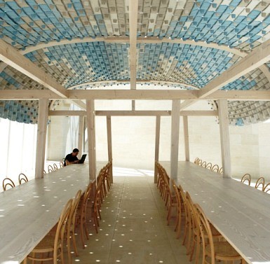
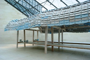
kristina is so good to me, she sent me these gorgeous pictures of the new bouroullec textile pavillion at the luxembourg museum of modern art (recognize those tiles?) it just opened this month and looks like such a pleasant place to dine outdoors. if only i could fit one of these in my back yard. well, if it had one that is. click here for more info on the bouroullecs, my heroes. [thanks, kristina!]
Labels: furniture

























5 Comments:
pictures are by Ronan and Erwan Bouroullec.
More info at:
http://www.bouroullec.com/?p=125
kristina
not into this design. what a waste of material! there are many other ways, natural materials can do better job than this. not because these 2 brothers are famous that we have to applaud to everything they do.
reader
why a waste of material? just bc you don't like it or is there an inefficiency in the design you don't like. just curious...
and, just for the record, i don't like it bc they're famous, i like it bc i think it's beautiful.
d*s
Why so bent out of shape? I don't understand reader's comment either. Why is it a waste to use the tiles, but not a waste to use any other materials?? The pavillion is indoors so any material you use would double for aesthetic use and just to screen the sun (and in this case to absorb sound), natural or otherwise, designed by the Bouroullecs or by Grace and AC.
i love the idea of ac and i designing something together. so cute! ;)
ds
Post a Comment
<< Home