|
 |
 |
 |
| |
the last post of the old d*s
 this is a bittersweet post to write, as it will be the last one written on this site before the new one goes live. blogger has been so good to me over the past three years but i'm excited to move to a new platform with more capabilities and an improved layout. on monday morning (october 1, 2007) design*sponge will be moving to: DESIGNSPONGEONLINE.COM PLEASE NOTE: the site will not load until 10 am on monday morning. until then it will be password protected. all of the old content has been migrated to the new site, categorized and arranged in a way that makes the site so, so much easier to use. you can browse by categories, look at event calendars, read the guest blog on the same page as the main posts and see some of the many new features we've added to the site (including new people!). i've also answered some FAQ's in the comment section below. ac and i are headed to montauk today for a much needed break before the new site launches. i have oodles of glitches to fix today so i'll be working on the new site and getting our sneak peek ready for monday. so i hope you all have a wonderful weekend, thank you for all of your support over the last three years. i'll see you on monday morning at 10 am at the new d*s: designspongeonline.com! ps: the new feed is right here- in case you're reading via a feeder [ photo above from studio job for super design at covent garden] Labels: miscellaneous
nuggets
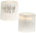
 my friend jennifer is obsessed with all things faux-wood. give her a good bark print and she's in heaven. she picked up a few of these little stitched nuggets from small stump the other day and now i have major nugget envy. they are so sweet and small- anything that fits perfectly in your palm has such a nice, comforting feel. you can pick up individual faux-wood nuggets right here for $16 each.  Labels: accessories
minimalist birdhouse
 inspired by the modern birdhouse we talked about a few months back, d*s reader courtney of two straight lines decided to create her own version, using eco (and bird) friendly materials. and to be honest, i like hers better! she used a found gourd that she painted with non-toxic paint and used little twigs as the perch. couldn't be cuter if she tried. [thanks, courtney!] Labels: diy
library love (part deux)

d*s reader sam just sent this photo over after seeing jennifer's colorful libary below. sam's not sure where the photo came from (if anyone knows please let us know below so i can properly credit the mag or owner) but we're both in awe of the sheer rainbow of color. this photo is from the home of flickr user chotda. [thanks, sam!] Labels: interior design
creative painting
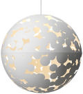
.jpg) yesterday i spent the afternoon painting a second coat of paint on our dining room walls. i figured some of the splotchy bits would show up in photos so i should really get around to fixing that. halfway through the painting i was cursing our uneven walls and my short legs for not being able to reach the top despite standing on the tallest chair we have. so i took a break and read an email from d*s reader nikki. after seeing what SHE did with paint in her home i felt like a total loser for complaining about a single plain room. nikki received a lighting fixture from a designer friend and decided to mimic the shape of the lamp in paint on the ceiling. it's such an unexpected but beautiful detail. then she added a slew of stripes on the wall by her door and i was suddenly filled with the desire to stripe our whole home. it looks so pretty and really gives life to what could have been a cold studio space. stay tuned for a full sneak peek of nikki's home on the new d*s next week. [thanks, nikki!] .jpeg) Labels: diy, interior design
parachutes
 i'm loving these parachute bike cards from etsy seller two guitars. i have a thing for bike prints (i'm dying to upholster a chair in julia rothman's bicycle print) right now and these are just what i've been looking for. you can pick up a set of 10 cards for $5 right here. Labels: paper
flor
 whoever is behind the styling in the new flor catalog is doing a fan tastic job. we have some flor in the house but ours never manages to look this clean and cool. i particularly love the vintage furniture they're using in the shots- it really blends modern and traditional brilliantly. click here for more information on flor. 


 Labels: rugs and flooring
library love
 one day when we have room for two seperate rooms of books i'm going to hijack our collection and arrange half of it by color. right now ac prefers to arrange by theme but if this picture of jennifer's home from the domino decorating contest is any indicator- color looks way, way cooler. love that chest of drawers by the front door, too. so cute! Labels: interior design
sample sale
 as part of the dumbo art under the bridge festival this weekend sesame letterpress and mooontree arts are having a sample sale this saturday and sunday (SEPT 29-30) at their studio (55 washington street, suite 608) from 11-5 pm. i attended last year and it was a great way to pick up some gorgeous letterpress goods for a discounted price so if you're in the area be sure to stop by! ac and i are taking one last weekend trip before the new site launches so i won't be there but hopefully some of you guys can attend! Labels: miscellaneous
20x200
 one more quick thing- jen bekman's new 20x200 project is a wonderful resource for affordable prints. i'm loving this " ny.07.#20" print by jennifer sanchez. you can choose from three sizes of prints ranging from $20 to $200 to $2,000. such a fun idea. click here to browse the full 20x200 selection. Labels: artwork
the sound of panic
 today i'm heading out early to work on finishing up our apartment. the other day it hit me: i promised i'd do a sneak peek of our house as the first post on the new site and the house isn't done. eek! it will never be totally done but there's a lot that could be finished up today so i'm going to head out early to finish some painting, find some much needed details and make things a little spiffier for the big reveal next monday. so stay tuned, monday i'll introduce the new d*s (some new team members!) and our little d*s home. can't wait! Labels: interior design
judy ross
 textile designer judy ross just launched two beautiful new collections of pillows and rugs. in addition to new styles and colorways, the pillow collection includes two styles with metallic rayon thread that give each piece a little extra shimmer. i've always loved judy's work and her way with color so i'm thrilled to see the new patterns that combine grey and yellow (my favorite color combo) as well as the new pattern, "carousel" (seen above in rug form). judy's site is being updated and will soon have e-commerce but for now you can contact the studio directly (212-352-1920) to buy any of the pieces above (pillows start at $190 and rugs start at $80 per square foot). enjoy! [thanks, judy!] 


 Labels: accessories
boston design guide
 i've wanted to put together a boston design guide for some time. it's one of the cities readers request guides for most often but sadly i always end up forgetting to take my camera around with me when we visit ac's family outside of the city. thankfully, while chatting with the lovely elisabeth of black pearl press she offered to help me out, as she's an actual local and we share the same love of local boutiques and an aversion to big box brands. her finds (with a few of my personal favorites added in) are now in guide form- arranged by neighborhood- and perfect for anyone heading up to boston on weekend vacations or over the holiday. elisabeth also included some great places to eat while you're shopping so click here to read the full guide. happy boston shopping! [ as always, feel free to leave suggestions and we'll update them as we go along] [ stay tuned next week for the new d*s and a guide to chicago design!] 
 [Photos above: Good and Hudson, home stores in Boston]> Labels: guides
office help update
 with the help of your reader suggestions mk made some (fast!) changes to her office. i just wanted to share the new orange and blue theme she set up over the weekend. that's some quick painting! 
 Labels: interior design
walteria living + mark mothersbaugh
 i've been a big fan of mark mothersbaugh's music for some time now. his soundtracks always have such an wonderful, otherworldy feel and a sense that whoever is tinkering with the blips and bleeps really knows what they're doing. the life aquatic was one of my favorites as well as the simple theme he created for the rugrats animated show years ago. i couldn't stand the show but i loved the music. so it's no surprise that mark's new collection with walteria living would be just as interesting. mark's black forest collection features imagery that is a digital mutation of an illustration from a nineteenth-century pictorial archive of avian species. in addition to the black forest collection (which includes a 5-piece place setting and cuckoo clock), mark is releasing a series of vases and plates called the postcard diaries. inspired by downtime during world-wide devo tours in which mark would draw on the back of postcards to send to friend and family, this series is fascinating in the way that we catch a glimpse into the artist's private, very personal thoughts and drawings. you can find more information on mark mothersbaugh's new work with walteria living right here. 

in addition to mark's work there are beautiful new pieces from kathleen at walteria as well. i'm smitten with the bespoke series of cast pendants and endangered species bracelets (made of porcelain with a portion of the proceeds going to the wspa). they have such a rich, exotic feel to them and they can be custom monogrammed for gifts. you can view the entire collection right here and contact walteria if you're interested in any of the designs above. [thanks, kathleen!] 

 Labels: ceramics
coe & waito
 i'm always so thrilled to hear from alissa and carly at coe & waito- they were a big hit here last august and ever since i've been a huge fan of their work. now alissa and carly have launched a new collection of small bottles inspired by memories of antique bottles they dug up as children. made of slip cast porcelain with a creamy clear glaze, each bottle is embellished with platinum decals of insects, weeds, roots, and dirt, as if they were just pulled from the ground. you can choose from three shapes (measuring appx. four by two inches) for $68 each. 

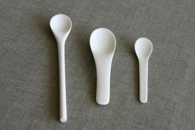
in addition to their beautiful new bottle collection, coe & waito have introduced a family of three spoons made of slip cast porcelain, unglazed and sanded smooth. there are three variations available: long ($32), medium ($30), and small ($28). the spoons are my absolute favorite and remind me of the wonderful back and forth on blogs like skinny laminx, hoping for happy accidents, lena corwin and port2port in which people sent each other photos of spoons in their home. you can find more information and purchase coe & waito's new products right here, at their newly updated website. [thanks to alissa and carly for the tip!] [ please note: carly and alissa added that because the spoons are unglazed, they will acquire a patina if used with highly pigmented foods/liquids] 


 Labels: ceramics
guide to mirrors + weekly wrap up
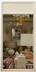
 earlier this week i uploaded a guide to wall mirrors i've been working on for a few days. ac and i are looking for a mirror for our bedroom and i found some pretty spectacular (and affordable!) mirrors out there. the slideshow is grouped into categories like frameless, sunburst, etched, decorative frames, wooden and much more. this was one of my favorite slideshows i've done in a while- something about seeing all these beautiful mirrors together makes me really happy. one day when i can afford a big fancy mirror i'm definitely snagging this one. in the meantime, we went with this one. click here to check out the full slideshow and here to check out the rest of the guides i've done so far (lighting, budget lighting, desks, bedding, beds, dining chairs and sofas). i hope you all have a great weekend- i'll see you next week for the last full week of blogging on the old site (before we move to the new site)! below are highlights from this week: 
 Labels: accessories
american craft
 for me, this week's theme was all about "craft". wednesday night i attended the re-launch party for american craft magazine, followed by dinner at craftbar and then a lecture last night with rena tom and amy shaw at the american craft council library. former dwell editor andrew wagner is the new editor-in-chief of american craft magazine and has given the book a complete overhaul. i've spend the last two days pouring through the pages being pretty blown away by not only the gorgeous stories on artists and their studios but the little details like font choice, new page layouts (some of which reminded me of dwell) and their experimentation with cover flaps (when you turn the flap over, rather than an ad, there's a beautiful photo of the cover artist's work with a brief description and teaser for the story inside). some people at the party mentioned having an issue with the international craft coverage inside and the fact that a french artist (the incredible nathalie lete) graces the cover but ultimately after reading through it i agreed with andrew who said, "we're taken with all of the energy emanating from makers in the united states and abroad. w wanted to capture as much of that as possible." there is plenty to see and some truly goregous photography inside so if you're near a bookstore i highly suggest picking up a copy. and definitely check out the story on nathalie lete's work and home- you'll love it. [ guide to mirrors next!] 
 Labels: miscellaneous
plum
 i'm not a big brown, red and orange person so when fall comes around i always have a tough time adjusting to an autumnal color palette. but these colors seem like a nice compromise to me. i've been looking for fabric to upholster the bench at the foot of our bed and this palette seems rich and warm without being too much in the "fall leaves" direction. plus i'm a big fan of plum. you can pick up yardage of this fabric for $8.50 right here. [ stay tuned for a new guide next!] Labels: textiles
|
 |
 |
 |
 |
|
|
 this is a bittersweet post to write, as it will be the last one written on this site before the new one goes live. blogger has been so good to me over the past three years but i'm excited to move to a new platform with more capabilities and an improved layout. on monday morning (october 1, 2007) design*sponge will be moving to:







.jpg)
.jpeg)


