|
 |
 |
 |
| |
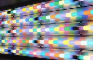
 CHEW ON THIS [stella mccartney sign*lite brite neon] it's friday. i'm exhausted. too much sickness in one week. but, i do love these guys. a lot. they're gonna be big. BIG. take my word for it. go check out the crew at lite brite. they're the best. speaking of the best...i'm lucky enough to be able to celebrate a special anniversary with a special someone this weekend. hope all your weekends are filled with as much happiness as mine will be....see you monday! (i promise not to be so sick and slow to post, really...) Labels: artwork, lighting
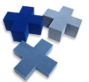
 CUTE FEST [FUNkey* mixko design] i know this isn't brand new, but who cares? this picture is soooo damn cute i have to post it. plus, it makes me think of my cat. cat's are the greatest. and so are little stools like look like computer keys. Labels: furniture
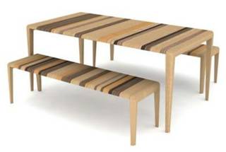
 STRIPEY STRIPE STRIPE [strata*rushton brothers] as the cold medicine kicks in my writing becomes more and more incoherent. please hang in there with me...i have more stuff to show! this strata piece is by ed carpenter of rushton bros. i found it on the timeframe website. thanks mocoloco for pointing out their work...very cool 
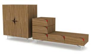
WHAT'S THAT? [curious boxes*ed carpenter and sam johnson of rushton bros.] also from timeframe. i like the pattern on the side. apparently takes inspiration from victorian interest in curioisity boxes. need more research on that....

PEEL BACK DESIGN [discovery*richard shed and alex taylor or hf noakes and sons] my original find from mocoloco. i love this. so simple and so cool
Labels: furniture
celestial design
 australian design team satelight caught my eye while i was browsing through modernwhite's website. their felt bracelets were painfully cool and i thought i'd see what else they were up to. turns out they're up to a TON of cool stuff... from belt bracelets and lighting to sound proof panels and topographic dining ware, satelight has got some phenomenal products that are dying to be a hit in our half of the world. their jewelry happens to be my favorite (i fell in love with the felt bracelets first, remember?): their typo and tag bracelets are really, really cool. take a look for yourself...it's definitely worth the trip to their site. enjoy! 
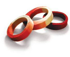
FLY FELT [felt bracelets*satelight] what originally pulled me in. i looove these bracelets....wonder if they're treated to protect against water because doesn't felt smell bad when it's wet?

SOUNDS GOOD [acouStick tiles*satelight] cool designs to keep cool places quiet...see additional picture above...

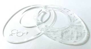
YOU'RE IT [tag jewelry*satelight] sex and the city style...

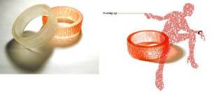
DONOR STYLE [type o bracelets*satelight] cool clear bracelets...
Labels: windows and walls
my heart belongs to minnesota: an ode to the boys of blu dot
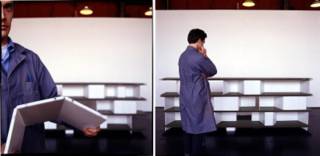
 besides the fact that charlie lazor is a dreamy furniture god (and makes a mean flat pak house), blu dot has an endless amount of great things going for them (aside from now being repped by the tiny firm i work for...hooray!). based in minneapolis and founded in 1996 after charlie, john christakos and maurice blanks all met at williams college, blu dot had its humble beginnings as a way for the three friends to have cool furniture at an affordable price...that they they actually liked. the rest is history. creativity, functionality and affordability are the key qualities of blu dot's designs: each piece manages to make "design" more approachable and, not to mention, easier on your wallet. with pieces like the sturdy but elegant chicago shelving unit (love it) and the cleverly named felt up chair (see previous posting...), blu dot adds a bit of humor to the contemporary market while still holding their values of good design and quality construction dear. their newest pieces include a fantastic set of tables called barbarella. one of their trademark "flat pak" designs (meaning the piece arrives as one sheet of perforated steel that can be folded and bent into place), barbarella's form is its function. meaning that its hollow, folded form naturally creates extra storage space and hip little nooks for hiding clutter and all your favorite magazines. in the vein of creative storage, free play is a system designed by blu dot that is comprised of a do-it-yourself design kit inluding the shelves and units that can be folded into any number of shapes to create a unique one-of-a-kind shelf. so, much like my bouroullec boys, the lads at blu dot have shared some of the creative process with us, the humble consumer. i can't get enough of these guys, so if you're like me, you'll wanna check out their groovy website...and while you're at it, cruise on by charlie's flat pak house site and see what all the buzz is about. 
DREAMY MR. LAZOR [free play shelving*blu dot] ahh.....mr. lazor. he could show me how to put together shelving any day...

WINDY CITY [chicago wall unit*blu dot] the boys from minnesota make shelving cool...

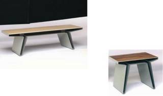
QUEEN OF TABLES [barbarella*blu dot] i am table, hear me roar....

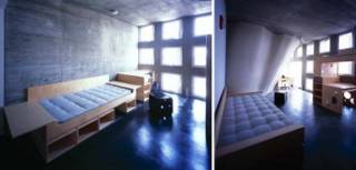
SMART KID FURNITURE [furniture for MIT dorms*blu dot] even geniuses need a place to crash. but god those dorms look depressing...ugh
Labels: furniture
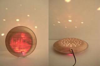
 NO, NOT LEWINSKI [lighting*monacca] id magazine has a great little section of its site called "new and notable" that keeps track of designs and designers on the horizon. i caught wind of monacca there (via the fantastic ms. lasky)- it's a line of cedar-laminated products from ecoasu umajimura, there and have been intrigued ever since. comprised of villagers from umajimura, japan, ecoasu was created to reinvigorate national interest in native cedar. i was unable to find much more information (and the email from the head designer was a bit broken bc of language issues), so if you can read japanese and can tell me more from the website, pleeease, let me know! the lighting (above)and the ridiculously cool briefcase are my favorites (such a natural, pleasing light yeah?). you can find more info at www.arenot.com.

MAD ABOUT MONACCA [cedar collection*monacca] the works...
Labels: lighting
design is dead!
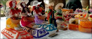
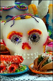
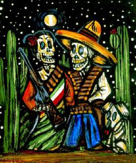
 ok well, not really, but lots of other things are and what better way to celebrate than mexico's day of the dead! i've always been fascinated by this holiday and figured it would be high time to celebrate it, seeing as it's almost halloween. the new york times did a great piece on the food half of the celebration, which is a phenomenal celebration of life and those who are no longer with you. i, for one, feel that the colors and symbols that dominate the festival are both eery and wonderfully vibrant. these photographs i so shamelessly stole from the ny times give you a great idea of what i mean. for more info (and postcards!) you can check out this site. happy day of the dead! 
GRATEFUL DEAD [skull confections from mexico*nytimes] eery edibles...

SOUTH OF THE BORDER [day of the dead imagery*mexico] in a world full of streamlined bent ply and monochromatic neutrals..it's nice to bring some color and vibrancy to the world...
focus: artist
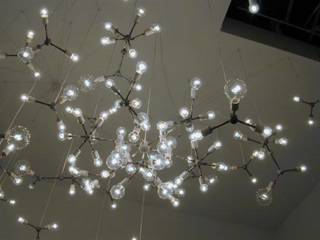
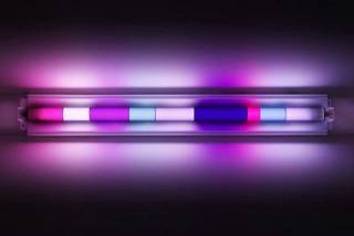
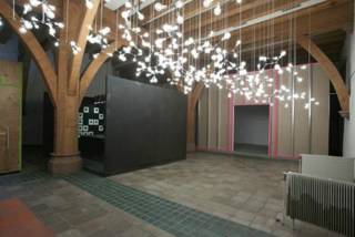
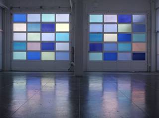
 spencer finch is cool. his work at the whitney biennial this year blew me away. i just wanted to put up a little something about his lighting pieces so people could check him out on their own, seeing as he's a brooklyn-based artist...and you know my preoccupation with supporting local artists. as i've started to pay more attention to lighting as art, i've become drawn to people who have explored the medium and pushed it in different directions. finch's work at the biennial was a brilliant collection of bulbs and wires- reminiscent of maurer and calder's earlier works (it also reminded me of the opening credits for "punch drunk love" designed by artist jeremy blake). his experimentation with neon deserves some attention too- the way he works with color and light to create moods and illicit emotions is phenomenal. this is seen most precisely in his piece "paris/texas", in which he uses colored panels to filter light so that the light in texas (where the installation took place) resembles exactly the light in paris on a particular night in 2003. i need to delve deeper into spencer fitch's work and background, but i've been sidelined by a nasty cold this week, so i'll have to leave the additional research up to you guys...you can check out spencer's site here or read up on his reviews and exhibitions here. enjoy! 
BULB HEAVEN [whitney biennial piece*spencer finch] what first drew me in...so gorgeous

MOOD LIGHTING [moonlight*spencer finch] beautiful. just beautiful.

PLANETARY GRACE [mars black*spencer finch] a world of beautiful lights...
 LIGHT GARAGE [paris/texas*spencer finch] Labels: artwork
for the love of ronan and erwan
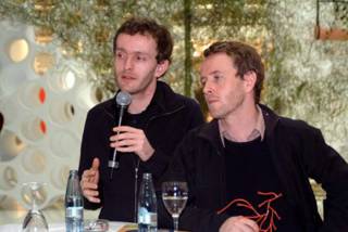
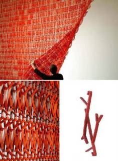
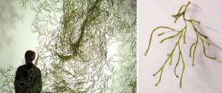
 it's no secret that i love the bouroullec brothers. i have been a fan of theirs since day one and have continued to pay allegiance to this dazzling design duo from paris. luckily, my day job has given me the chance to work closely with their designs and even catch sneak peeks of their work in sketch form (thanks day job!), so i thought i'd share some pics i just got from europe. these were taken at the cologne furniture fair from this summer, but these were taken by ronan and erwan themselves. i love these guys. i really do. twig and algues, new space dividing systems due to hit vitra stores and retailers in january are such a radically innovative way to reimagine the idea of walls, division of space and transparency. like most bouroullec projects, the creativity is left up to the consumer: twig and algues are actually comprised of individual elements that can be fit into any number of configurations, shapes and sizes. they can also be layered (or not) to control the amount of light and privacy. (the one down side? they take a frickin eternity to put together) while they may be a bit out there for most homes, i love that their work caters to the customer that experiments with non-traditional forms and dares to imagine they could live in a world full of red twigs and green algues (seaweed in french). along with algues and twig, the bouroullecs designed a few more pieces for vitra's soon to be launched at home collection. one of them is called box- it is, quite simply, a great little storage unit that has holes in the bottom and a notched out top so that electrical wires can be run through or stored, without the cost of unsightly cords dangling everywhere. box should hit vitra stores after the new year, but i'll have more details soon. until then, go check out the brothers b and see why i think they are just the coolest guys, ever. they push the envelope of traditional form and managed to infuse functionality into every out-there design. way to be guys... psst...you can see some additional bouroullec products here, in my very first post on 'my favorite things'. 
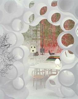
CLOUD 9 [view of bouroullec's "ideal house" at cologne furniture fair*ronan and erwan bouroullec] heavenly view looking through their cloud storage system into the world of the bouroullecs...

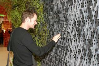
HAPPY TWIG GUY [viewer takes in twig and algues next to it*bouroullecs] people love to look at this stuff. at icff people kept trying to take it apart in the vitra booth. but if they knew how long it took to put all this together, they'd keep their paws off....this stuff takes quite some time to put together...eesh

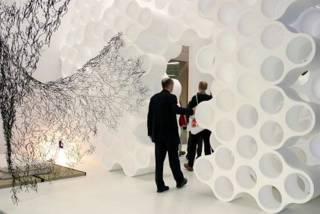
COME ON IN [walking through cloud and past algues*bouroullec booth at cff]

TWIGGY TWIGGY [twig*bouroullecs] in it's sheet form, close up and the individual component...imagine putting all this together....double eesh

FROM THE SEA [algues*brothers b] french word for algae or seaweed...cool either way. this is my favorite of the two...it can take such amazing shapes

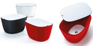
NO WIRE HANGERS! [box*bouroullec brothers] well, no wires showing at least. hide your electrical components in these fun little bouroullec boxes...coming soon to a vitra store near you...well, soon as in 2005
Labels: accessories, furniture
ginder girl
 ANTLER BOY [ghost tree*eric ginder] i stumbled upon designer eric ginder while drooling over the goods at velocity (how great is velocity? i am constantly impressed by their collection. great taste and great work. win win.) and have found a new love- ginder's ghost collection of entryway furniture (for lack of a better term). his ghost coat tree and ghost tile antler coat rack are uber cool and well, uber pricey. but if you've got 2 grand to drop on a sweet coat rack- sign up here. erich's website is still in the works, but i promise i'll be writing more about him when it's up. until then, check out velocity for his retail designs and check back here for more info when it's available. 
BOO! [ghost collection*eric ginder] hang your hat and coat on something spooky- spooky cool.
Labels: furniture
 FLOWER POWER [vasemaker*designfenzider] i can't remember where i first saw this, but it is worth a second look. the vasemaker from designfenzider brings glamour to your very own cups and containers. you can even make something gorgeous out of your plain old juice glasses. you can pick up a vasemaker at the apartment in soho or snag one online here. 
EVERYDAY GLAMOUR [vasemaker*designfenzider] make beauty out of the ordinary.
Labels: accessories
happy monday...
 CUTTING EDGE CANINE [bow haus*bow haus design] i know this isn't brand spanking new, but i can't get enough of it. after a pet-filled weekend i've been dying to check out modern digs for our four legged friends. dwell covered bow haus (could that name be any cuter?) this this summer, but i feel the need to post it again, because well, it's monday and everyone needs a little cuteness on monday. dogs are cute! especially in hip little houses! by the way...have you registered to vote? do you have your absentee ballot? do you have all the materials and info you need to be ready to vote on november 2? if not (and even if you do) drop by rock the vote and get the facts straight. please vote...it's important! Labels: furniture
tgif....finally
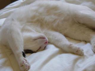
 BE LIKE TURK [cat nap*casa coles] take some advice from my cat: have a relaxing weekend and i'll see you on monday... ugh. t-mobile ruined my friday, so i've had my will to blog sucked right out of me today. however, i will be back on monday: fresh, happy and un-bummed about how much t-mobile really really bites. bites! (i urge you to use another company- they just gouged me for a phone i lost. like accidents don't happen...geez) anyway, i'll be back next monday with gobs of info on a bunch of cool new designers and their even cooler new designs. hint hint (two are from paris and one represents gowanus...) so, have a great weekend everyone. see you monday... xoxo, design*sponge
thursday's boy: celebrating the day before friday with frank tjepkema
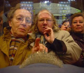
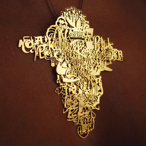
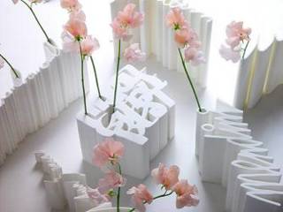
 droog design darling, frank tjepkema is amsterdam's finest. designer, that is. with several of his designs already scooped up and placed in the illustrious droog design collection, tjepkema is at the top of his game. sadly, i only jumped on the tjepkema truck in 2003 after i saw his "signature thing", but i've been a loyal fan ever since. based in lovely amsterdam (where i once managed to run into someone from my little southern hometown..talk about small world) tjepkema attended both the technical university of delft and the design academy at eindhoven, and THEN graduated with an MA from the sandberg institute in amsterdam. when he's not busy racking up design diplomas (and now heading up the design dept at the rietveld academy in amsterdam), frank is busy working on some of the most interesting and beautiful designs i've ever seen. famous for his preoccupation with branding and identity, tjepkema has a veritable obsession with logos and their use in the corporate world. i first saw this in his now-infamous bling bling collection, available at moss, and have continued to love it in his work for the wedding of princess maxima and willem-alexander. comprised of layers of corporate logos, the bling bling pendant is a great big chunk of branding genius. i don't think i'd ever actually wear it, but it's still amazing. for the wedding of maxima and willem-alexander, tjepkema designed the most elegant and delicate tiara made of layers of the words "i love you" written in as many languages as it can be said. tjepkema's ability to combine conceptual innovative ideas with functional intelligence and visual elegance is truly unparalleled. taking his branding compulsion to a more practical place, tjepkema designed the imaging and logo for the francois vatel cooking school- designs so cool that they make me want to go there. well, not really, but you get the point. speaking of cooking, has anyone been to per se in nyc? i'm nursing a pretty huge thomas keller crush and would love to know how it is... frank tjepkema continues to produce some of the most amazing products in contemporary design. his pieces are bright and innovative enough to perk up any lackluster thursday afternoon so, go check him out! *this is a much abbreviated version of my original article, as evil blogger chose to eat my saved draft...jerks. 
ICH LIEBE DICH? [princess tiara*frank tjempkema] i can't get enough of this picture. i looove it.

SHINY SHINY [tiara close-up*frank tjepkema] girls like pretty things from frank...

HOLLA HOLLA [bling bling medallion*frankie t] what what?

SIGN IT ["signature thing" vase*f tjepkema] have your own signature hold your flowers!

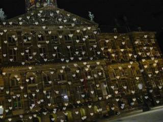
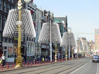
WHAT A GIRL DREAMS OF [decorations for dutch royal wedding*frank tjepkema] a sky full of hearts and arrows, what more could you ask for?

WEDDING PARADE [more wedding decs*f tjepkema] for wedding day decorations...

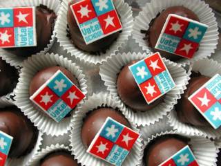
EAT THIS [edible logos for francois vatel*frank tjepkema] mmmm....good enough to eat!

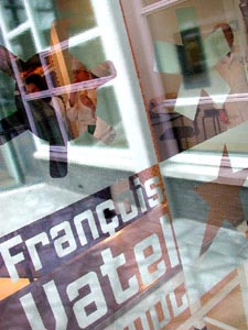
COME ON IN [entrance to fv school*frank tjepkema] school's cool again...
Labels: artwork
ahh!
please excuse my blog today- blogger is completely messed up. ignore ignore! i can barely get rid of things that aren't even supposed to be up yet! damn!
d*s
 ROHRLICH GOT IT RIGHT [noguchi free form sofa*vitra design museum] marianne is not always my favorite design writer, but i do like the feature she did this morning on curvy sofas. well, i at least like the noguchi sofa. i don't know where this picture came from but i love it. love it. yeah green sofas and yeah isamu noguchi! (that's for you coles...) more info at design within reach Labels: furniture
fell in love with a girl....
 thank you thank you thank you bryan boyer for turning me on to a great new designer (jewelry, that is) that is not ridiculously overpriced! bryan emailed me about his friend rena tom, so i decided to check her out and i'm so glad i did. rena's jewelry is just plain gorgeous. the materials match the design in their simple, raw elegance. kryptonite and wood mix beautifully with stones like chalcedony and ruby quartz, creating absolutely precious bracelets, earrings, necklaces and rings. now, i'm more of an earring/ring/necklace girl, but her peacock bracelet is really to die for (i'm keeping it in mind for upcoming christmas gifts for my family). for my money, the flag necklace and wooden necklace are the cutest, but you really can't go wrong with any of them. so, drop by rena's site and indulge in some beautiful fall jewelry. support local artists! (well, she just moved here, so it's local enough...) 
GREEN WITH ENVY [necklace and bracelet*rena tom] rare plasma verisite stones and any girl's weakness, gorgeous green kryptonite

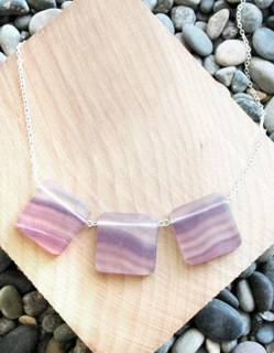
PURDY GIRL [necklace, necklace and ring*rena tom] curve necklace made of mother of pearl, nature girl necklace made of ebony and green fluorite, mega ring

LOVE IT [flag necklace*rena thom] gorgeous. gorgeous.

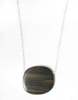
TREE HUGGER [necklace*rena tom] ebony and sterling silver. so pretty...

BETTER AND BETTER [custom invites*rena tom] AND she makes custom cards and paper goods!

LADY BIRD [peacock bracelet*rena tom] if i wore bracelets, i'd wear this one in a heartbeat...
Labels: accessories
|
 |
 |
 |
 |
|
|


