|
 |
 |
 |
| |
 CHEW ON THIS [stella mccartney sign*lite brite neon] it's friday. i'm exhausted. too much sickness in one week. but, i do love these guys. a lot. they're gonna be big. BIG. take my word for it. go check out the crew at lite brite. they're the best. speaking of the best...i'm lucky enough to be able to celebrate a special anniversary with a special someone this weekend. hope all your weekends are filled with as much happiness as mine will be....see you monday! (i promise not to be so sick and slow to post, really...) Labels: artwork, lighting
 CUTE FEST [FUNkey* mixko design] i know this isn't brand new, but who cares? this picture is soooo damn cute i have to post it. plus, it makes me think of my cat. cat's are the greatest. and so are little stools like look like computer keys. Labels: furniture
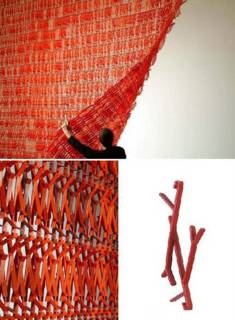
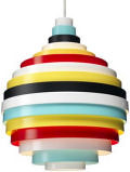
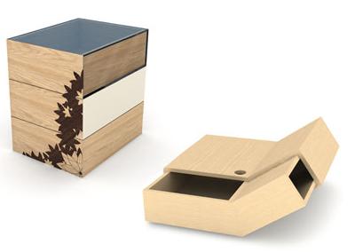
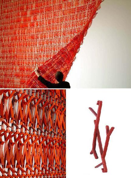
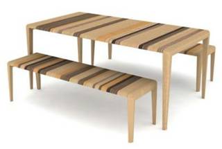
 STRIPEY STRIPE STRIPE [strata*rushton brothers] as the cold medicine kicks in my writing becomes more and more incoherent. please hang in there with me...i have more stuff to show! this strata piece is by ed carpenter of rushton bros. i found it on the timeframe website. thanks mocoloco for pointing out their work...very cool  
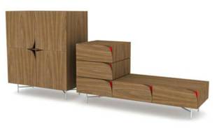
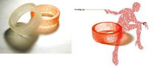
WHAT'S THAT? [curious boxes*ed carpenter and sam johnson of rushton bros.] also from timeframe. i like the pattern on the side. apparently takes inspiration from victorian interest in curioisity boxes. need more research on that....
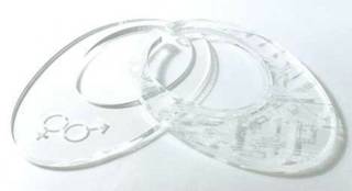
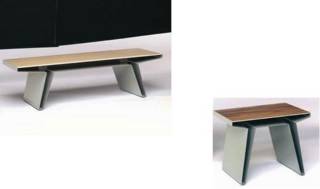
 PEEL BACK DESIGN [discovery*richard shed and alex taylor or hf noakes and sons] my original find from mocoloco. i love this. so simple and so cool
Labels: furniture
celestial design
australian design team satelight caught my eye while i was browsing through modernwhite's website. their felt bracelets were painfully cool and i thought i'd see what else they were up to. turns out they're up to a TON of cool stuff... from belt bracelets and lighting to sound proof panels and topographic dining ware, satelight has got some phenomenal products that are dying to be a hit in our half of the world. their jewelry happens to be my favorite (i fell in love with the felt bracelets first, remember?): their typo and tag bracelets are really, really cool. take a look for yourself...it's definitely worth the trip to their site. enjoy!  
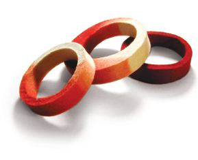
FLY FELT [felt bracelets*satelight] what originally pulled me in. i looove these bracelets....wonder if they're treated to protect against water because doesn't felt smell bad when it's wet?
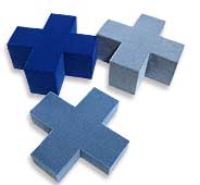
 SOUNDS GOOD [acouStick tiles*satelight] cool designs to keep cool places quiet...see additional picture above...
 YOU'RE IT [tag jewelry*satelight] sex and the city style...
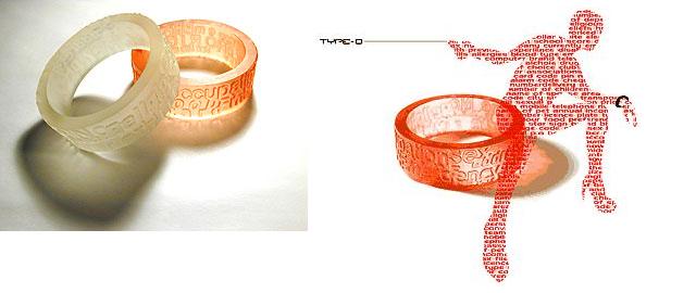
 DONOR STYLE [type o bracelets*satelight] cool clear bracelets...
Labels: windows and walls
my heart belongs to minnesota: an ode to the boys of blu dot
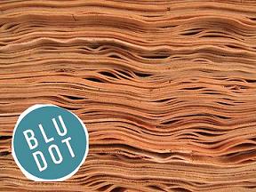
besides the fact that charlie lazor is a dreamy furniture god (and makes a mean flat pak house), blu dot has an endless amount of great things going for them (aside from now being repped by the tiny firm i work for...hooray!). based in minneapolis and founded in 1996 after charlie, john christakos and maurice blanks all met at williams college, blu dot had its humble beginnings as a way for the three friends to have cool furniture at an affordable price...that they they actually liked. the rest is history. creativity, functionality and affordability are the key qualities of blu dot's designs: each piece manages to make "design" more approachable and, not to mention, easier on your wallet. with pieces like the sturdy but elegant chicago shelving unit (love it) and the cleverly named felt up chair (see previous posting...), blu dot adds a bit of humor to the contemporary market while still holding their values of good design and quality construction dear. their newest pieces include a fantastic set of tables called barbarella. one of their trademark "flat pak" designs (meaning the piece arrives as one sheet of perforated steel that can be folded and bent into place), barbarella's form is its function. meaning that its hollow, folded form naturally creates extra storage space and hip little nooks for hiding clutter and all your favorite magazines. in the vein of creative storage, free play is a system designed by blu dot that is comprised of a do-it-yourself design kit inluding the shelves and units that can be folded into any number of shapes to create a unique one-of-a-kind shelf. so, much like my bouroullec boys, the lads at blu dot have shared some of the creative process with us, the humble consumer. i can't get enough of these guys, so if you're like me, you'll wanna check out their groovy website...and while you're at it, cruise on by charlie's flat pak house site and see what all the buzz is about.  DREAMY MR. LAZOR [free play shelving*blu dot] ahh.....mr. lazor. he could show me how to put together shelving any day...
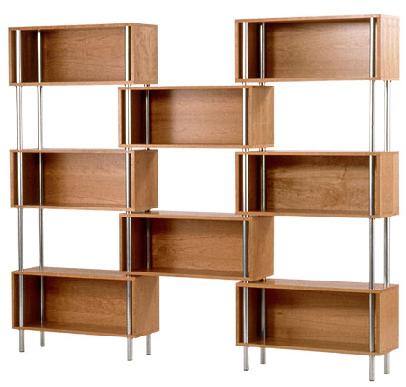
 WINDY CITY [chicago wall unit*blu dot] the boys from minnesota make shelving cool...
 QUEEN OF TABLES [barbarella*blu dot] i am table, hear me roar....
 SMART KID FURNITURE [furniture for MIT dorms*blu dot] even geniuses need a place to crash. but god those dorms look depressing...ugh
Labels: furniture
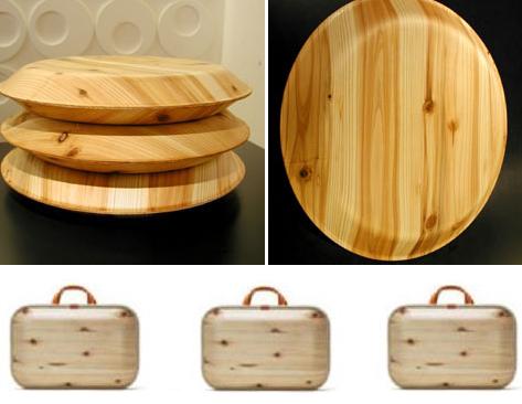
 NO, NOT LEWINSKI [lighting*monacca] id magazine has a great little section of its site called "new and notable" that keeps track of designs and designers on the horizon. i caught wind of monacca there (via the fantastic ms. lasky)- it's a line of cedar-laminated products from ecoasu umajimura, there and have been intrigued ever since. comprised of villagers from umajimura, japan, ecoasu was created to reinvigorate national interest in native cedar. i was unable to find much more information (and the email from the head designer was a bit broken bc of language issues), so if you can read japanese and can tell me more from the website, pleeease, let me know! the lighting (above)and the ridiculously cool briefcase are my favorites (such a natural, pleasing light yeah?). you can find more info at www.arenot.com.
 MAD ABOUT MONACCA [cedar collection*monacca] the works...
Labels: lighting
design is dead!
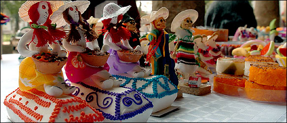
ok well, not really, but lots of other things are and what better way to celebrate than mexico's day of the dead! i've always been fascinated by this holiday and figured it would be high time to celebrate it, seeing as it's almost halloween. the new york times did a great piece on the food half of the celebration, which is a phenomenal celebration of life and those who are no longer with you. i, for one, feel that the colors and symbols that dominate the festival are both eery and wonderfully vibrant. these photographs i so shamelessly stole from the ny times give you a great idea of what i mean. for more info (and postcards!) you can check out this site. happy day of the dead!  
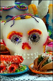
GRATEFUL DEAD [skull confections from mexico*nytimes] eery edibles...
 SOUTH OF THE BORDER [day of the dead imagery*mexico] in a world full of streamlined bent ply and monochromatic neutrals..it's nice to bring some color and vibrancy to the world...
focus: artist
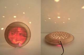
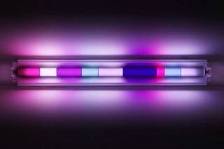
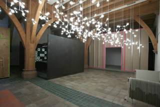
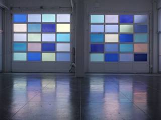
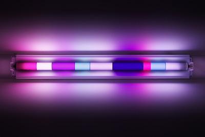
spencer finch is cool. his work at the whitney biennial this year blew me away. i just wanted to put up a little something about his lighting pieces so people could check him out on their own, seeing as he's a brooklyn-based artist...and you know my preoccupation with supporting local artists. as i've started to pay more attention to lighting as art, i've become drawn to people who have explored the medium and pushed it in different directions. finch's work at the biennial was a brilliant collection of bulbs and wires- reminiscent of maurer and calder's earlier works (it also reminded me of the opening credits for "punch drunk love" designed by artist jeremy blake). his experimentation with neon deserves some attention too- the way he works with color and light to create moods and illicit emotions is phenomenal. this is seen most precisely in his piece "paris/texas", in which he uses colored panels to filter light so that the light in texas (where the installation took place) resembles exactly the light in paris on a particular night in 2003. i need to delve deeper into spencer fitch's work and background, but i've been sidelined by a nasty cold this week, so i'll have to leave the additional research up to you guys...you can check out spencer's site here or read up on his reviews and exhibitions here. enjoy!  
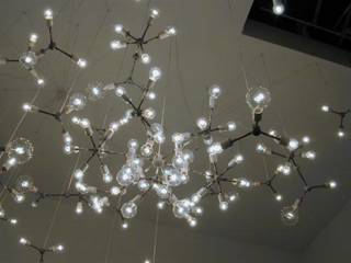
BULB HEAVEN [whitney biennial piece*spencer finch] what first drew me in...so gorgeous
 MOOD LIGHTING [moonlight*spencer finch] beautiful. just beautiful.
 PLANETARY GRACE [mars black*spencer finch] a world of beautiful lights...
 LIGHT GARAGE [paris/texas*spencer finch] Labels: artwork
for the love of ronan and erwan
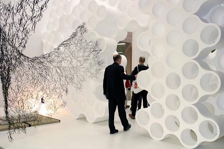
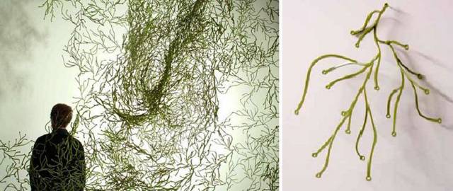
it's no secret that i love the bouroullec brothers. i have been a fan of theirs since day one and have continued to pay allegiance to this dazzling design duo from paris. luckily, my day job has given me the chance to work closely with their designs and even catch sneak peeks of their work in sketch form (thanks day job!), so i thought i'd share some pics i just got from europe. these were taken at the cologne furniture fair from this summer, but these were taken by ronan and erwan themselves. i love these guys. i really do. twig and algues, new space dividing systems due to hit vitra stores and retailers in january are such a radically innovative way to reimagine the idea of walls, division of space and transparency. like most bouroullec projects, the creativity is left up to the consumer: twig and algues are actually comprised of individual elements that can be fit into any number of configurations, shapes and sizes. they can also be layered (or not) to control the amount of light and privacy. (the one down side? they take a frickin eternity to put together) while they may be a bit out there for most homes, i love that their work caters to the customer that experiments with non-traditional forms and dares to imagine they could live in a world full of red twigs and green algues (seaweed in french). along with algues and twig, the bouroullecs designed a few more pieces for vitra's soon to be launched at home collection. one of them is called box- it is, quite simply, a great little storage unit that has holes in the bottom and a notched out top so that electrical wires can be run through or stored, without the cost of unsightly cords dangling everywhere. box should hit vitra stores after the new year, but i'll have more details soon. until then, go check out the brothers b and see why i think they are just the coolest guys, ever. they push the envelope of traditional form and managed to infuse functionality into every out-there design. way to be guys... psst...you can see some additional bouroullec products here, in my very first post on 'my favorite things'.  
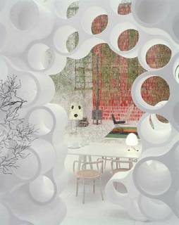
CLOUD 9 [view of bouroullec's "ideal house" at cologne furniture fair*ronan and erwan bouroullec] heavenly view looking through their cloud storage system into the world of the bouroullecs...
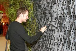
 HAPPY TWIG GUY [viewer takes in twig and algues next to it*bouroullecs] people love to look at this stuff. at icff people kept trying to take it apart in the vitra booth. but if they knew how long it took to put all this together, they'd keep their paws off....this stuff takes quite some time to put together...eesh
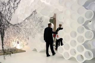
 COME ON IN [walking through cloud and past algues*bouroullec booth at cff]
 TWIGGY TWIGGY [twig*bouroullecs] in it's sheet form, close up and the individual component...imagine putting all this together....double eesh
 FROM THE SEA [algues*brothers b] french word for algae or seaweed...cool either way. this is my favorite of the two...it can take such amazing shapes
 NO WIRE HANGERS! [box*bouroullec brothers] well, no wires showing at least. hide your electrical components in these fun little bouroullec boxes...coming soon to a vitra store near you...well, soon as in 2005
Labels: accessories, furniture
ils sont si bons
michael amzalag and mathias augustyniak make up m/m, an amazing graphic design and art direction firm based in paris. after meeting at an art school in france, michael and mathias formed m/m in 1995. from its conception, m/m has worked with some of the most innovative and experimental artists in both fashion and music . i stumbled upon m/m after falling in love with their artwork for icelandic songstress, bjork. m/m created haunting visuals to accompany both the album and one of its singles, "hidden place". the way graphics and stunning photography intertwine in her album art is breathtakingly beautiful. images of swans and various flora float overtop of images of the already unusual looking singer, compounding both the album and singer's otherwordly aura. after working a connection between a friend and yohji yamamoto, m/m starting designing posters and ad campaigns for the japanese fashion magnate. their work with yamamoto is some of my favorite and it also marked their entrance into the fashion world- an entrance that has lead to some beautiful work for designers like balenciaga and calvin klein. whether they're working for high-profile fashion or music clients, m/m produces some of the most creative and visually innovative design out there. i highly recommend you check out their work and become better aquainted with the other parisian duo currently occupying my thoughts...  ICELAND'S FINEST [still from hidden place video*m/m] bjork is so phenomenal. and so is the artwork in this video...
 POP PRINCESS [vespertine album art*m/m] their work for bjork's vespertine album...
 BALENCIAGA BOYS [ad for balenciaga*m/m] more fashion...
 AMERICAN ART [calvin klein ads*m/m] bringing their parisian style to the good old usa..
 LE QUACK [duck graphic for bjork*m/m] i loved these simple graphics they did for bjork's album...
Labels: graphic design
ginder girl
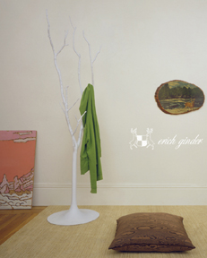
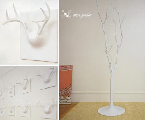
 ANTLER BOY [ghost tree*eric ginder] i stumbled upon designer eric ginder while drooling over the goods at velocity (how great is velocity? i am constantly impressed by their collection. great taste and great work. win win.) and have found a new love- ginder's ghost collection of entryway furniture (for lack of a better term). his ghost coat tree and ghost tile antler coat rack are uber cool and well, uber pricey. but if you've got 2 grand to drop on a sweet coat rack- sign up here. erich's website is still in the works, but i promise i'll be writing more about him when it's up. until then, check out velocity for his retail designs and check back here for more info when it's available.  BOO! [ghost collection*eric ginder] hang your hat and coat on something spooky- spooky cool.
Labels: furniture
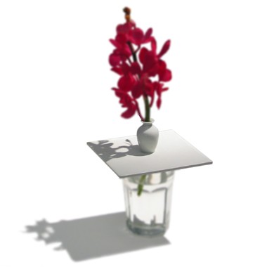
 FLOWER POWER [vasemaker*designfenzider] i can't remember where i first saw this, but it is worth a second look. the vasemaker from designfenzider brings glamour to your very own cups and containers. you can even make something gorgeous out of your plain old juice glasses. you can pick up a vasemaker at the apartment in soho or snag one online here.  EVERYDAY GLAMOUR [vasemaker*designfenzider] make beauty out of the ordinary.
Labels: accessories
happy monday...
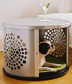
 CUTTING EDGE CANINE [bow haus*bow haus design] i know this isn't brand spanking new, but i can't get enough of it. after a pet-filled weekend i've been dying to check out modern digs for our four legged friends. dwell covered bow haus (could that name be any cuter?) this this summer, but i feel the need to post it again, because well, it's monday and everyone needs a little cuteness on monday. dogs are cute! especially in hip little houses! by the way...have you registered to vote? do you have your absentee ballot? do you have all the materials and info you need to be ready to vote on november 2? if not (and even if you do) drop by rock the vote and get the facts straight. please vote...it's important! Labels: furniture
tgif....finally
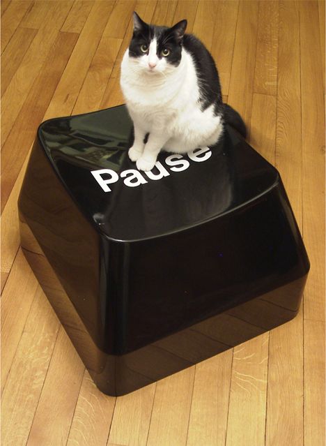
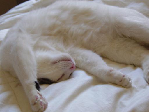
 BE LIKE TURK [cat nap*casa coles] take some advice from my cat: have a relaxing weekend and i'll see you on monday... ugh. t-mobile ruined my friday, so i've had my will to blog sucked right out of me today. however, i will be back on monday: fresh, happy and un-bummed about how much t-mobile really really bites. bites! (i urge you to use another company- they just gouged me for a phone i lost. like accidents don't happen...geez) anyway, i'll be back next monday with gobs of info on a bunch of cool new designers and their even cooler new designs. hint hint (two are from paris and one represents gowanus...) so, have a great weekend everyone. see you monday... xoxo, design*sponge
thursday's boy: celebrating the day before friday with frank tjepkema
 droog design darling, frank tjepkema is amsterdam's finest. designer, that is. with several of his designs already scooped up and placed in the illustrious droog design collection, tjepkema is at the top of his game. sadly, i only jumped on the tjepkema truck in 2003 after i saw his "signature thing", but i've been a loyal fan ever since. based in lovely amsterdam (where i once managed to run into someone from my little southern hometown..talk about small world) tjepkema attended both the technical university of delft and the design academy at eindhoven, and THEN graduated with an MA from the sandberg institute in amsterdam. when he's not busy racking up design diplomas (and now heading up the design dept at the rietveld academy in amsterdam), frank is busy working on some of the most interesting and beautiful designs i've ever seen. famous for his preoccupation with branding and identity, tjepkema has a veritable obsession with logos and their use in the corporate world. i first saw this in his now-infamous bling bling collection, available at moss, and have continued to love it in his work for the wedding of princess maxima and willem-alexander. comprised of layers of corporate logos, the bling bling pendant is a great big chunk of branding genius. i don't think i'd ever actually wear it, but it's still amazing. for the wedding of maxima and willem-alexander, tjepkema designed the most elegant and delicate tiara made of layers of the words "i love you" written in as many languages as it can be said. tjepkema's ability to combine conceptual innovative ideas with functional intelligence and visual elegance is truly unparalleled. taking his branding compulsion to a more practical place, tjepkema designed the imaging and logo for the francois vatel cooking school- designs so cool that they make me want to go there. well, not really, but you get the point. speaking of cooking, has anyone been to per se in nyc? i'm nursing a pretty huge thomas keller crush and would love to know how it is... frank tjepkema continues to produce some of the most amazing products in contemporary design. his pieces are bright and innovative enough to perk up any lackluster thursday afternoon so, go check him out! *this is a much abbreviated version of my original article, as evil blogger chose to eat my saved draft...jerks.  ICH LIEBE DICH? [princess tiara*frank tjempkema] i can't get enough of this picture. i looove it.
 SHINY SHINY [tiara close-up*frank tjepkema] girls like pretty things from frank...
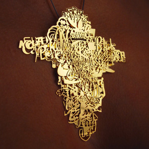
 HOLLA HOLLA [bling bling medallion*frankie t] what what?
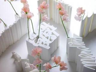
 SIGN IT ["signature thing" vase*f tjepkema] have your own signature hold your flowers!
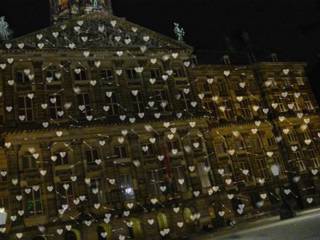
 WHAT A GIRL DREAMS OF [decorations for dutch royal wedding*frank tjepkema] a sky full of hearts and arrows, what more could you ask for?
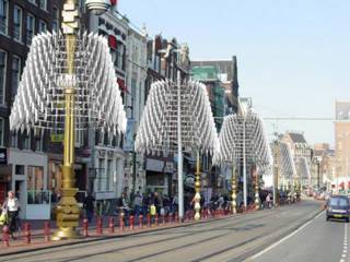
 WEDDING PARADE [more wedding decs*f tjepkema] for wedding day decorations...
 EAT THIS [edible logos for francois vatel*frank tjepkema] mmmm....good enough to eat!
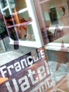
 COME ON IN [entrance to fv school*frank tjepkema] school's cool again...
Labels: artwork
ahh!
please excuse my blog today- blogger is completely messed up. ignore ignore! i can barely get rid of things that aren't even supposed to be up yet! damn!
d*s
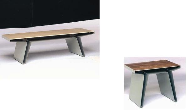
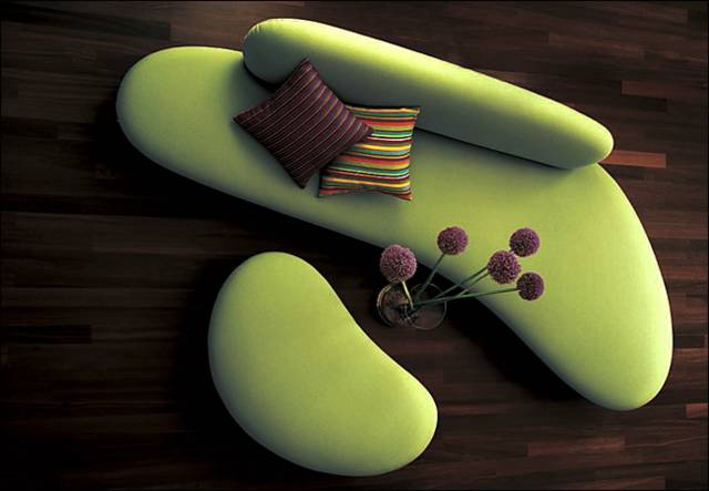
 ROHRLICH GOT IT RIGHT [noguchi free form sofa*vitra design museum] marianne is not always my favorite design writer, but i do like the feature she did this morning on curvy sofas. well, i at least like the noguchi sofa. i don't know where this picture came from but i love it. love it. yeah green sofas and yeah isamu noguchi! (that's for you coles...) more info at design within reach Labels: furniture
fell in love with a girl....
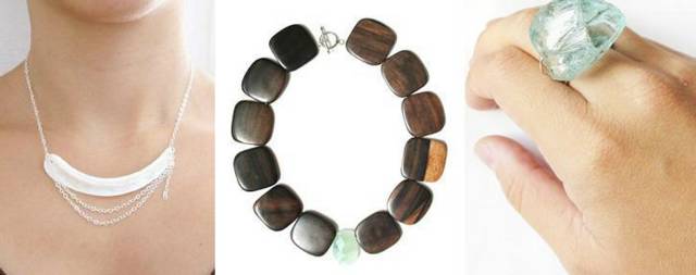
 thank you thank you thank you bryan boyer for turning me on to a great new designer (jewelry, that is) that is not ridiculously overpriced! bryan emailed me about his friend rena tom, so i decided to check her out and i'm so glad i did. rena's jewelry is just plain gorgeous. the materials match the design in their simple, raw elegance. kryptonite and wood mix beautifully with stones like chalcedony and ruby quartz, creating absolutely precious bracelets, earrings, necklaces and rings. now, i'm more of an earring/ring/necklace girl, but her peacock bracelet is really to die for (i'm keeping it in mind for upcoming christmas gifts for my family). for my money, the flag necklace and wooden necklace are the cutest, but you really can't go wrong with any of them. so, drop by rena's site and indulge in some beautiful fall jewelry. support local artists! (well, she just moved here, so it's local enough...)  GREEN WITH ENVY [necklace and bracelet*rena tom] rare plasma verisite stones and any girl's weakness, gorgeous green kryptonite
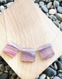
 PURDY GIRL [necklace, necklace and ring*rena tom] curve necklace made of mother of pearl, nature girl necklace made of ebony and green fluorite, mega ring
 LOVE IT [flag necklace*rena thom] gorgeous. gorgeous.
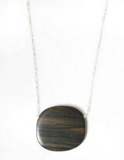
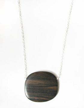
 TREE HUGGER [necklace*rena tom] ebony and sterling silver. so pretty...
 BETTER AND BETTER [custom invites*rena tom] AND she makes custom cards and paper goods!
 LADY BIRD [peacock bracelet*rena tom] if i wore bracelets, i'd wear this one in a heartbeat...
Labels: accessories
 IT'S ABOUT TIME [george nelson table clocks*vitra] vitra decided it was about time (i know, i know, painful...) to reissue some more george nelson clocks, so here they are...table clocks from the early fifties that are so cute it's hard to pick a favorite. well, maybe not. i like the chronopak clock (bottom left) the best. they run between $250 and $350 and will be in vitra stores sooooon. call 888-278-2855 for additional retailers or just shoot me an email, the firm i work for reps them currently. *clockwise from top left (pill clock, night clock, watermelon clock and chronopak clock) Labels: accessories
 JURY'S OUT...[shu uemura oils*ai yamaguchi] these limited edition bottles (home to shu uemura's oil face washes) designed by japanese artist ai yamaguchi kinda freak me out. my initial reaction was "oooh..cool!" but then i looked closer. their eyes kinda weird me out. what do you guys think....freaky or fabulous? Labels: graphic design, miscellaneous
 SIGN THIS [american sign museum*cincinatti] i've always loved signs and now, guess what? there's an american sign museum in ohio that just opened in october! hooray! so, if you're in the cincinatti area, head on over and check out some of america's iconic signage past... Labels: miscellaneous
 I LIKE THIS THING [surface*new deal design] it's one of those days...you know, the kind where you wish you'd stayed in bed? because of that i just feel like posting things i think are cool today. so there. this weird wall art slash clock thingy is from new deal design (makers of a slick looking, ipod-like cd player available at target). i'm not quite sure how practical it is and i'm having a hard time finding specs, but today kinda sucks so, oh well. i'll find them later. Labels: artwork
 I HEART I.D. [i.d. magazine*i love it] did i forget to mention how much i love i.d. magazine? i can't get enough of them. here, go see them. they're the greatest. this month's issue is exploring a whole host of new ideas involving increasingly dangerous environmental conditions. geez i love these guys. and to top it off, these guys are the sister mag to HOW and PRINT. how cool is that? ok, end gushing and commence today's new posts.... Labels: miscellaneous
oh, canada!
 maybe it's all the ac newman. maybe it's the cold, dreary weather enveloping new york. either way, my mind is drifting north this morning- way north. as in, canada. as if there wasn't enough great stuff coming out of that country, we design-minded folks have another reason to pay attention to our neighbors up north- a phenomenal design project known simply as cabin. created as a collaborative project between artists and designers, (who work under the name mother) cabin seeks to "write the story of canadian culture" through their work. the story they tell is full of frosty canadian symbolism- tales told on wallpaper and textiles conjure up images of deer, mounties, cuckoo clocks, bears and of course, cabins. bowls made of logs, wallpaper designed to look like cabin walls and utensils made of axe handles cement cabin's idea of traditional canadian culture in the contemporary design world. besides capitalizing on the popularity of graphic art in the design world, the cabin project takes dead aim on a seemingly untouched niche in the design world- canadian heritage. while it might not sound riveting at first, the infusion of traditional canadian imagery into furniture, textile and product design has lead to some really spectacular products and a sense of pride in one's culture that i admire to no end. there is a feeling of admiration for and honor of canada's history present in the collection and that is what makes it so special to me. in addition, i can't remember the last time i looked at a group's work and liked every single piece. i like practically every design on their site. i highly recommend you stop by and check it out- it's worth the time and, well, they have a flash site so i can't get all the pictures off for you! here are just a few designs that caught my eye...  REMEMBER THIS [memory wallpaper*cynthia hathaway] cabin paper for urbanites. cynthia's designs for mother's cabin project. (credit where credit is due- paul over at metropolis snagged this earlier...)
 SPLINTER TEETH [log bowls*loyal loot collective] the ladies of loyal loot contribute to the cabin craze in the earthiest of ways...
 GONE HUNTIN' [buddington bear rug*loyal loot collective] the ladies get morbid....and canadian
 CUT IT UP [axe handle utensils*mother] a nod to rustic canadian dining chic....
Labels: accessories, furniture
mmm...monday
 refreshed after a weekend in my home state and inspired by my morning subway read, i decided to check out the goods at environment337. located in lovely carroll gardens, e337 has some really great stuff that's too cool to pass up. so, in the words of ali g, check it:  CALL OF THE WILD [fauna animals*environment337] i think these are the greatest pillows. ever. really. i do. i am still reeling from the current animal print trend, but this is an animal trend i could get behind...
 HINT HINT [drop necklace*verre ny] for those of us with upcoming anniversaries (wink wink), pretty sparkly things are always nice....
 CARD FREAK [woodblock cards*environment337] why do i love cards so much? why do i love woodblock and prints so much? oh yeah, because that was my major in school....mmm...prints
 RUN THIS [flora runners*env337] gorgeous excuses to be like your mom and use a table runner. i always thought runners were sort of antiquated, or at least always reminded me of veranda magazine and my mom's holiday arrangements, but these are perfectly up to date. love them.
 MARVIS MADE [marvis toothpaste*italy via env337] on packaging alone, this toothpaste wins every contest i can think of. try it. let me know what you think.
Labels: accessories
 GOING HOME [design*sponge out of town until monday] the autumnal beauty of my home state is calling (and so are free home-cooked meals!) so i'm headed home to the 757 for some rest and relaxation. i'll be back on monday with updates and fresh design ideas from the south...should be a welcome change to my brooklyn-clogged mind. have a great weekend everyone!
 I LOVE COLE(S) [new contemporary collection*cole and son] mmmmm mmm...groovy printed wallpaper is always welcome in my book. yes, the trend might be close to overkill, but when it comes from royalty like this, you just can't say no. cole and son's "new contemporary" collection has been all over the place, from met home magazine and metropolis to the cover of time magazine's style issue. they've taken traditional patterns and given them a fresh look. my favorite? the plam leaves and pompeiian purple...so cool. from left to right: cow parsely, flamingos, rajupur, orchid, malabar, palm leaves, malabar, malabar, malabar, hick's hexagon, pompeiian and rajupur Labels: windows and walls
 GEN ART [gen does jeffersonville*tlc] everyone who's ever known me knows that i am a recovering trading spaces-aholic (i know, i know..). for a few years i worshipped at the altar of genevieve gorder and took inspiration from her insane projects on the show (moss wall anyone??) and re-designed anyone's dorm room i could get my hands on. now it seems the illustrious ms. gorder has been called upon by tlc to redo....wait...wait for it....AN ENTIRE TOWN! jeffersonville, a tiny affluent suburb in the catskills will be redone by ms. gorder (local baseball team uniforms and all...) during a one month shoot. now, i love gen as much as the next person, but what do you guys think about this?? metropolis did a big blurb on the show and i agree with the writer, the lovely ms. karrie jacbos- i'm all about the "social mission" of "town planning", but i'm not so sure the show isn't more "extreme makeover" than "social town planning". thoughts? more info can be found here... Labels: interior design
 RUFF STUFF [housepets fabric*donghia] it was love at first site...some lucky bum featured in house and garden this month had a gorgeous vintage hans wegner chair upholstered in donghia's oh-so-cute housepets fabric. i want it sooo soo badly. please? if this doesn't make you say "aww" then i don't think you're human. that's right- not human. Labels: textiles
queen of take-out
 deadline schmedline- lorena barrezueta is worth the wait. this brooklyn-based designer has what it takes to keep a notoriously impatient writer (me!) from giving up. i was anxious to talk with her the second i saw her designs at the future perfect and at this year's brooklyn designs show, my crush was confirmed. lorena barrezueta is the coolest. barrezueta has a degree in product design from parsons- and she knows how to use it. debuted this past spring, lorena's gourmet dishware collection is some of the most creative work i've seen in awhile. made of porcelain, slip
cast in the form of disposable, alluminum take-out containers, the collection is available in white porcelain, rimmed with gold leaf, or in a colorful array of bright glazes. (i bought a little, two-section number in a great spring green...it now houses my teeny tiny collection of nice jewelery the beauty of barrezueta's gourmet collection is in its concept- discovering and appreciating the beauty in what most people see as disposable, unimportant items. inspired by "tasteful kitch" and all things second hand, barrezueta designed a seventeen piece collection now available throughout the city and through her website, lorenabarrezueta.com the queen of everday gourmet sat down to answer some questions of mine over the past week or so- here are the highlights. enjoy! buy gourmet dishware! design*sponge: where does your inspiration come from? could you maybe tell me a little bit about your design process? lorena barrezuta: find inspiration it what others might consider to be ordinary. i also like questioning various forms of etiquette and social norms. my design process usually involves a lot of writing. i need to hash out three or four pages of emotional banter before i get to the basic idea of what i'm trying to address with my design. then there's a lot of prototyping, revising, obsessing and refining until i'm satisfied. music and laughter also play a HUGE part in my life as well as my work. design*sponge:tell us a little bit about yourself- where did you study, did you enjoy your experience in design school, were there any sort of movements or trends a foot at school that you think will be popular in the near future? lorena: i graduated from the product design department at parsons school of design. design school was challenging but i fortunately had some very close classmates that i really admired, respected and loved to laugh with which helped make the experience quite enjoyable. design*sponge: how involved are you in the design community? do you attend shows and design school events? or has running your own studio and producing this line taken up a lot of time? do you pour over design magazines for ideas and an idea of what's big in the market or are you more concerned with your own work? lorena: i like to be aware of what's out there but i don't care to obsess over anyone or anything. i'll attend a show or discussion here an there but i mostly like to focus on my own work. design*sponge: what's been the most difficult part of becoming a professional designer? what are your goals professionally- would you like to continue in a studio of your own or perhaps join up with other designers to form a company and do you plan to branch out to other mediums besides ceramics? lorena: the most difficult part about working on my own is that i do everything myself. that will eventually change as my company grows but it can sometimes get a bit overwhelming. i want to continue building my design company and eventually expand my product line to furniture, jewelry, handbags and more. i also would like to collaborate with other designers in the future. designsponge:what do you do in your spare time and do you have any favorite local stores where you feel great design is being represented? lorena: i really enjoy spending time with my boyfriend, close friends and family. i love dancing...a lot....and i actually don't go shopping very often. design*sponge:what are some of your favorite things in the design world right now? lorena: i enjoy the hands on quality of some of the work that i've seen recently. what disappoints me about design in general is the underlying pressure to constantly produce new product. i feel that this mentality doesn't really allow time for refinment of ideas and utimately stunts the quality of design and innovation. design*sponge: what would you like to see more of in the design world. this could be as broad or as general as you like.. lorena: i would like to see more quality and less quantity. design*sponge: lastly, just for fun- could you make a list of 5 things you can't live without? it can be anything, a dish, a band, a place or person, anything... lorena: i can't live without music, food, water, tissues, & all of my loved ones!  DISH IT UP [gourmet dishware*lorena barrezueta] the colored version....
 PORCELAIN PICNIC [gourmet dishware*lorena barrezueta] pure porcelain, pure genius.
 GOLDEN GIRL [gourmet dishware*lorena barrezueta] gold rimmed, for those who don't want to rough it too much...
Labels: ceramics, interviews
that's right, i'm partisan
sinclair is an evil evil media institution that must be stopped. whether you lean left or right, you should be outraged at the company's (a company that owns over 60 stations nation-wide, several in key swing states) plans to preempt regular programming on all of its stations to air a blatantly anti-john kerry documentary. despite your own feelings on john kerry, it is flat out WRONG to air a blatantly partisan film like this and label it a "news-event" in order to get out of FCC regulations that demand equal time (i wouldn't mind it so much if they decided to show, say, fahrenheit 911 at the same time). it's disgusting. revolting. and downright WRONG. josh marshall's blog has all the details on what you can do to stand up to evil evil sinclair media. first, do you live in a sinclair media zone? check here to see. if you do, or know someone who does, follow these steps: find the local advertisers on your sinclair station, write or call them and tell them you will no longer use their products, etc if they support this station's decision to air a blatantly partisan film. speak up. make your voice heard and standards of decency enforced. boo sinclair! xoxo, design*sponge
 HOORAY FOR TAKE OUT [gourmet dishware*lorena barrezueta] she's finally here...the long awaited interview with ms. gourmet dishware herself, lorena barrezueta, will be up tomorrow... until then, have a great night everybody... Labels: ceramics
take flight
 inspired by the streamlined forms of aviation and boatmaking design, james murphy is a man who knows good wood. his flight deck table (one of the winners of interior design's "future furniture" competition) is the product of simple, beautiful design combined with the best materials and detailed, handcrafted construction. but flight deck is only one of many pieces designed by murphy that reflects a love of quality over a desire for mass production. handcrafted and made of only the finest materials, murphy's furniture represents a purity of design that comes only with furniture dedicated to the natural state of its material. this is what i love about these pieces the most- the way they let the materials shine. murphy didn't feel the need to mess around with the design or complicate it with detailed decoration and fancy joinery- he let the wood speak for itself. and if you look at the american walnut and cherry he uses, you can see why these pieces deserve to be noticed. in essence- murphy's designs are gorgeous pieces (my favorite? it's a tie between the wing shelf and flight deck...) handcrafted out of the finest materials and committed to showcasing the beauty of wood in its natural state. these no fuss pieces would be elegant additions to any new york (or non-new york) apartment. you can find more information on james and his designs at jamesmurphydesign.com  WING IT [wing shelf*james murphy] simply beautiful
 FLY ME AWAY [flight deck*james murphy] gorgeous, gorgeous.
 CROSS MY HEART [cross table*james murphy] asian inspired wood brilliance
Labels: furniture
toast this
 hysterical. hysterical. too funny for words. go look now. please. Labels: miscellaneous
earth tones
 among my minor obsessions is a preoccupation with sheets that are comfy but cool. i was waiting for someone to design the perfect bedding for me and it seems that the girls over at amenity heard my call. their debut line of bedding, available in three patterns, instantly made it onto my pre-christmas wish list. la based designers nicole chiala and kristina de corpo set out to design, "beautiful, yet useful, everyday objects of high quality that reflect the warmth and beauty of nature." well, ladies, i'd say mission accomplished. manufactured in california, these sunny duvets and shams come in three patterns: drift (a graphic thistle print), twig and leaf. equally appealing in their simplistic beauty, amenity's patterns make a graceful statement that brings the allure of nature into your home- without having to go all hippy on you. prices are moderate to high (check amenity's website for purchase info) but worth the cost- these elegant designs capture the essence of nature and managed to translate it into beautiful designs for even more beautiful bedding.  DRIFT AWAY [drift in cocoa*amenity] man i need a nap
 STICKS IN MY BED [twig bedding in cream*amenity]
 LEAFY DREAMS [leaf bedding in cream*amenity]&
Labels: textiles
 I HEART ARCHINECT [archinect.com] do you? i do, because they just published one of my stories on 2x4, my favorite group of graphic designers. read on... Labels: graphic design, miscellaneous
bleh....
i hate to start monday with a gripe, but i've got a lot to say today. i feel like jerri on strangers with candy (a show my lovely rock the voter was on...)- desperate to stand up with my hands in the air and scream... "I'VE GOT SOMETHIN TO SAAAAAAAAY!". but thankfully, this medium prevents the sort of aural damage that would ensue, were i to rant and rave to my heart's content. so anyway, first thing's first. why is the new york times so boring? i know they don't publish things until they're already established, but why must that be so painfully obvious (in the realm of style, no political talk for today...)?? geez- the times is running their T magazine now, a look at design and style from the times' perspective and i'm about to fall asleep just thinking about it. granted, one of the companies i work for got more than generous coverage in it, i thought the whole thing was a veritable snooze-fest. case in point- modern baroque. aaaarrrrgh! i know i wrote about it too, and not that long ago, but for some reason i'm tired of hearing about it. eesh. next trend, please. while the photography in T is lurvely (and bonus points if you can name the movie that references*), i have a hard time getting through it without creating my own al gore-ish symphony of sighs. it's just boring. bo-ring. what's even worse is that the team of writers at T magazine is soooo nice. i've mingled with the editors at a few recent nausea-inducing schmooze-fests (i am horribly ill-suited for my current day job)and they were lovely. i've even spoken to them about up-and-coming designers but it seems they take the safe route every time. in some respect i guess i should shut up because a) they clearly are talented people with enough insight to work for the new york times and b) i have no idea what's it like to have to please a national audience and a publisher at the same time. so, perhaps i'll mark my rant down to: moderately displeased. either way, this is the first of the day. i'll write some more as soon as i managed to dig up some (late) breakfast and refuel.... *psst...if you don't know what movie has the word "lurve" in it, here's the answer. Labels: miscellaneous
dead like me
 sooooo, rumor has it that graffiti artist dalek (not to be confused with the equally artsy dalek) is about as exhausted as i am. through the (incredibly dorky) grapevine of design geeks like me, i got the scoop: apparently, after his venture (albeit a brief one) into product design (or rather, adding his designs to already created products), dalek is OUT. i guess it just wasn't his thing, or maybe it wasn't edgy enough. either way, word is that cereal art, who distributes his skateboard deck designs, toys and shower curtains (yes, shower curtains), pushed him to put his crazy little space monkeys onto everything. now, this is clearly a rumor-mill by-product, but to me, it seems pretty possible. street artist turned hip product designer isn't really a huge stretch, but the few times i've seem him (at an art show and in person, creating a wall mural in brooklyn), he seems pretty dedicated to himself, and only himself. and i don't think that's necessarily a bad thing. maybe having his mug (or at least his recognizable designs) on a nationally distributed product was a little too un-cool. who knows. either way, could be the end to space monkey shower curtains. me? i think he should stick to graffiti murals, weird kid robot-type figurines and bein well, street. if you ARE interested in an artist that didn't have a problem selling out street for the biz, check out stephen sprouse's collection for knolltextiles. there's no doubt he was a genius, but something about his work with diesel just pissed me off. it's so NOT street culture. he WAS street culture (albeit glam punk street culture). but in the end he sorta sold out for faux street and faux punk. oh well...i'd still upholster my chairs in graffiti camo if i could get my hands on enough (you'd think the day job would have more perks....) have a great weekend you guys, back on monday with the much talked about interview with gourmet dish goddess herself, lorena barrenzeuta, a piece about flat-pack design and well, the rest will have to be a surprise.  MONKEY SEE... [space monkey*dalek]
 MORE [more space monkeys*dalek] too cool for product design?
 THE MAN HIMSELF [hard at work*dalek] workin for no one but himself. yeah, son.
 INK [drawRing*dalek] sans color, still cool
Labels: artwork
 I NEED A DRINK [design*sponge] i hate it when fridays feel like mondays. the day job is wretched (although i do have a lovely lunch date at spice market....mmm) so i will have to post friday's musings after 3 or so. check back later for my thoughts on dalek and his venture into product design... Labels: accessories
from the slums of shaolin...or clapham
 donna wilson's got flow. or flo, rather. the british designer's latest work with uk collective flo is a girly masterpiece that brings a feminine, decorative flair to the world of home accessories. donna's doyley rug may have used its feminine charm to win me over but, considering it's made out of my material-of-the-moment, felt, it was an easy sell. constructed of gorgeous wool felt and embellished with beautiful cut-out, doily-esque patterns, wilson's doyley rug is another example of the creative possibilities found in felt. for me, it's just one of those pieces that i loved right off the bat. it's cute, intricate and simple at the same time. win, win and win. along with designers from team absolute zero degrees, flo and donna wilson have put together a small collection of wonderfully lady-like but universally appealing accessories for flo (available at the placesandspaces showroom in london) that i think deserve a little extra attention. wilson's friends over at absolute zero degrees created two new wallpaper and textile designs for flo that bring great decorative patterns to the wall. granted, the graphic wallpaper trend isn't exactly brand spankin new, but i think theirs is a worthy addition to the bunch. my favorite is the swallow pattern, reminiscent of blik's fly decals (why are swallows just that cool?), but their bee pattern is equally appealing, especially in the clay/light blue colorway they chose. absolute zero's swallow and bee patterns, along with wilson's doyley rug, represent a sort of delicate, decorative style that i love for its inherent femininity. but despite the fact that i cling to the girly-ness of the doyley and absolute zero designs, their work is far from exclusionary (even if one of the patterns is composed of bees and butterflies...). their nods to delicate graphic patterns fit in with current trends in both wallpaper and furniture. so, don't be afraid boys, these girls made butterflies, bees, doilies and birds cool enough that we could all enjoy them.  GIRLY RUGS RULE [doyley rug*donna wilson for flo] a little bit of etiquette for your floors
 BUGS ARE FOR GIRLS [bees print*absolute zero degrees for flo] butterflies and bees make for a perfect pattern
 BIRDS BIRDS BIRDS [swallow print*absolute zero design for flo] also available in rust and black, as seen above
Labels: windows and walls
first lady of art direction: deanne cheuk
 i am a self-professed tokion addict. since day one, i've been a loyal fan, follower and devotee, drawn in by its devotion to phenomenally creative layout design. while such a commitment to aesthetic can easily create a case of all sizzle and no steak- tokion manages to rise above the fray and publish one of the most beautiful magazines out there- with truly great content to match. heavy on both style and substance, it knows no equal in my book. and behind all of this creativity is deanne cheuk, art director extraordinaire. few publications show such a passion for layout design and i have ms. cheuk to thank for tokion's untouchable graphic prowess. the magnitude of deanne's talent and work ethic cannot be overestimated- if you haven't seen the current (oct 04) issue of tokion, go grab one right now- her work speaks for itself. inside this month's issue she has painstakingly laid out each article's title in string. yes, string (my scanner is refusing to perform today, so i will post pictures of the string titles as soon as humanly possible). this sort of dedication to unique ideas is something that makes ms. cheuk's work stand out as a cut above the rest. along with contributing artists like misty keasler, nancy barr and kate orne, ms. cheuk provides tokion with the consistent visual punch that allow it to exist unsurpassed in its field. ms. cheuk was nice enough to take time out of her very busy schedule (she also publishes her own magazine, MU, which is equally gorgeous) to speak with me about her work at tokion (and her opinion of the design scene in general). here are some highlights. enjoy:: design*sponge:: what do you think tokion brings to the magazine world that was missing from it before? deanne cheuk:: from a design point of view, i think the design of tokion is very free and fun. i don't use standard fonts for titles and most are either hand drawn or laboriously constructed out of string or painted with watercolor or drawn with dots or anything else that can take days at a time for one title. no other magazine would ever spend that much time on a title! design*sponge:: with so many arts magazines in the industry, what drew you to tokion? what about tokion is so special in your opinion? deanne cheuk:: tokion is the magazine i have been art directing for the past 14 issues. it is special to me as the publisher gives me the freedom to do what i want to with the design, which is very important to me with all my work. i also really love the stories and subjects they choose to follow. design*sponge:: are there any magazines you think deserve more attention than they current receive for things like design, layout and commitment to creative aesthetics? deanne cheuk:: i think america magazine is really great. i love what they are doing with their printing [foiling the edges of the pages]. design*sponge:: is there anything missing from the design world you'd like to see more of? deanne cheuk:: more originality! there isn't enough of it and there can never be too much of it!  SHE'S MY STAR [string title*tokion] geez, can you even fathom how long this would take for an entire magazine full of STRING titles. i can't even describe how much i love it.
 ZEBRA CHIC [article title*tokion] nuff said. look at it. i mean, come on.
 WATERCOLOR PLAY [game review title*tokion] she even made tiny watercolors and dotted titles. so cool.
 QUEEN OF TITLES [king of art title*tokion] deanne's amazing work with watercolor titles
 COLORED PENCIL PRINCESS [page layout*tokion] she's a wiz with crayons and pencils
 FUNGI LADY [fungi girl piece*deanne cheuk] from miss cheuk's website and soon to be released book
Labels: graphic design
teensy pause in ladies' week...
 i just wanted to take a quick time out and thank everyone for your comments and emails. hearing everyone's different opinions (especially you, miss r) on things i've written is great. thanks for keeping me on my toes and giving props where props are due (and rants where rants are due). my ideas are always changing and insight from different perspectives is always welcome. it's great to hear from students and designers alike- your thoughts mean a lot to me and i look forward to hearing more of them. i'm proud to flip and flop with the best of em (lookin at you kerry...) and i think having an open mind to new ideas and even upending some of your own firmly grounded opinions is the best way to be, so i look forward to comments, challenges, kudos and more from everyone. thanks again for stopping by and don't forget- got stuff you wanna see? more reviews? more pictures? lemme know! i'm always open to places, people and trends that i haven't caught onto yet). xoxo, design*sponge and now...on to the ladies of tokion
hey ladies in the place i'm callin out to ya
 in what i'm declaring "ladies week"! i will proudly cover several local and not-so-local lady artists and designers. drool over kirsten while i prepare my report on the oh-so-lovely deanne cheuk of tokion. mmm...tokion. and go see missy, why don't ya! she's the best and she's my friend. Labels: artwork, graphic design
ulve love: the joy of kirsten ulve
 this piece started out intending to delve deep into the world of contemporary stationery design, as i'm something of a letter freak (despite the fact that, as of late, my actual letter writing has been rather scant). when i was in school i horded stationery and all the trappings of correspondence, obsessed with page design and layout on such a small scale. nowadays i seem to have lost the time for letter writing and actual communication vis-a-vis the grand old united states postal service. but all that changed when i found kirsten ulve. wandering aimlessly down fifth avenue (brooklyn that is, not manhattan) the other week i popped into scaredy kat, one of the greatest card stores in the world. looking for hip yet respectable thank you cards for the day job, i found a pack of snail mail stationery by kirsten ulve that was begging to be purchased. i snatched it up and promptly sent it off to all of my dearest girlfriends along with super cute buttons from smart women vote. while everyone loved the buttons, they were all dying to know about the stationery- and so was i. after pouring over everything i could find about her on the internet, i discovered kirsten ulve couldn't be relegated to being one of many in a stationery article, but needed to have her own piece. (i also discovered she gets insanely excited about seeing animals on nyc streets, much like i do. therefore, she must be great) a graduate of the university of iowa (bfa drawing + ba graphic design), ms. ulve works in character design, editorial illustration, fashion illustration, children's illustrations, illustration for animation, advertising, and corporate identity. whew. all of her illustrations are done by hand and later retouched by adobe illustrator. with a client roster that includes nickelodeon (nick at nite promos), entertainment weekly (celebrity caricatures), rolling stone and mattel, kirsten is a busy lady. her work has a sort of 50's aesthetic to it, but can range from retro to ultra-contemporary with an air of japanimation. but all labels aside, her work speaks for itself. you can see her full archive of illustrations on her website or listen to her speak with artbeatstreet.com here. while her snail mail stationery continues to get me moving to and from the post office, her individual illustrations are strong enough to be works of art themselves. so go ahead, grab a pack of stationery and send someone a letter- everyone loves real mail and everyone should love kirsten ulve. oh, and if you're too greedy to send them out, do what i do- take each page and frame it, perfect for kids' rooms or fun bathroom art.  BOX FULL OF LETTERS [snail mail stationery*kirsten ulve] the letters that started it all...bonus points if you know what band this caption references!
 SWAN SONG [bjork caricature*kirsten ulve, editorial] the queen of icelandic pop, ala kirsten.
 ORANGE YOU GLAD? [orange alert*print by kirsten ulve]
 UNO DOS TRES [uno branding*kirsten ulve] the lady made uno hip. come on now...that's cool.
 CITY CHICK [soho grand advert*kirsten ulve] queen of urban girl cool.
Labels: artwork, graphic design
disappointment design: firstop 2004
 i hate to admit it, but brooklyn let me down. the design community here has always kept me on my toes, wanting for nothing in the way of great, innovative design- but this weekend things were different. with the exception of a few studios, this weekend's firstop design festival in williamsburg was a lackluster display of disjointed themes, designs and trends. a few interesting patterns emerged, but for the most part i was left wishing i'd taken a more leisurely brunch at relish with my favorite politico. porcelain mockups of "throwaway" consumer products were everywhere. along with bent ply (ugh), porcelain casts of everything from styrofoam cups to hostess cupcakes lined the shelves of williamsburg studios and stores alike. the trend wasn't entirely without merit, but was so overwhelming that i fear i'm already behind in declaring it painfully overexposed. miri mizrahi's porcelain "styrofoam" cups at the future perfect were cute, but a bit tiring after awhile. light-hearted pieces like jason miller's porcelain hostess cupcake were amusing, but to me, signify the end of the trend. i mean, do we really need a porcelain version of everything? after awhile it just feels like overpriced tchotchke. (i'm aware that lorena barrezueta's gourmet dish collection at the future perfect is also one of the products of porcelain mania, but i find her works have less to do with kitsch that they do with art or, at the very least, functional pieces of dishware.) silver and gold were still a hit (see piet houtenberg's grenade oil lamps at the future perfect), but in the end the stand out pieces weren't part of a larger trend you could feel throughout the event. (i understand the show didn't have to have a unified trend, but what i would have liked to feel was a sense that all of the designers were taking bold new steps in interesting directions. perhaps this was poor timing on the show's part, but to me it felt as if the designer's just weren't hitting their marks yet). on an up-note, the emergence of felt as a key element in design schools is starting to spread to brooklyn and i'm pleased to say this trend has endless possibilities and a wide range of creative implications. not jut felt but recycled fabrics, paper products and eco-friendly design materials seemed to be just below the surface at firstop. bettencourt wood's green building ideas (also seen in their scrapile line by colleen smiley) were a welcome change and one i hope continues to grow. also, on a totally unrelated note, matt dilling's neon chandelier at the future perfect was fantastic. dilling works at lite brite neon which has quite an impressive portfolio and list of clientele. all in all, this past summer's living spaces show in williamsburg was the better showing of brooklyn talent. in spite of this weekend's blah showing, i'm not giving up on my home turf- and hope you guys don't either. keep your eyes on stores like citizen-citizen, the future perfect and the yarn tree for brooklyn brilliance, it's bound to happen soon and i think this show was simply the result of poor timing.  LITE BRITE [neon chandelier*matt dilling] matt dilling is a neon god. check out his website and see why.
 MORE? [porcelain styrofoam cups*miri mizrahi] cute but sort of eh? porcelain cast styrofoam cups.
 FELT UP [recycled felt chair*bettencourt wood] a sign of things to come...i hope
 MORE PLEASE [felt cushioned crate stool*future perfect] i'd like more of this, although less gray and orange, please.
 TIME FOR FELT [felt clocks*yayo designs] felt clox. nuff said.
 SILVER AND GOLD AGAIN [grenade oil lamps*piet houtenbos] metallic faux-grenades at the furture perfect.
 WAX COOL [all wax candles*citizen:citizen] they melt all the way down. so cool.
 ECO WOOD [table and chair set*bettencourt wood] gorgeous wood. comfort judges are still out...
Labels: design shows
i almost forgot...
 IF ONLY I HAD THE MONEY [creativity now conference*tokion magazine] in the battle bewteen free and entry fee, free almost always wins in my world. so, entry fee, you have been trumped by the age old allure of a free design show in williamsburg. i practically worship tokion's design and layout editors, so it with great dismay that i will not be attending this year's spectacular creativity now conference. but that doesn't mean you shouldn't go. so go. now. that means you.
i'm exhausted
 it's starting to get colder here in new york and my southern disposition is taking awhile to catch up. so, i'll be back on monday with fresh stories, fresh ideas and most of all fresh takes on everything i see this weekend at firstop in brooklyn. if you don't already have plans to, head over to williamsburg and check out the local talent. firstop's website has maps, times and participant info so you have no excuse! until then, i'll be catching up on some much needed sleep, checking out i heart huckabees with my favorite rock the vote-er and getting ready for next week's news. COMING UP: an interview with gourmet dishware goddess, lorena barrezueta and an exploration into the world of kirsten ulve and contemporary stationery design. have a great weekend! and if you're starved for design coverage, don't forget to check out core77, mocoloco, treehugger, designaddict, designboom and reluct.
|
 |
 |
 |
 |
|
|