Enter your Email


Powered by FeedBlitz
 

28.2.05

jon forsythe

JOHN 4

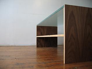
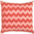
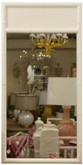
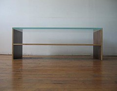
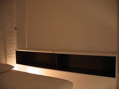
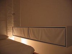
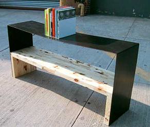
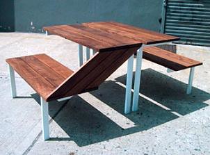
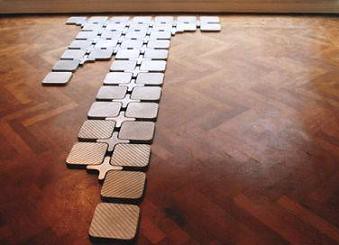
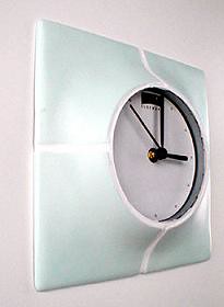
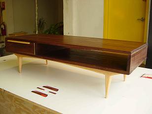
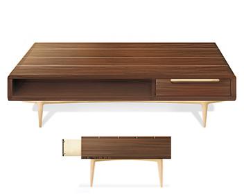
i held off on entering jon in the diy contest- i thought he would be a bit of a ringer, in the sense that he's already an architect and clearly has an eye for design in a professional sense. that said, it doesn't make his work any less amazing. i love jon's work the way i love calvin klein's work from the early 90's- it's minimalist, stylish, sleek and modern. you can't go wrong with any of those adjectives, so clearly you can't go wrong with jon's work. he's just now expanding the firm to cover design in a non-architecture sense so there's no website yet. but you can contact jon here for more info. keep up the great work, jon. can't wait to see where it all goes.

ps: i have to go through a battery of icky medical tests today so i'm out of the office. i'll be back posting tomorrow. have a wonderful day and thank you again to all those who entered the diy contest!

JOHN 3

JOHN 2

JOHN 1

Labels:

the small object

gmail-1

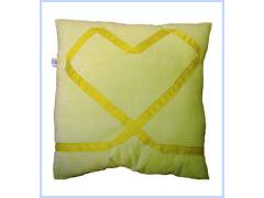
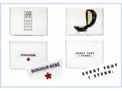
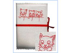
sara from the small object makes the cutest stuff that i couldn't bear to leave out. i'm in love with her cute cards that apologize for being a "stinker". oh, and that great yellow ribbon heart pillow. too cute. sara has a whole little cottage industry going so check her out and support a wonderful indie artist. hooray for craftsters!

gmail-3

gmail

Labels:

poster boy

gmail-6

i've had these sittin in my "to post" folder forever- no idea why i waited until now. whoops.

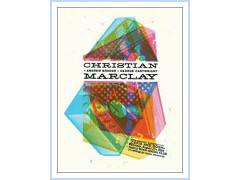
i've always been into rock posters so these were no exception. aesthetic apparatus designs posters for a whole slew of artists- i especially love these from rjd2 and christian marclay shows. very cool. check out more aesthetic apparatus work here. enjoy...

gmail-7

Labels: ,

WINNERS!

well, the results are in, the votes have been tallied and your d*s diy contest winners are posted below. i can't stress how much i enjoyed this competition- i want to thank all of you who participated, from the very bottom of my heart. you overwhelmingly confirmed my suspicions that there was a well of untapped talent out there. so, my hat is off to all of you- it is because of people like you that i do this- i love to share all of the wonderful talent that's out there, so without further ado, here are your winners according to category.

  • FURNITURE!

    my first love, the category nearest and dearest to my heart, furniture was the part of the contest i was most excited about- and i was far from dissapointed. you guys turned out in droves and i was so thrilled to see such enthusiastic and creative responses. so, here are your winners. enjoy...
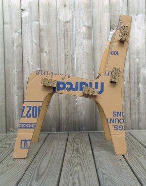
    cardboard chair
    FIRST PLACE [cardboard chair by nick tretiak] this chair was a clear favorite for me for one simple reason: this chair represents to me, the essence of design: a problem solving process that creates something that is both functional and beautiful. nick, an id student at rit, was short on cash but long on supply scraps, so he created something that combined function and form beautifully. i even love the way the graphic of the brand logo works with the design. this is design at in its most basic form and i wanted to celebrate it. so, congrats nick, great work.
    anna
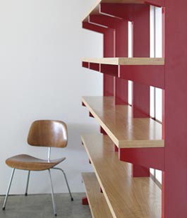
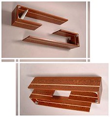
    2ND PLACE [shelves anna nicholson]anna's shelves are something i wish i could just whip up if i had the time. gorgeous, simple and functional, these shelves are the sort of thing i'm surprised hasn't already been picked up by a manufacturer. great work, anna. keep it up!
    peter
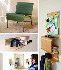
    3RD PLACE [skifta mobller by peter hanchak] third place goes to brooklynite, peter hanchak (who i just realized i went on a blind date with before the days of ac. small world). his collection incorporates a subtly interactive material in each piece. ex: the chair features a thermochromic heat sensitive surface that creates a series of "memories" showing where the user sat and how they moved about on the chair. cool stuff, only reason it was third is because im kinda tired of bent ply. sorry. great stuff, peter.
    LLANA
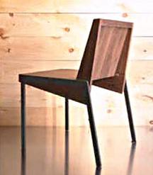
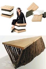
    HONORABLE MENTION(S) [smor chair by ilana and wooden bench by nick tretiak] i love both of these for their whimsy and creativity. definitely worth the honorable mention...

  • PRODUCT

    this was a tough category for me bc i couldn't decide if some pieces should be in product or "other" so, sorry if it bugs anyone. i made these choices so i could showcase as many people as possible.
    birdies
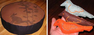
    FIRST PLACE [pet products by mary] mary was turned in by her significant other and i'm so glad she was. i'm a sucker for pet-centric design so it's no surprise this was my favorite. i love what talented people can do with an idea and some spare time. these dog beds are great and the catnip toys are even cuter. way to go, mary!
    JENN 1
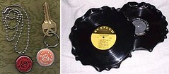
    2ND PLACE [key chains and record platters by jenn] while i've seen similar platters on the market already, i like the style of these much more. the others have sort of harsh edges. while both of these products are simple and straight forward i think that they represent diy design well- plus they reuse existing materials, which is always a bonus in my opinion. great job, jenn!

    CHRIS 1
    THIRD PLACE [external ipod charger by chris diclarico] i almost didn't put this one in because it's gotten so much attention already (next time please don't send me stuff that's been all over the internet already), but i had to admit it's cool.

  • JEWELRY!

    i'll have to admit i was a bit underwhelmed in this category, but i found two entries that definitely stood out from the rest. check em out and enjoy...
    hable 1
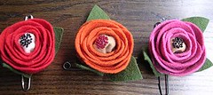
    FIRST PLACE [rose pins by llubav obando choy] llubav works for hable construction (love them!) and designs these adorable rose pins inspired by her nature peru. i think they're the perfect combination of dainty and elegant. you can contact llubav here.
    MANCHE
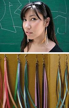
    SECOND PLACE [ear candy by manchester and hue] manchester and hue make the cutest earrings. founded by christie and brie, this company makes fantastic jewelry. but more interestingly, their turnons include chivalry and crosstown buses, while they're turnoffs are black socks. ick.

  • GRAPHIC/PAPER!

    i created this category because the best entries were all paper products. so, hence, your graphic winners are as follows...
    ballsdropping
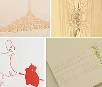
    FIRST PLACE [cards by pancake and franks] i love these cards. enough said. the wood grain and the heart are fantastic.
    saturate2
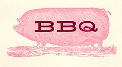
    SECOND PLACE [cards by saturate design] i know i know, i've talked about kate before, but i love her work. i don't exactly love the idea of animals as food, but you know, it's a cute design. there are plenty of others to choose from. great job, kate!
    IPXEL 2
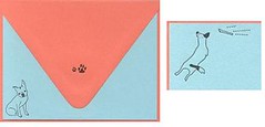
    THIRD PLACE [pet cards from pixel and floyd] i love pixel and floyd. adorable handmade cards with a pet theme. too cute. i especially love that image of the dog jumping in the air.

  • OTHER!

    this category is a mixed bag, some stuff might be a better fit for the product category, but it worked out that i could showcase more people this way. so, enjoy your other catgory winners!
    all seth clocks
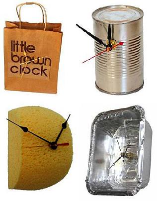
    FIRST PLACE [clocks by seth] i think these clocks are hysterical. they embody diy design. i'm especially fond of the little brown clock. too cute. makes you feel like design in within your reach (no pun intended) and anyone could make them. i love it. but didn't like the thinly veiled pickup attempt in seth's email. shame shame, seth.
    JESSICA 2
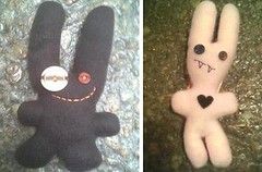
    SECOND PLACE [felt buddies by jessica] i love these. cute and a perfect fit for the "other" title. oh, and jessica likes noodles and cake. yum.
    DCP_7531
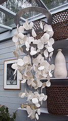
    THIRD PLACE [porcelain chandelier by karen] karen is a swedish designer who's got a ton of talent. i love this porcelain disc chandelier, it's elegant and dangly and that's fantastic. what's also fantastic? karen is an american tv addict and she loves desperate housewives. lol. awesome. thanks, karen!
    recordbox2ENID
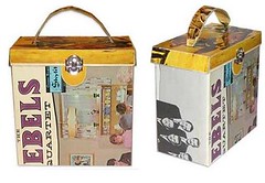
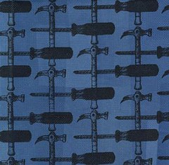
    HONORABLE MENTION(S)[record boxed by walt and tool textile from enid] these guys deserve a nod for their hard work. i love walt's dedication to creating a home for his records out only record material (do you think that freaks the records out? to be housed in their own skin? eek) and enid's cool graphic tool pattern. two great designs that certainly earned their honorable mention. great job guys!

    THANKS TO EVERYONE WHO ENTERED- I WAS SO HONORED THAT YOU ALL TOOK THE TIME TO ENTER. KEEP UP THE GREAT WORK! ALL MY LOVE AND ADMIRATION, D*S

    Labels:

  • 25.2.05

    lite brite neon to the rescue!

    img_3748

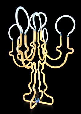
    just when i think i'm about to die of a)boredom b)the winter doldrums and c)suffering from a crappy week, lite brite neon comes along to cheer me up with their bright new additions to the lighting world. not content to rest on their neon laurels (check their neon chandies from last year), matt dilling and co. have designed a new table light that evokes the baroque in such a modern, electric way. they're still in proto form but you can always contact matt here and get more info- they're always willing to build if there's a demand. you can find more info on lite brite neon here. enjoy!

    editor's note: i have a scoop that lite brite neon is going to soon be the darling of the ny times style mag...i'll be sure to post the exclusive right before the pub date.

    Labels:

    hooray for hive!

    pic_tier

    hiveminddesign is a brooklyn based design collective that i've been dying to post about for some time. their website was in constant construction and it's finally up with some pictures of their new work. hooray! these guys are amazingly talented and i was blown away when i saw them at last year's brooklyn designs show. sigh, i love brooklyn design.

    hiveminddesign's furniture is beautiful in its simplicity and dedication to the highest level of quality. they work with beautiful materials and manage to find the best way to make each specific material shine within a piece. i'm rather partial to their initial hit- the honeycomb looking space dividing unit- but i'm also a new fan of their crux system- a walnut veneer storage system that, if i had the space, i would love to have. you can find more info on hiveminddesign here. have a wonderful weekend everyone!!

    DON'T FORGET TO ENTER THE DIY CONTEST! TODAY'S THE LAST DAY FOR ENTRIES!! DETAILS HERE.

    pic_campaign

    pic_bowtable

    pic_cygnet

    Labels:

    hit the floor

    akrol08

    i'm in love with this floor tiling system. well, i'm assuming it's a floor tiling system. i'm waiting to hear back from vivid about it, as there's very little info on the website. i don't normally post things when i'm still waiting on info but, you guy know me, i'm horribly impatient and wanted to post it anyway- i'll update it as soon as i get the extra details. this floor installation was designed by dutch designer aad krol for vivid and i think it could certainly be produced in quantities large enough to cover a small room or heck- even a big room! you can see more of aad's work here and find more info on vivid here. i'll let you know when i get info on purchasing, etc etc.

    Labels:

    elseware

    clock

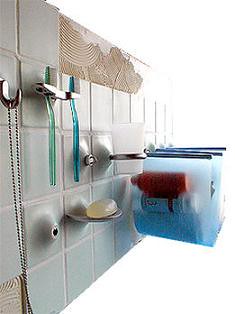
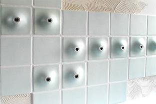
    elseware is a brooklyn based industrial design collective that makes one heck of a cool tiling system. if you're like me and positively loathe those weird suction cup things that you have to use to stick anything to a tile bathroom, you'll get why this is so great. janet villano designed a really cool tiling system called massa that is comprised of tiles that each have a different accesory built into them. you can have a built in bud vase, soap dish, hook, towel holder, toothbrush holder or sling shelf. it's a pretty cool idea. of course you'll need to be able to tile a section of your bathroom, but if you are- oohwee is this a cool idea. click here for more info on janet's massa system and here for more info on the goods from elseware.

    tile system by janet villano

    tilesystem1

    Labels:

    24.2.05

    that's one hot piece of glass

    Various%20Orbix%20Vases

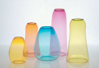
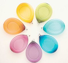
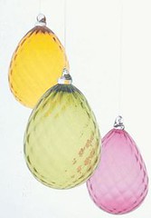
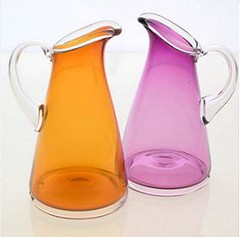
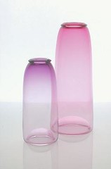
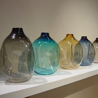
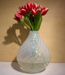
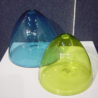
    thanks to ryan kundrat for always introducing me to cool new design things. ryan pointed out that if i like john pomp, i'll probably like orbix hot glass. and well, ryan you were right. not only to i love the shapes they design, but i love the color range as well. with offerings in both opaque and transparent styles, orbix provides a fantastic line of glassware that is just dying to be purchased and placed in your home. (not to mention orbix is based in good old alabama- yay south!). click here for more info on orbix and to see their entire gorgeous collection. thanks, ryan!

    Optic%20Tear%20Ornament

    Diamond%20Egg%20Ornaments

    Wrap%20Pitchers

    Stretch%20Vases

    Labels:

    pomp and glassblowing...

    square-vase-new

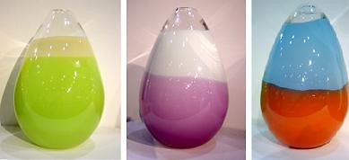
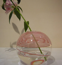
    john pomp is a fantastic glass designer based in my home turf of williamsburg, brooklyn. he's no stranger to great press, so i'm sure some of you may have seen his work before. but i figured i'd mention him anyway, because i love his work. pomp was trained in venetian glass techniques and his skills shine through in each unique piece. i'm rather fond of the egg shapes vases (see below) he makes with beautiful color bands, but you really can't pick an ugly piece. pomp's work is ALL over the place but you can click here to find a retailer near you. click here for more info on john pomp and click here for info on john's glassblowing studio, one sixty glass. enjoy...

    classic-bulb-opal

    egg-beige-green

    thread-new

    hive-new

    Labels:

    great goehl

    wood table at goert

    i saw this piece at firstop last year and took a picture thinking, man, i need to talk about this on the site! and the somehow i forgot. whoops.

    richard goehl is a williamsburg based risd grad who runs a small studio in my neighborhood. goehl's work strives to "bring out the beauty and elegance of wood" and i think he's done that pretty well. so far this is all i can grab in the way of pics, but you can contact richard here to get more info or pricing details.

    12_goehl

    Labels:

    re:bar

    rebarred

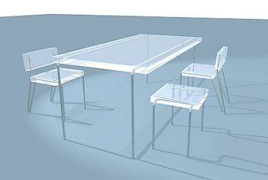
    i love this "rebarred" table and chair set from nydesignroom. they were shown at firstop 2003 in williamsburg, but i guess i missed them. available in a limited quantity, rebarred is a beautiful example of how amazing rebars and cast resin can look together. i wish i could afford them. they would look so sick in my kitchen. ah, to dream. you can contact nydesignroom for more info and to see the rest of their collection. or, if you're in the 'burg, stop by their showroom at 339 bedford ave (take the L to bedford ave).

    Labels:

    stick em' lights

    sticky lamp 2001

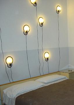
    wouldn't it be cool if you could just place your lights wherever you wanted on your wall like a sticker? well, now you can. dutch designer chris kabel designed these "sticky lights" for driade in 2003. i just found them and think that they serve an interesting purpose, although i'm not so keen on the bare bulb look. but the idea of sticky lights is fantastic. would love to see someone expand on this with more attractive lighting...let me know if you've seen some! click here for more info on chris kabel.

    Labels:

    hooray for jay!

    designprijs17

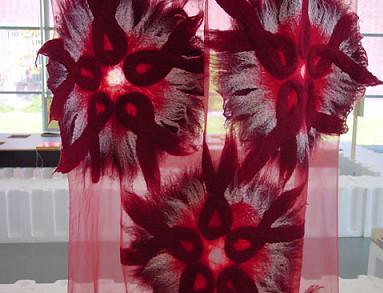
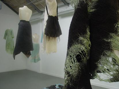
    inspired by jay's win last night on project runway (hooooraay!) i decided to feature some gorgeous textiles by dutch designer claudy jognstra. she's also part of the vivid crew i mentioned yesterday. her work is breathtakingly beautiful and certainly deserves some recognition. click here for more info on claudy and the whole vivid crew.

    editor's note: just got back from the doctor, will be posting more after i eat breakfast...it's been an icky morning.

    jongstra10

    Labels:

    Creative Commons License
    This work is licensed under a Creative Commons Attribution-NoDerivs 2.5 License.