|
 |
 |
 |
| |
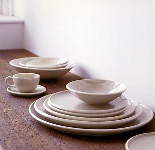
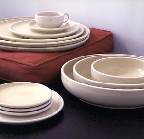
teresa chang
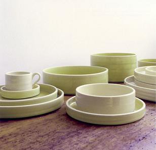
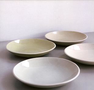
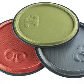
 teresa chang is a philadelphia-based artist whose line of tableware is simply gorgeous. reminiscent of the same sturdy, warm feeling found in the work of san francisco studio heath ceramics, teresa's work is both elegant and visually substantial. i've always been a fan of plates and bowls that looked as if they were heavy and would feel comforting to have rest on your lap as you ate noodles (or ice cream) and watched a good movie- and these pieces look like just that. the colors are comforting and subtle, and the designs are simple and understated. and to top it off, most of the prices won't send you into credit card debt. 
ms. chang is away on vacation until august 2, but after that you can place orders with her via email, phone or fax. you can see the whole collection and find pricing right here. 

Labels: ceramics
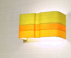
bone simple
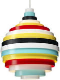
 bone simple design is the work of ny based artist, chad jacobs. i'm quite fond of this horizontal striped sconce (even though i don't normally like sconces), although i'd like to see it in different colors. something with a bold vermillion stripe would look great. more info right here. Labels: lighting
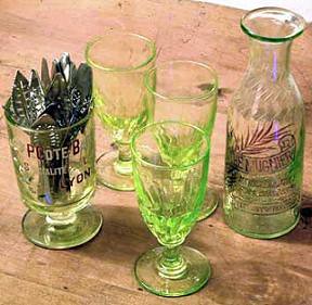
uranium glass
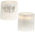
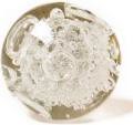
 ok, ever since i read this article about the woman designing marc jacob's home collection, i've been nursing this small obsession with uranium glass. i can't remember where i read the article, or the name of the marc jacobs woman (does anyone remember this??) but she had a gorgeous collection of uranium glass and i've been trying to find it online ever since. i like the sort of pale yellow colored class, and i'd love to find it in all sorts of weird glassware, esp anything looking like a beaker or plain glass, nothing fancy or victorian. anyone have any ideas? i tried ebay but everything was really green and super ornate. thanks for any tips! Labels: accessories
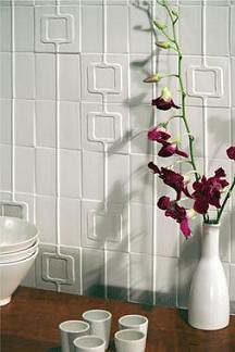
angela adams at ann sacks
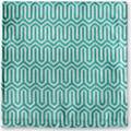
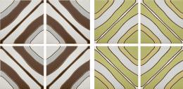
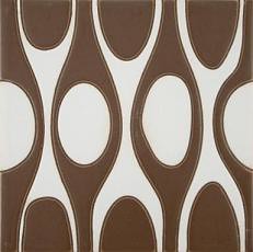
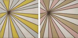
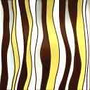
 starting august 1st, angela adams will debut a beautiful collection of tiles she designed for ann sacks. characteristic of ms. adams' work, the collection includes 6 patterns in her signature geometric but organic style. the colorways are bright, happy and very angela. you can view the line here and start ordering on august 1. 


Labels: ceramics, windows and walls
a little kitsch goes a long way...
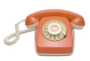
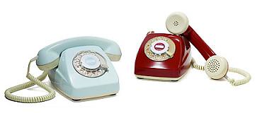
 too much kitsch can be awful, but just enough can be fantastic. these vintage phones at uncommon goods would be perfect used in just the right place. next to a shag rug and pea green refridgerator, this would certainly be overkill, but i could see someone working this in to an existing decor really well. available in three colors at uncommon goods for around $150 (the orange is out of stock for two weeks, but will be back soon if you're interested in it). 
Labels: accessories
woof woof
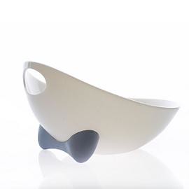
 i'm a sucker for pet designs. like these fun feeders and toys from wetnoz- they're fun, affordable and available online (or you can check out their list of retailers to find a store near you). my favorites: the springroll toy, the non-slip mat and the metro line of scoop/feeder bowls. 


Labels: accessories
cheep cheep, part deux
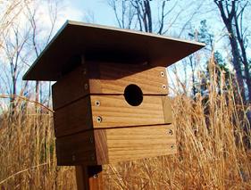
 thanks to everyone who sent in great modern bird feeder suggestions- velocity art and design has now decided to sell one of the suggestions on their site! you can now see (and buy) the whole collection from "modern birdhouses" online at velocity. so, i will now proceed to blatantly steal of all the text from velocity's site, written by dail at modern birdhouses. 
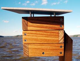
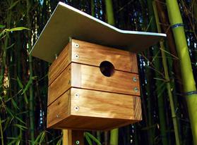
"Modern Birdhouses' Case Study Masters Series honors the architectural pioneers who participated in the Case Study Houses Program. The Case Study Houses Program was established in 1945 by John Entenza, the progressive editor and publisher of Arts and Architecture magazine. Entenza commissioned architects to design simple and innovative modern homes for a growing post-war housing market. The resulting homes took full advantage of industrialized building processes and continue to broadly influence modern architecture. Participants included such icons as Charles Eames and Eero Saarinen. Our birdhouses — named after Case Study participants J.R. Davidson, Richard Neutra, and Ralph Rapson — feature simple lines, modern detailing, and durable materials. They are hand-made from sustainably harvested teak that has been certified with the Rainforest Alliance's SmartWood program (www.smartwood.org). The wood is finished with an oil that protects against water, mildew, and UV rays. The roofs are constructed of sandblasted 1/4" thick aluminum plate and aluminum dowels. Stainless steel fasteners prevent rust and corrosion. The opening is 1-3/8" in diameter, which will accomodate common cavity-nesting birds such as chickadees, bluebirds, wrens, and swallows." 
"The birdhouses ship pre-assembled, except for the mounting bracket, which can be attached with two provided stainless steel screws. A keyhole slot on the back of the mounting bracket allow the birdhouse to be hung on a single screw. The floor is easily removable for cleaning." so, check out the whole line at velocity. thanks l+j! Labels: accessories
love it
 i don't often mention music or do music review on d*s, but i had to put this up today. i've been listening to of montreal's latest cd "the sunlandic twins" for the last week and i highly suggest that, if you can get your hands on a copy, you take a listen. it's phenomenal. knowing me i'll play it to death and be sick of it by next week, but for now, i'm hooked- which is kind of funny, considering i used to hate indie rock. but thanks to ac i'm now a recovering hippy who has learned to find joy in music that doesn't last for 6 hours. you can find out more about of montreal right here. Labels: miscellaneous
go, jane, go
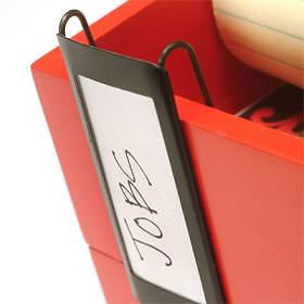
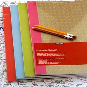
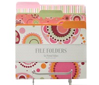
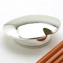
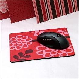
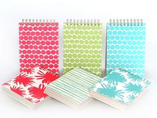
 i love see jane work- such fun work accessories. today i'm crazy about their pepperpot file folders and mousepad (they're girly, be warned..) and the clip on file labels (so helpful for people like me that run through files and don't want to get a new one because the permanent label is wrong). i also love the sleek little silver pencil sharpener, r+h composition books, hable spiral notebooks and the fancy accordion files. see them all at seejanework. 


Labels: accessories
risd(ee)
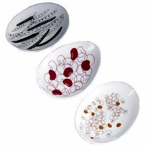
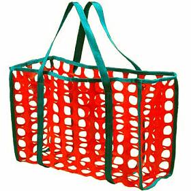
 risd works, the online store for risd, carries some amazing products. i just wanted to share these two because they're among my favorites: a bean-print dish set (3 for $70) by hirokazu + oranudh ingkhavat masuda and the tote bag by shawn parks that reminds me of a tomato ($40). 
Labels: ceramics, student design
hey ladies....
 inspired by o at home's "women who make beautiful things" section (it's a fantastic section), i decided to install a permanent feature on d*s: hey ladies... 
this (weekly or bi-weekly) section will feature a talented female designer whose work deserves both celebration and in-depth discussion. in an industry dominated by men (i'll be dealing mainly with product and graphic design...), i think these successful women deserve to be noticed, commended and applauded for their wonderful work. 
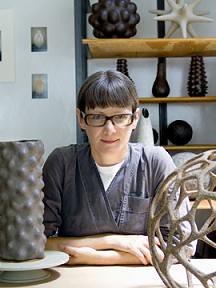
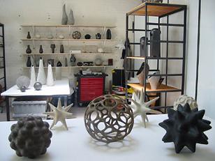
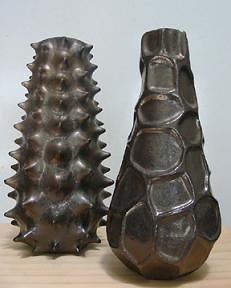
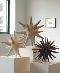
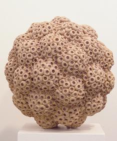
today i want to focus on pamela sunday, a brooklyn-based designer whose sculpture is carried throughout new york. formerly an art director, ms. sunday discovered her passion for clay over 10 years ago. while working in world of fashion advertising, she decided the time was right to follow her heart, so she left fashion for design and hasn't looked back since. for the past 10 years she's been creating beautiful, one of a kind, hand built ceramics from her carroll gardens studio that reflect her interest in texture and form. what i love most about ms. sunday's work is its clear interest in and focus on surface texture and organic shapes. her sculptures remind me of shapes and textures found underwater- her pieces are wonderfully reminiscent of both prickly sea urchins and star fish, with textures and patterns recalling coral and plant life. 
ms. sunday's work is an oasis of in-your-face texture in a world of jonathan adler-ish smooth perfection. while it may not be for everyone- it's certainly more intense than a lot of the ceramics i've seen in most people's houses (and some of the textures give even me the willies)- i think it has a very specific audience that will appreciate the exploration into form and its relationship to texture and surface. you can find ms. sunday's work at karkula in nyc (68 gansvoort street), regeneration furniture, the jason lamberth gallery in the hamptons (103 hayground rd., water mill, ny) and belvedere in atlanta. thank you, pamela for passing along your work- it's wonderful to see what the brooklyn women around me are up to... 
Labels: ceramics
extras
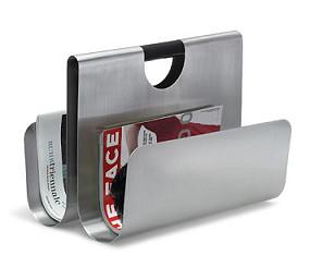
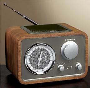
 these are too cute- the retro radio from levenger (plays mp3s from your ipod) and the stainless steel magazine rack from wactor. [via productdose] 
Labels: accessories
focus: packaging
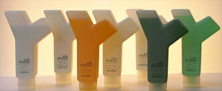
 celebrity hairstylist to the stars (ok, not that stylist to the stars), yuki sharoni has introduced a new line of hair products with distinct, y-shaped packaging. while i normally don't like the idea of shaping a bottle after your intitial, i think the packaging looks pretty neat- it reminds me of a tree branch, or this. [via stylephile] Labels: miscellaneous
sit on it
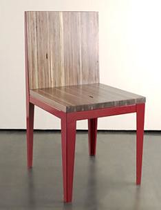
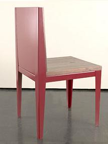
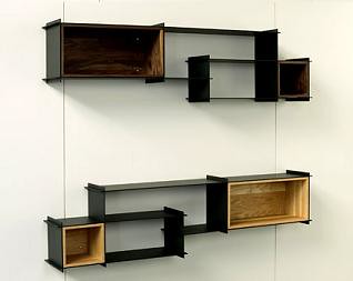
 i love this chair from hivemind (fantastic brooklyn-based designers, ruby and sather). chair-4 is contructed of powder-coated steel and walnut. it's simple with clean lines and a sleek finish- perfect. i think their crux credenza and crux shelving system are pretty slick too. you can see the whole shebang right here. 


Labels: furniture
i wanna be made
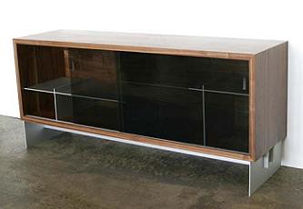
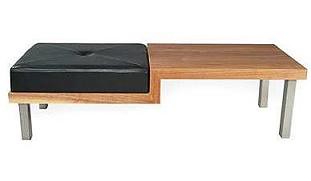
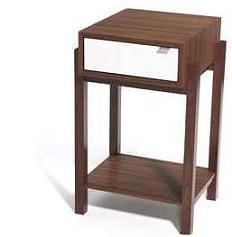
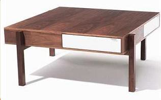
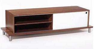
 besides sharing a name with one of mtv's most fantastically awful television shows, made is a portland oregon-based design studio that produces some of the most lovely, modern woodwork around. 

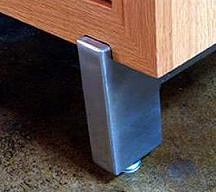
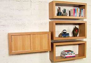
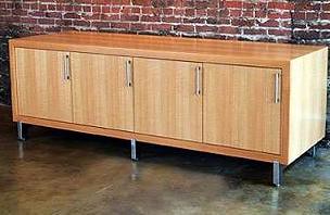
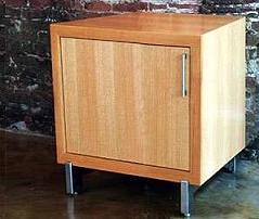
their two existing lines, plateau and nest, are characterized by their clean lines, modern forms and quality woodwork. the plateau collection's simple steel and wood construction is wonderfully sparse and perfect for an urban loft that needs something minimal, yet cool for storage. 

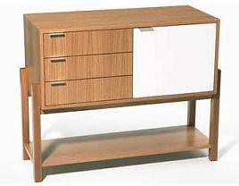
the nest line is full of beautiful dark woods offset by white lacquer drawers and doors. i love the combination of dark and light- it's perfect for most modern interiors. 

made also carries a "low down media cabinet" that i'd love to get my hands on if i could- it's so simple and so clean-lined that i just have to have it in my apt. but then again, i made myself a promise that i'd stay away from walnut for a while... 

you can see made's full collection here and contact them for ordering and pricing information right here. Labels: furniture
|
 |
 |
 |
 |
|
|
