|
 |
 |
 |
| |
call for submissions

meg mateo ilasco of designer's library (she shared her apartment with us on monday) sent over a call for submissions today and i thought some of you might be interested. meg's putting together an interior decor book which focuses on how people are bringing their family history, heritage, or culture into the styling of their home. she's collecting submissions for the book until april 10, 2007. sounds like fun! if anyone is interested or has any questions, they can email meg right here. good luck! [photo above is from paula smail's house and the photo below is from meg's home] [speaking of books, thanks to lotta jansdotter and co. for including my review on her new book's back cover. it was such a nice surprise] 
Labels: interior design
just arrived...
 i'm working on our kitchen later today and some of the components just arrived: the gold chain knobs from anthropologie (i'm loving chains right now- i feel a mini trend coming on) and my citron colored flor tiles from interface. will post pictures when i'm done... Labels: accessories
d*s shop: last day

just a reminder, today is the last day for the feb d*s shop. after this month i'm taking a month off to make some changes in the shop and prepare the next collection. so if you'd like to place an order click here to do so today- there are affordable prints, photographs and even some handmade linen journals. and as always, 100% of the profits go directly to the designers. [thanks to dooce for the sweet d*s shop shoutout yesterday] 


restlessthings

we talked about restlessthings' blue fawn print a few weeks ago but i wanted to add one of her newest designs- a new floral gocco print on vintage book pages. it's only $10 and there are 20 left so if you're interested just click here to get more info and place your order. Labels: artwork
doris salcedo
 alyson fox
 passed along a fantastic link to artist doris salcedo this morning. ms. salcedo is a colombian sculptor who often uses furniture in her work. the installation above was created for the international istanbul biennale in 2003 and included over 1550 chairs stacked between two city buildings. you can see more of ms. salcedo's work right here...[thanks, alyson!] [photo above by muammer yanmaz] Labels: artwork
domestic

i've mentioned domestic before but recently i delved deeper into their collection and found a patterns tucked away that i hadn't seen before. the ceiling collections by studio job are always my favorite so it was great to see that they come in colors other than black, like a light grey/blue, gold and flat white. in addition to studio job's collection i really loved some pieces by inga sempe- her black and white flower piece was so subtle and modern. you can click here to browse domestic's most recent wall vinyl collections- you'll notice some fun prints and color variations that haven't been promoted (or seen) as heavily yet. it's always fun to stumble on new color choices... 

Labels: accessories, windows and walls
bloomframe

this piece made the rounds this week but i had to share it here- the bloomframe is a dual balcony and window designed by hofman dujardin architecten in amsterdam. even if it was installed well something about folding out your balcony would always make me a bit uneasy- but it's a fun idea to think about. compact living ideas are always a good reminder to try to invest in objects that serve dual functions and let us downsize on the "stuff" in our lives. [via notcot] Labels: furniture
sofia barao
 this
this beautiful piece was printed over a piece of original vintage book paper. i love the combination of a soft, vintage book page with an assortment of lively modern colors. you can pick up this print right here for $13.50. [via poppytalk] Labels: artwork
sneak peek...lost bird found

sara jensen and her husband thor of lost bird found have a beatiful home in astoria, ny. i wanted to end today on a colorful note so i thought their beautiful green bedroom (with touches of bright orange) would be perfect. sara was the designer behind the popular pomegranite pouches at dec's d*s shop and she continues to produce through her studio, lost bird found. you can click here for larger (and many extra) photos of sara and thor's lovely home in astoria. 
"First I have to say that we are struggling with the fact that we have wood paneling, I almost didnt move in to this apartment when my husband was just my boyfriend because of the wood paneling! Thor's favorite color is bright green, he painted the bedroom before I moved in. He says it stays. I say okay. Its grown on me. The orange dresser was originally a white dresser that had been up at my lakehouse. I brought it back while I was still living in Boston and painted it orange. I guess we dont buy into the mellow bedroom colors." Labels: interior design, sneak peek
jill dryer
 artist jill dryer recently contacted me about a new series of paintings she's created. my favorites feature iconic chair designs (i love the wegner) or home accessories like pendant lamps and mobiles. it's always fun to see elements of interior design approached from a fine art standpoint. you can view jill's full collection of paintings for sale right here. 
Labels: artwork
repop
 lena corwin
 picked up this vintage dresser the other day at brooklyn's repop warehouse. i was so inspired by her find (it's such a beautiful piece) that i'm zipcar-ing myself over there later this week. i'm still on a credenza hunt and i'm hoping to nab something along these lines that fits our small wall... Labels: furniture
klaus bürgel
 my obsession with facets (thanks to hannah allijn) hasn't wayned over the years and these pieces by designer klaus bürgel aren't helping. i'll take a lovely facet or geodesic shape anywhere i can get it. i love the contrast of smooth facets next to softer, rounded materials. a facet in pink (see " porcelain")? i'm in heaven. this drawing (and the ring below) are part of klaus' full collection which you can view right here. [via hoping for happy accidents via new jewellery] 
Labels: artwork
bookhou design

arounna and john at bookhou sent over some of their new work and i'm smitten with this tray. you can find more information on their work right here and some of their latest pieces from the ids toronto over at bloesem this morning. [thanks arounna] Labels: accessories
ken gangbar
(2).jpg)
designer ken gangbar just sent over these shots from the interior design show in toronto. he showcased an installation and sculptural work- the textures are beautiful so i couldn't pass it up. click here for more information on ken's work. .jpg)
Labels: artwork
sneak peek...kevin and david

today's sneak peek belongs to kevin mccarthy and david sokol of beacon, ny. i knew david when he was an editor at id magazine and now he and kevin share a beautiful house right around the corner from the dia: beacon. you can click here to see full sized (and extra) photos of their home. [also, kevin designed the string-shade lamps in the photos, more info on them right here] "This is our dining room: A lot of the furniture in the house was my grandmother’s, which my father packed up and drove here from Seattle after she passed away. Many of the table lamps had old shades that needed to be replaced and I started experimenting with restringing them with twine from a hardware store—and there you have the early rumblings of my new business. The vintage wallpaper is from Secondhand Rose and hung by yours truly. The Supernova pendant was a present from David. The cats, Gus and Eugenia, are a new addition circa 2006."  "The exterior: What you can see is taken on a snowy day after our spending the morning clearing sidewalks and the driveway of “heart attack” snow. The house flies an Italian “Pace” flag. What you cannot see is the beautiful bell purchased from Arcosanti. The shade and portrait: I made this two-color shade from linen string and the moiré affect it creates is gorgeous. The portrait is of an unknown man and is from Hudson Supermarket."  "Cat portrait: This was a housewarming gift from our friend Leigh, better known as jezebel The portrait is hung on my favorite wall, because it’s one of the few elements to have survived from the original 1860s-era house." Labels: interior design, sneak peek
sneak peek...sarah cihat

our last sneak peek for the day (there are boys coming tomorrow in case anyone is worried) belongs to brooklyn ceramicist sarah cihat. i love the wood grain wallpaper on her walls and had to share this overview and close up shot. the pattern acts as a nice neutral background but gives just the slightest hint of pattern. [update: the walls are a finish that sarah did herself! it's taupe grey
over gloss white paint with the help of a special wood grain squeegee she found "ages ago"] 
Labels: interior design, sneak peek
metropolitan bed

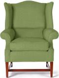
i'm loving this yellow metropolitan bed at AT. yellow and green keep popping up everywhere, it's such a nice dose of springy colors. i just bit the bullet and bought fabric to have our couch reupholstered so i'll post the pictures next week when it's through...i went back and forth between a bright yellow and kelly green pattern and chose the kelly green. should be springy and perfect for the warmer months ahead... [speaking of the apt, i'll be posting d*s apt update pictures over the next few weeks. we're finally in a place where we can fill in our space a bit more...] Labels: furniture
musical chairs

last thursday i did a little window shopping in anthropologie's rockefeller center shop and caught the beginning of a small exhibition taking place within the shop. "musical chairs" is a group exhibition of works by emerging designers based in the united kingdom and netherlands. the artists produced works inspired by the humble chair form and came up with some really beautiful pieces. my favorite was a small series done by pieke bergmans who melted glass vessels into chairs and benches...they have to be seen to be full enjoyed. the melting shape was so soft and glassy- i spent at least 10 minutes with this one chair just looking at the glass. the pieces below are by pottinger & cole and peter woollin & kate staddon. you can stop by anthropologie at 50 rockefeller center to see them in person... enjoy! [ click here for more photos of pieke bergmans melted glass work] 
Labels: artwork, student design
sneak peek...nama rococo

the lovely karen combs of nama rococo let us sneak a little peek into her home in western massachusetts. i'm crazy about the bright white walls and floor and the amount of light her home seems to get. not to mention the adorable orange lamp. [ click here for full sized (and extra!) photos of karen's home] "This photos is of my little sofa with Tang on the floor (pretty bare bones for a wallpaper designer, no?)"
 "This is my favorite bookshelf with a strip of "birch" wallpaper my friend martha flood made (i'm trying to get her to market it!)" Labels: interior design, sneak peek
wonderwall

ok one non-sneak peek post quickly: these beautiful pieces were just sent over from wonderwall in sweden. wonderwall sells limited edition artwork and they recently added 11 new designs ot their collection. had to share.... click here for more information. 


Labels: artwork, windows and walls
sneak peek monday...

i'm working on a special project today (i'll let you know the details if it works out) so i've decided to devote today to the new sneak peek column. i'll showcase 3-4 artist's homes with descriptions in their own words. i'll be back tomorrow with regular posts bu i wanted to make today all about inspiration rather than shopping. it's always wonderful to be inspired by real people's homes and see how people living in less than perfect apartments and houses make things work on their own terms (without the help of professional architects, designers and contractors). our first peek today belongs to writer and designer meg mateo ilasco. [ click here for full sized pictures of her home] "I live in a hybrid Eichler style home built in 1959. Over the past couple years I've been trying to synthesize my decorating style. I've discovered that, for me, rooms work best when they have these four elements: 1. new, contemporary pieces, 2. vintage, thrift store finds, 3. nostaglia, and 4. my heritage and culture. Items I consider nostaglic are decor from our (my husband and I) parents' homes. I enjoy that they help instill a sense of continuity. Finding a good balance is key. The above image is from my living room. It has my favorite vintage find: Danish shelving by Poul Cadovius (Royal System) which I bought six years ago on ebay for a ridiculously low price. (Seriously, I miss those days!) In the beginning, I was very fixated on Scandinavian stuff. But later I felt a little disconnected with my collection. So I began introducing things from my Philippine culture and blending them in with the existing decor (some examples are the capiz lamp, rattan chairs, and wood artwork in the dining room)"  "This is the other side of the living room. The stereo cabinet is from my childhood, except now it's been outfitted with new speakers and plays songs from an iPod. The hanging capiz lamp and shell decor are also nostaglic. We hung one inside and another outside to create a dialogue between the two--to bring the inside out."  "Just to show other parts of my home, here's the entry way with framed pieces from Kesuke Serizawa's 2006 calendar (bought from Salvor Kiosk) and a step table with a vintage lamp and hanging melamine plates by Thomas Paul and Lena Corwin."  "This is my dining room. It's funny, when I was growing up I used to be embarrassed that our home was stuck in a 1970s time warp. I regarded my mom's handmade goods with equal disdain: her macrame plant holders, handpainted porcelain elephant statues, and crocheted pillows. As a child, I'd think, "Couldn't we just buy things?" She said that one day I'd grow to appreciate her stuff. Mom was right! In addition to the living room I also have a photo of Sara Paloma bottles juxtaposed with a Philippine tribal pot." Labels: interior design, sneak peek
inv/alt design

angela schwab at inv/alt design just send over some fun recycled dishware products from her etsy shop. they remind me of hrafnkell birgisson's hoch die tassen but use the same concept for plates and platters. you can browse angela's collection right here and shop online ($20 each). 
Labels: accessories
hannah allijn
 i fell in love with designer hannah allijn's faceted curtain in 2005 and was thrilled to hear from her today. her beautiful curtain is finally going into production and will be available for purchase soon (i'll have the update here when they're ready). i've been secretly saving for these for two years now and can't express how excited i am to finally know they're hitting the market. i love how the pattern comes to life when you draw open the curtains- they're so soft but structured. of the thousands of posts i've written at d*s over the past three years they're probably the design that has stuck with me the most. (well, that and nama rococo's debut). you can view hannah's site right here and stay tuned for purchasing information. [all photos by egwin heins] have a great weekend everyone! below are some highlights from this week's new features: 
Labels: textiles, windows and walls
wallpaper crazy
 bold pattern is everywhere these days and anthropologie is doing a great job of delivering it in wallpaper form. these two new designs are printed on surestrip which promises "wrinkle-free installation and easy peel-off removal" (anyone have an experience otherwise?). the beautiful floral is called dotswold is available for $88 per roll right here. the vintage-style sunburst print is available right here for $88. happy wallpapering! Labels: windows and walls
dombra

nothing like a bright yellow print to wake you up on a cold friday morning. dombra by marimekko is a beautiful deep goldenrod pattern with accents of magenta and pink. perfect for using in small spots or a bright white room that needs a pop of color. click here for more information and to buy ($38 per yard). Labels: textiles
kraken

colorful bird towels from etsy seller kraken...$7 each right here. be sure to catch her cute silkscreened prints ($30), too... 
Labels: textiles
|
 |
 |
 |
 |
|
|
 meg mateo ilasco of designer's library (she shared her apartment with us on monday) sent over a call for submissions today and i thought some of you might be interested. meg's putting together an interior decor book which focuses on how people are bringing their family history, heritage, or culture into the styling of their home. she's collecting submissions for the book until april 10, 2007. sounds like fun! if anyone is interested or has any questions, they can email meg right here. good luck! [photo above is from paula smail's house and the photo below is from meg's home]












(2).jpg)
.jpg)


