|
 |
 |
 |
| |
pineapple lifesavers in the sky
 it is with a sad heart that i say goodbye to my favorite comedian of all time, mitch hedberg. he was the funniest person i ever heard. the world is a little bit sadder and certainly not as funny without him. so, instead of a moment of silence, i'd like to share some of mitch's genius. *"i bought a doughnut and they gave me a receipt for the doughnut...i don't need a receipt for the doughnut - i'll just give you money and you give me the doughnut, end of transaction. we don't need to bring ink and paper into this. i can't imagine a scenario in which i would need to prove that i bought a doughnut...some skeptical friend, don’t even act like i didn't buy a doughnut, i've got the documentation right here...oh wait it's back home in the file...under "d", for doughnut." *"i like cinnamon rolls, but I don't always have time to make a pan. that's why i wish they would sell cinnamon roll incense. perhaps I'd rather light a stick and have my roommate wake up with false hopes." *"i like vending machines, because snacks are better when they fall. if i buy a candy bar at the store oftentimes i will drop it, so that it achieves its maximum flavor potential." *"i opened up a container of yogurt, and under the lid it said "please try again" because they were having a contest i was unaware of. but i thought i might have opened the yogurt wrong...or maybe yoplait was trying to inspire me, 'c'mon, mitchell, don't give up. please try again. a message of inspiration from your friends at yoplait. fruit on the bottom, hope on top." more mitch here. Labels: miscellaneous
sprokets (updated)
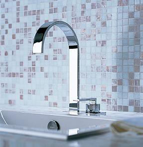 dornbracht's name reminds me of mike meyers in sprokets. ah i miss the days when snl was funny. ok, sorta funny. ok, sometimes funny. anyway, make no mistake, dornbracht is no joke- they make seriously gorgeous accessories and fixtures for the bathroom. not exactly the kind i could afford, but i'm sure someone out there can. the mem fixture above is quite simple, sick. it is the sickest faucet ever and i would love to open up a mini contest to find one that's even better. so, comment away below if you can find some. i love fun faucets. on another note, after a day of furious posting while blogger seems to be working momentarily, i'm exhausted. i've been really stressed out lately so i need to take a break. i'm in the middle of a crunch at work, some fast and furious freelancing and trying to put the finishing touches on the new and improved d*s to launch in the not so distant future. so, ac and i will be getting away tomorrow and i won't be posting to the blog. i need to get away from the city and find some new inspiration. i want to go to stores and see things in person, talk to people and see what's going on in the world of retail. i spend so much time behind a monitor i often forget what it's like to walk in and cruise through a great design store. so, in the interest of refueling for a better, more exciting d*s, i'll be signing off this evening and returning on monday, full of ideas and hopefully sportin some new kicks, because mine are TIRED. see you monday, have a wonderful, wonderful weekend. xoxox, d*s i wanted to add this really quickly. i'm in the midst of a redesign and a move, and i have some ideas about what i do and don't want for the site, but i'd love to hear suggestions from everyone out there. what features would you like to see added to the site? let your mind wander and then spill it into the comments below. i'd really appreciate hearing what everyone has to say. thanks so much. OHH! DON'T FORGET TO LOOK FOR LITE BRITE IN THE T STYLE MAG THIS WEEKEND!! 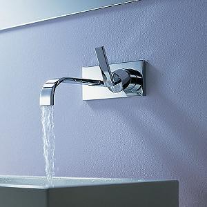
Labels: accessories
i am the wall-rus
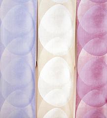
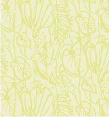
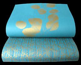 jocelyn warner makes purdy wallpaper. i'd write more but i'm verging on overload and fear i need some caffeine, stat! the long and short of it is: jocelyn will make your walls go from drab to fab (i've always wanted to use that expression in earnest) in no time flat. you can find her full collection right hurr (shout out, chingy). 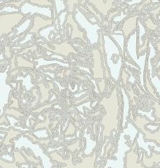
Labels: windows and walls
fred flare III: revenge of fred flare
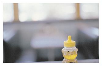 ok, i saved the best for last when it came to today's obsessive fred flare posts. i loove these placemats. i love them. they're made by bob's your uncle and they feature photographs of old school diners and diner memorabilia. you can't lose with these. especially if you have someone messy in your life. plop one of these down and you can both be happy. 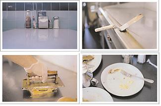
Labels: accessories
fred flare part II
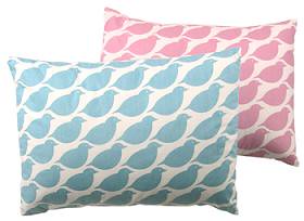 cheep and cheap go together like peanut butter and jelly. especially for a bird nut like me. i love these chickadee pillows- looks like something one good bumblebee would like. hi, one good bumblebee! Labels: accessories
little freddy flare, part I
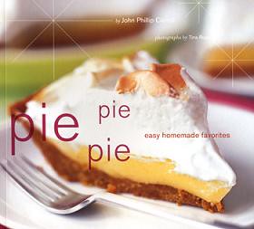 i love fred flare. have i said that yet today? soooo trendy and crazy and fun. i wouldn't go there to invest in lifetime pieces, but it's a great stop for fun design that will spice up your humble abode. this week i love books from fred flare. first off, i love the pie book because it's called "pie pie pie" and well, that's what i scream when i see pie. i also LOVE these "this is..." books about cities. i saw the san fran one in wburg the other day and almost got it. click here to get it yourself. 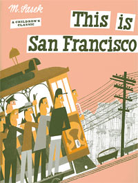
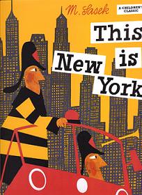
Labels: accessories
alphabets nyc
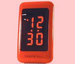 great store. great stuff. i love this little retro tokyo alarm clock. super cute and super sweet. click here to pick one up. Labels: accessories
cause you're so sassi
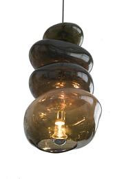 i love this light. it's going to be exhibited by hidden art uk at the milan show this year (i wish i could go, boo hoo) and i LOVE it. nuff said. made by damdesign and it's damn good. Labels: lighting
reefer
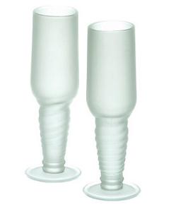 my mom had a cat named reefer in the 70's. i just had to share that. not only because it's hysterical, but because it sorta relates to this post. these glasses from factory 37 are made from recycled reef glasses, which make them super environmentally friendly. "the green glass company takes original bottles that are heading for the landfill and transforms them into these functional yet witty glasses." while i'm not super gung ho about the look, i do love the thought behind it. very treehugger, very cool. Labels: accessories
i heart rena
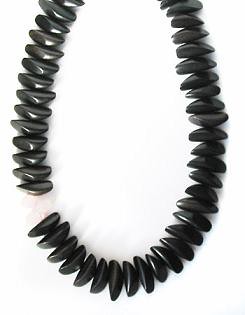
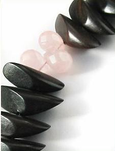 it's been way too long since i've posted about rena and wouldn't ya know- she's got new stuff up. such a busy bee. my favorite brooklyn jewelry lady is at it again with a gorgeous new collection of summer 2005 jewelry. i've posted by favorites here, but you can see the whole shabang if you click on this. yay rena! 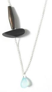
Labels: accessories
a new new deal
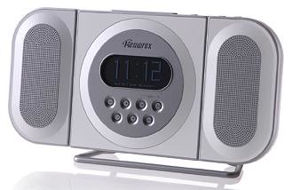 yeah i know, that title's from those obnoxiously whiny freelancer's union ads, but it fits, i swear. new deal design makes some sorta cool designy gadgets that i've mentioned before, but i wanted to add these pieces. i saw this radio at target and looved it. it's a bit ninties, but i'm still catchin up when it comes to audio equipment. plus i like the horizontal aspect of it. very nice. oh, and the dunlop guitar screw? it's nice and modern and it reminds me of ac. i love a man that can restring his own guitar. you can find more info on new deal design right here. 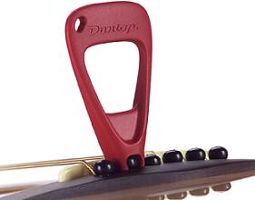
Labels: miscellaneous
katey kate kate
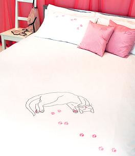 i've talked about kate storer before. her groovy touch pillows were sultry and oh so bad in the very best way. now she's put out something with that's a little bit sweeter- a cat duvet and pillow set that would be perfect for a little girl's room or you know, one of those 30 year old women who spends friday night with her three cats and jeopardy reruns. (heck, let's face it- i'd be that girl if it weren't for ac. we've already got two cats....). i also love kate's disposable hand warmers that she made for addject. tres cool. click here for more info on ms. storer. enjoy... 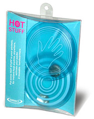

Labels: textiles
cheese factor
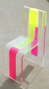 for some reason i have miami vice stuck in my head. the movie wanted to borrow some furniture from a client of ours and ever since i've had that cheesy 80's style in my head. this chair from waazwiz reminds me of that style. rock on neon pink and yellow! crockett and tubbs forever! Labels: furniture
fun stuff
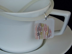
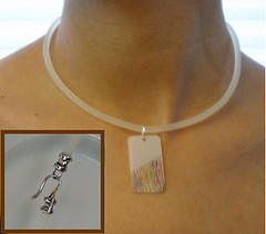 don't want to say it too loud but blogger might be back. hooray! real quick, ms. blue tea bag commented below and i like her stuff, wanted to share it. cute jewelry type accesories. click here for more info. thanks blue tea bag! 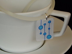
Labels: accessories
why am i so lame
 i saw nora from project runway this morning on my stop of the L. and what did i do? act like a goon and stare at her and do like 25 double takes to make sure it was her. i walked behind her for a block being like, small, cute, mohawk, stylish- it's either naima from next top model or nora. turns out it was nora. everyone else stared too. makes me feel better. Labels: miscellaneous
home away from home
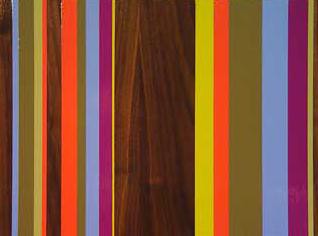
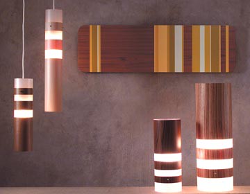 sometimes i wish i could just live in velocity art and design. i know i can't, but i wish i could. i'd love to wake up surrounded by all their amazing art and all sorts of rad design stuff. then i'd wander to their kitchen section and cook something delicious with awesomely designed spatulas and pans. ah, to dream. maybe one day i'll own my own store and live in it, or well, above it or something. who knows. but until then, here's some info on one of velocity's featured artist's: joe futschik. joe's work is beautiful and simple (my favorite). his art combines gorgeous pieces of wood with modern, graphic color blocks (painted on top). joe can produce custom work, but you can also check out the collection at velocity. enjoy! 
Labels: lighting
today is for tomine
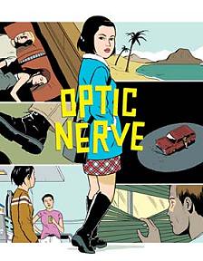 i've wanted to write something about adrian tomine for some time, but fearing both another melt down from blogger and the idea that adrian's work is so widely revered i'd somehow mangle a review- i've postponed it until now. but today i decided, blogger is giving me a headache so if i'm going to struggle to get something up, i'd like it to be something i'm really interested in. 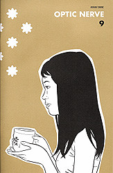
so, enter adrian tomine. first of all i have to admit i knew nothing of adrian tomine until i met ac. i was never a comic book person, and still am not, but i was drawn instantly to how beautiful tomine's work is. born in sacramento, tomine took to comic books at a young age and, while still in high school, he started writing and illustrating stories, which he published in his first mini-comic optic nerve (a series i read in one sitting, thanks to ac). a year later, he was hired by pulse magazine to produce a monthly comic strip which lead to publisher drawn & quarterly offering to produce 'optic nerve' as a regular comic series. 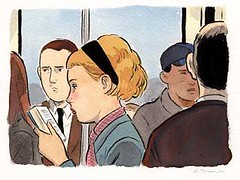
what i love so much about tomine's work is not so much the content (which is equally amazing) but the style. tomine's style is equal parts haunting and elegant. the lines are clean and the design is flawless- his drawings are strong enough to stand on their own and tell their own story (see the new yorker cover below) and certainly deserve to be framed and appreciate for their graphic prowess. 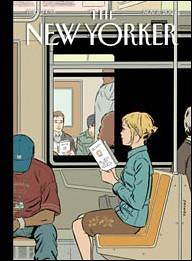
the long and short of it is, adrian tomine is a phenomenal artist whose work is something i thought those of us in the design community would enjoy- it has structure, style and most of all, a visual integrity that makes each piece timeless in its own simple, but beautiful way. you can see more of adrian's work here. enjoy... 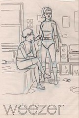
Labels: graphic design
all growns up
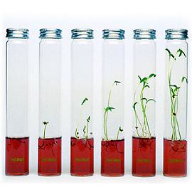 i've been trying to put this up DAYS and it's driving me insane. so sorry guys. i don't even have the energy to type it all. these are SICK plantariums by the same people who make the crazy futuristic art farm. i love it. gel instead of soil, so cool. 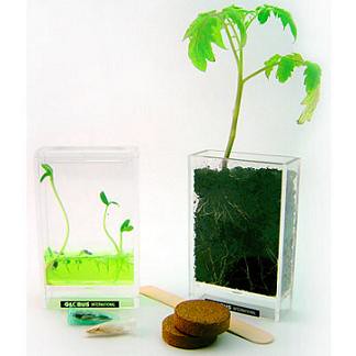
Labels: miscellaneous
sorry guys, blogger has been down, i dont even know if this will post. im so sorry things have been totally dead the past three days. i have these posts waiting to go but it wont let me post. im so sad. im sorry guys. but, there is a a silver lining- i'll be moving to a real website soon, one with a .com and everything. so then i won't have to deal with blogger issue. xoxo, d*s. i'm trying to post constantly so hopefully something will go up- at least this hopefully!
guck in a puck
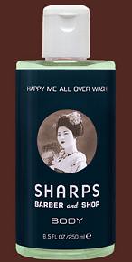
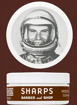 ac can attest to the fact that i frequently fall in love with packaging. maybe it's because i'm the product of parents that were involved in advertising and marketing, as well as the "interior" arts, but i seem to be constantly pulled towards packaging, the aesthetic and interesting advertising campaigns. for this reason, my latest crush happens to be ac's new hair products from sharps- a new york based company that produces grooming products for men with a fantastic packaging and marketing campaign. sharps' simple, bold and highly graphic campaign sucked me in from the start. we saw their products at riley james in san francisco and ac eventually caved and bought the "guck in the puck" after i cooed on and on about how much i loved the logos. their products are graced with four images, each somehow adding to the "modern, hip barbershop" feel of the line. the first is an astronaut (my favorite), the second, a goat with a strangely elongated neck, the third a suggestive geisha and the last, an old school microphone. each, along with the simple but gorgeous color combo of maroon/brown and white, add to a sense of updated masculinity that i love. beyond that, they smell good too. so, if you're lookin for some new hair gunk (girls too- it smells that good), look no further than sharps, a company that adds a little bit of cool to both your cabinet and coif. 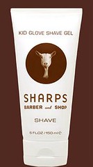
 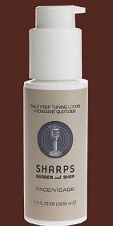
Labels: graphic design
tar-jay
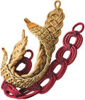
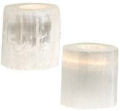
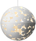
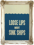
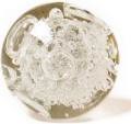
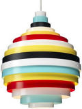
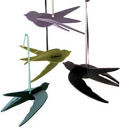
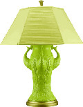
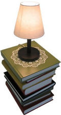
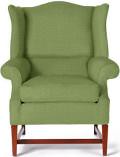
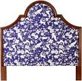
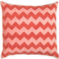
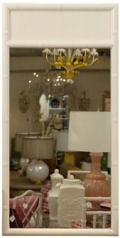
![B0007ZGUC0.16._AA260_SCLZZZZZZZ_[1]](http://photos7.flickr.com/7795491_49cbda6e47.jpg) target is a wonderful store. sadly the one closest to me in brooklyn in horrendous. back in virginia i would swing by as much as possible- there was even a bus from our college that went to target and back every hour. so in honor of target and their commitment to design, i decided to showcase some of my favorite target goods. so take a gander and click here to see the rest of the goods. not to be missed: the red hot shop - full of great trendy design pieces that definitely won't break the bank (my kinda design). PS: BLOGGER JUST CAME BACK, SORRY! ![B0006ZUJTQ.16._AA260_SCLZZZZZZZ_[1]](http://photos5.flickr.com/7795488_89a8fcfdc1.jpg)
![B0006VGZFC.16._AA384_SCLZZZZZZZ_[1]](http://photos7.flickr.com/7795487_c3db9b899d.jpg)
![B0007YJ62C.16._AA260_SCLZZZZZZZ_[1]](http://photos4.flickr.com/7795490_4721a292ba.jpg)
![B0007Y196I.16._AA260_SCLZZZZZZZ_[1]](http://photos6.flickr.com/7795489_e9778e4a37.jpg)
Labels: accessories
backity back back
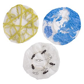
 blogger is finally back so, hooray, it's blog time! i have a lunch meeting today but i'm going to post as much as i possibly can today, to make up for yesterday's total MIA. darn you, blogger! sometimes ugly shower accessories get made over and it's funny. in this case it's cb2's showercaps. i loathe shower caps, they remind me of being little and hating showers and baths, but these are hysterical. if you have to wear one, why not where one with dance steps on it? cause they're funny. you can find more info on cb2 goods here. Labels: miscellaneous
|
 |
 |
 |
 |
|
|








![B0007ZGUC0.16._AA260_SCLZZZZZZZ_[1]](http://photos7.flickr.com/7795491_49cbda6e47.jpg)
![B0006ZUJTQ.16._AA260_SCLZZZZZZZ_[1]](http://photos5.flickr.com/7795488_89a8fcfdc1.jpg)
![B0006VGZFC.16._AA384_SCLZZZZZZZ_[1]](http://photos7.flickr.com/7795487_c3db9b899d.jpg)
![B0007YJ62C.16._AA260_SCLZZZZZZZ_[1]](http://photos4.flickr.com/7795490_4721a292ba.jpg)
![B0007Y196I.16._AA260_SCLZZZZZZZ_[1]](http://photos6.flickr.com/7795489_e9778e4a37.jpg)
