|
 |
 |
 |
| |
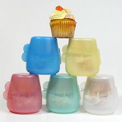
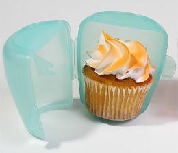
cup-a-cake
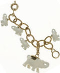
 i am literally running to a car now to go to the airport but i wanted to thank tara for passing this on to me (thanks, tara!). this is too cute and i'm a sugar freak so well, that's that. it's pretty self-explanatory, but too cute not to post before i go. ps: love you, ac. 
Labels: accessories
regional design
 i'm heading home to virginia today at 5, so i'll be gone tomorrow, but i was thinking about regional stuff and thought it would be fun to open up this post to suggestions about local design. i'm always on the lookout for great stores (with websites, preferably) in places i've never been before. everyone's got a store in their hometown that they love, so if that's you, please, take a second to tell us all about it in the comments section below- please include a link to their website as well. depending on how it shapes up, i'll do a post on it for monday and showcase some of the best that everyone turned in. i'd love to hear about all the great little stores across the country. and heck, if you know of some in other parts of the world and they have websites, throw em in! i love good online resources. thanks guys and have a wonderful weekend! i'll be back on monday, fresh and full of the type of rest and relaxation you can only get in the south. xoxo, d*s Labels: miscellaneous
whitney wares
 the whitney has long been my favorite art museum in manhattan. even with the moma's big fancy schmancy re-do and all their "manhattan is modern again" signs, my allegiance belongs to the whitney. their biennial is consistently my favorite show in the city. while the museum of natural history is my all-time favorite musueum in ny, the whitney will always be my favorite art museum. so, in honor of my unicorn teammate, lindsay (who did a great job as offense last week!) who works there, i thought i'd mention some of the great pieces that the whitney store has to offer. 
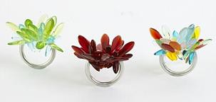
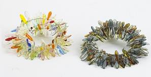
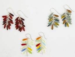
the main collection at the whitney store contains some of the great design classics of the last few decades-jeff koons pieces and the antler hooks by david wiseman- but it also houses a gorgeous jewelry collection by designer, dawn benedetto. 
benedetto's work is both colorful and whimsical, two of my favorite characteristics for jewelry to have. i was immediately drawn in by the petal rings, a beautiful series of dazzling glass beads on stretchable cords strung through a sterling silver band. the multicolored version is my favorite, it looks like a beautiful explosion of colored glass on your finger. 
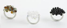
dawn also created earring and bracelet sets that have a similar style to the petal collection, but my favorite works of hers are the roe rings, which i will be saving up for as a little treat for myself ($58 online). i'm in deep like with the "dark black" version that looks eerily like the squishy stuff it's named after. the roe rings are simple, elegant and modern- three things any girl can admire. so, click on by the whitney's online store, or visit in person if you can- their collection is well edited and definitely deserves an online browse- and remember, mother's day is coming up so everyone has an excuse to be looking for great gifts online. ps: you can also buy dawn's work online where there is a wide variety of color choices and a new style, pearl. i love the roe ring in bottle green, olive oil and hive- gorgeous. Labels: accessories
thursday belongs to molo
 it's no secret that i'm molo's biggest fan, and today, i'd like to honor my favorite canadian duo with an excited post about their upcoming icff goods. 
if you don't know molo, let me fill you in: molo was formed in 2003 as the global vehicle to manufacture, distribute, and market the award winning product design work of stephanie forsythe and todd macAllen, of forsythe + macAllen design. the philosophy behind their product design work is the same as that behind their work in architecture, with one simply being an extension of the other. molo is actually an acronym for “middle ones, little ones”, reflecting only the scale difference in product design, as compared to the “big ones” of their buildings and structures. their work has won countless international design awards and promises to win many more as time goes on. 
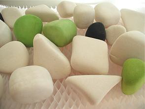
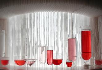
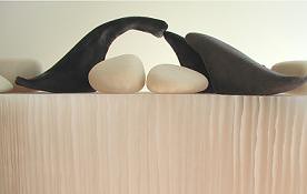
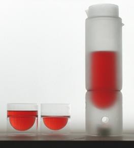
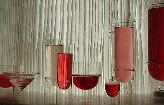
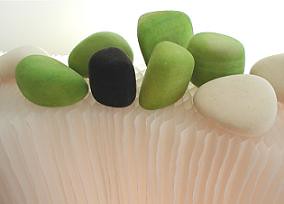
this year at icff, molo will debut several additions to their existing collection: a line of felt rocks and two new styles for the float collection, a martini glass and a half-sized tea lantern. 
the float collection is a premium line of hand-made glassware/barware appropriate for hot or cold use. molo's master glassblowers in the czech republic handcraft float glassware, literally one piece at at time. the unique suspended bowl shape insulates the hand from the liquid inside the glass, and also serves to elevate condensation away from a table's surface, making the use of a coaster unnecessary. this spring, molo will add an elegant, modern martini glass to the collection, along with a half-sized tea lantern, which are sure to be a hit at icff. 
molo's felt rocks are roughly the size of your hand, but will have varying sizes. like real stones, no two are ever alike and the shapes will be totally random. formed in the making of the very pure, wool felt buffing pads used to polish optical discs, the felt rocks are essentially an industrial by-product formed by break-away pieces that roll around in the hammering machine accumulating wool. molo collects them and then cleans them by hand. they will be available in groups of three. 
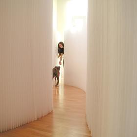
in addition to these great new products, molo will be designing huge paper softwalls for the icff theater. i, for one, will be running to the theater to see how it turns out. molo's softwall is one of my favorite products of the whole year. you can see my write up on it here. 
so, please stop on by molo's website, or, if you're in ny, check out their work at icff, ito en and felissimo, where their tea lanterns will soon be sold. enjoy! Labels: accessories, textiles
sin city
 i thought it was about time for a non-product post and although this came out a few weeks ago, i wanted to do a brief post on sin city. first, let me preface this by saying that i don't profess to be a) a film buff b) a comic buff or c) a lighting/tech buff. i'm merely expressing my personal interest in this film that i think, quite frankly, rules- in a visual sense. 
while i think the plot line of sin city, and the dialogue for that matter, were rather lacking, i think the visuals were out of sight. everyone was all freaked out when skycaptain came out last year, but honestly, i think this is worth way more fuss than skycaptain. long story short, sin city is an adaptation of frank miller's stories based in a morally bankrupt metropolis. the characters and plot lines are deliciously over the top and they certainly made sure that the film lived up to the famed film noir comic. 
black and white can seem played out sometimes, but in sin city, it provides the perfect backdrop for a series of seedy stories set in an even seedier town. it also makes for a wonderful vehicle with which to highlight the occasional splashes of color in the film (red blood, a yellow face). i was blown away by the sheer effect of the comic meets movie look. the actors left a bit to be desired (celeb overload combined with some poor choices- good god! why do people let brittany murphy act?!), but the visuals made up for it. 
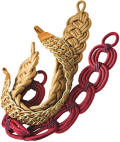
the scene i was struck most by was little gilmore girl, alexis bledel walking down the street in her whacked out street girl outfit with gloriously highlighted piece sign and cross chains (see above). it's just so gorgeous. 
i highly suggest you check it out if you've got a high tolerance for gratuitous violence and shoddy dialogue. i sort of wish i could have watched it without the sound- it might have been better than way. but heck, sometimes in life there's room for the visual and this is a perfect case- i'd watch this over and over again just to see this gorgeous comic brought to life. you can click here to find out more about sin city and find out where it's playing near you. Labels: miscellaneous
i'm pretty!
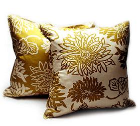
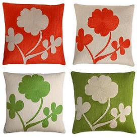
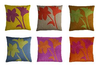
 these pillows remind me of an old ali fight we watched last night. he beat sonny liston and proceeded to scream to everyone, "i shook up the world! i shook up the world! i'm the greatest!. then he paused and screamed, "i'm pretty!". that was my favorite part. it relates because i think these pillows, if they could, would scream "i'm pretty!", too. cause they are. "botanical luxe pillows" available online at atmosphere home. Labels: accessories
knobs and hooks
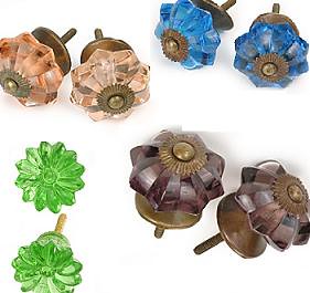
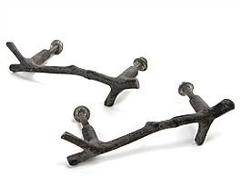
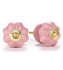
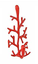
 that sounds kind of dirty, but really this is a super girly, super proper post. as most people around me know, i'm an anthropologie freak. i literally donate half my paycheck to their well-designed stores every month. but, inspired by the idea of renovating some pieces of my old furniture, i thought i'd check out the knobs and doodads they had to offer. 
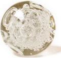
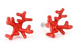
seeing as coral has been the rage for the past few months they have a few coral pieces to keep you happy if that's your thing. i'm drawn towards the antique-looking glass knobs, but you really can't go wrong with any of them. so, whether you're dressing up a new dresser or adding some much needed flair to an old cabinet, anthropologie has some great designs you should definitely check out. 


Labels: accessories
all eyes on....
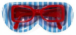
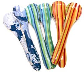
 sunglass shaped sunglass trays. i know, it's a bit unnecessary, but i think it's hysterical. for those of you who wear them (i don't, i know, i'm going to destroy my corneas) these might be a funny addition to a hall console table or wherever you throw your goods when you get home. found online for $18 buckaroos at decorativethings.com. they also make cute salad servers. sometimes cheap and plastic can be fun.  Labels: accessories
maxwell-silver
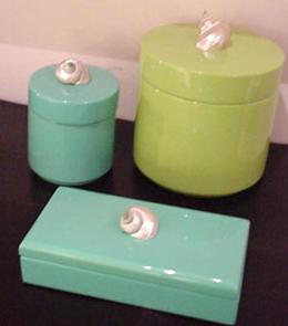
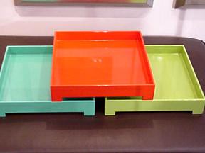
 i love great online resources (because i happen to think product resources are helpful, not culture-destroying...). maxwell silver combines a bunch of great home boutiques into one online home design haven. i'm rather partial to the lacquered boxes and trays, but you can't go wrong with jill rosenwald's pottery or bernaudaud votives either. there's a whole slew of great stuff to check out, so cruise on by and see what you can find. 


Labels: ceramics
eva lee
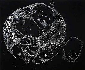
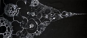
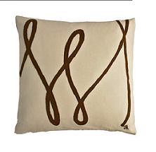
 eva lee emailed me yesterday about something unrelated to her own work, but once i saw it, i knew i had to post it. eva makes the most striking black and white illustrations that just blow me away. my favorite is posted above. 
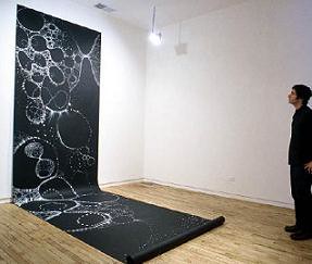
born and raised in good old nyc, eva currently lives and works in connecticut. she studied painting at bard, and earned her mfa at hunter college. during her time at hunter, eva was awarded the william graf travel grant to conduct research for her mfa thesis with scientists at the uc davis. her research there into methods of science and systems of knowledge culminated in a signature series of large-scale abstract drawings (which i love), made with white ink on black paper, consisting of numerous dots and lines that connect and evolve as the artist draws. these drawings have such a graphic elegance to them that i find myself wishing i was there to see them in person and experience the full effect of their size and their mastery of line. until then, you can see them online through eva's website. i hope you'll take the time to check them out. 
Labels: artwork
domi-NO?
 so everyone and their brother is emailing me to say "OH MY GOD! DID YOU SEE HOW SALON BASHED DOMINO?!?!". and i guess i felt that after the 14th email i should say something. i could go on and on about this for awhile, but i'll air my response simply: i couldn't disagree with salon more. i say, read the magazine for yourself and see what you think. i happen to love domino and think many of you will. salon doesn't, so, more power to em. but hey, to each his own. i for one will be thrilled to get my next copy of domino in the mail. keep it up domino, it's just one writer's opinion and i like to think that this writer's opinion cancels it out in some sort of cosmic way. xoxo, d*s
this is swigg
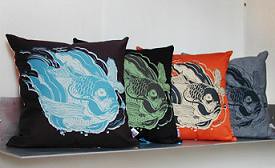
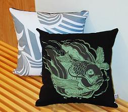
 i love swigg. they make the cutest, brightest products around. i'm in deep like with this "tsunami" line of pillows that have crazy bright fish on them. they were made before the tsunami tragedy, but 10% of the proceeds will go to unicef to benefit tsunami relief funds. swigg is always good at producing colorful products that make me smile, so i hope these can do that for you too (although now i'm noticing that the fish look kinda dead and i guess that's not so happy, but well, the colors are happy?). click here for the full story on swigg. 
Labels: accessories
when i'm all grown up....
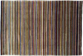
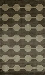
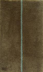
 ...i'll own nice pieces that i won't feel ok letting my cats tear up. and these are some i might consider- passed on to me by a lovely d*s reader, khaden tibetan rugs are rich, sensual and beautifully made. they're a bit more traditional than i'd normally go, but i'd love to have these in my hallways so i could walk on them barefoot, they look so thick and lush. i'm waiting to hear back about prices, but i'm sure they're pretty up there. so, if you can afford a nice investment piece now, i'd give these a look- they're gorgeous. more info on khaden here. 

Labels: rugs and flooring
ms. ross
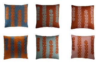
 i've mentioned ms. ross before in a post about auto, but i just found her personal site and was blown away by her work for the second time. i knew her designs were beautiful, but i hadn't seen the gorgeous array of colors her work was available in. and wow, is it gorgeous. auto carries some great pieces of hers, but nothing in the beautiful colors i saw on her site. 
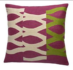
judy ross is new york based textile artist whose work blows me away. she blends century old embroidery techniques with modern design to create subtle but beautiful textiles for the home. her collection includes pillows, rugs, curtains, upholstery fabric, tablemats and bed covers. ms. ross' textiles are handmade using three different techniques, according to your preference: chainstitched (in india), hand-knotted and hand-tufted. each is gorgeous and oozes luxury. 
i highly suggest you check out ms. ross' work on her website, her pieces are a bit on the high-end of the market, but are definitely worth the investment. enjoy! 

Labels: accessories
ben loiz
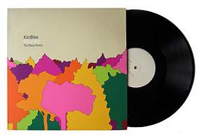
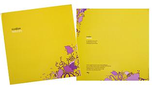
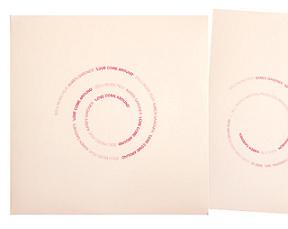
 chris bettig of the mountain label passed ben's site on to me this morning and i love it. ben loiz lives and works in LA as an artist and designer. his clients are a diverse group and his work ranges from print to packaging and identity. but what i love is his album cover work- it's gorgeous. there's something about these albums that i can't get enough of. simple, colorful, basic. i love it. you can see more of ben's work here. 

Labels: graphic design
ianonne sanderson
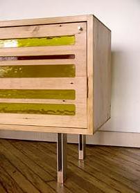
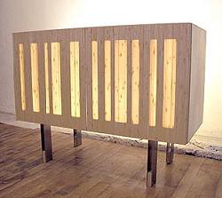
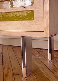
 i found ianonne's website on the icff exhibitor list and have now added them to my "must see" list. mainly because of their "glow box" and the "red line cabinet" which is made from reclaimed douglas fir floorboards from the philadelphia academy of music- nailmarks and all. i love it. i'll be sure to let you know how they represent at icff. click here for more info on ianonne. 

Labels: furniture
|
 |
 |
 |
 |
|
|
